The network for creativity
Join 1.25M professional creatives like you
Connect with clients, get discovered, and run your business 100% commission-free
Creatives on Contra have earned over $150M and we are just getting started
Back to feedPost

I just designed the LayerDock Chrome extension.
The goal was simple: get from any website to a review in one click.
The popup has two states, and each has only one obvious next step.
New site? Name it and tap Add to my Workspace.
Already added? Tap Open review or Copy share link.
The full editor opens in a new tab, so the popup stays small and the real work happens where there is room for it.
It's live now and free to try at layerdock.io.
I'd love to hear what you would change in the flow.

Two states with one obvious next step each is the right call for a popup this small.

LayerDock popup with two clear states is the right UX call — Chrome extensions need zero confusion in the first 3 seconds.
The network for creativity
Join 1.25M professional creatives like you
Connect with clients, get discovered, and run your business 100% commission-free
Creatives on Contra have earned over $150M and we are just getting started





Related posts

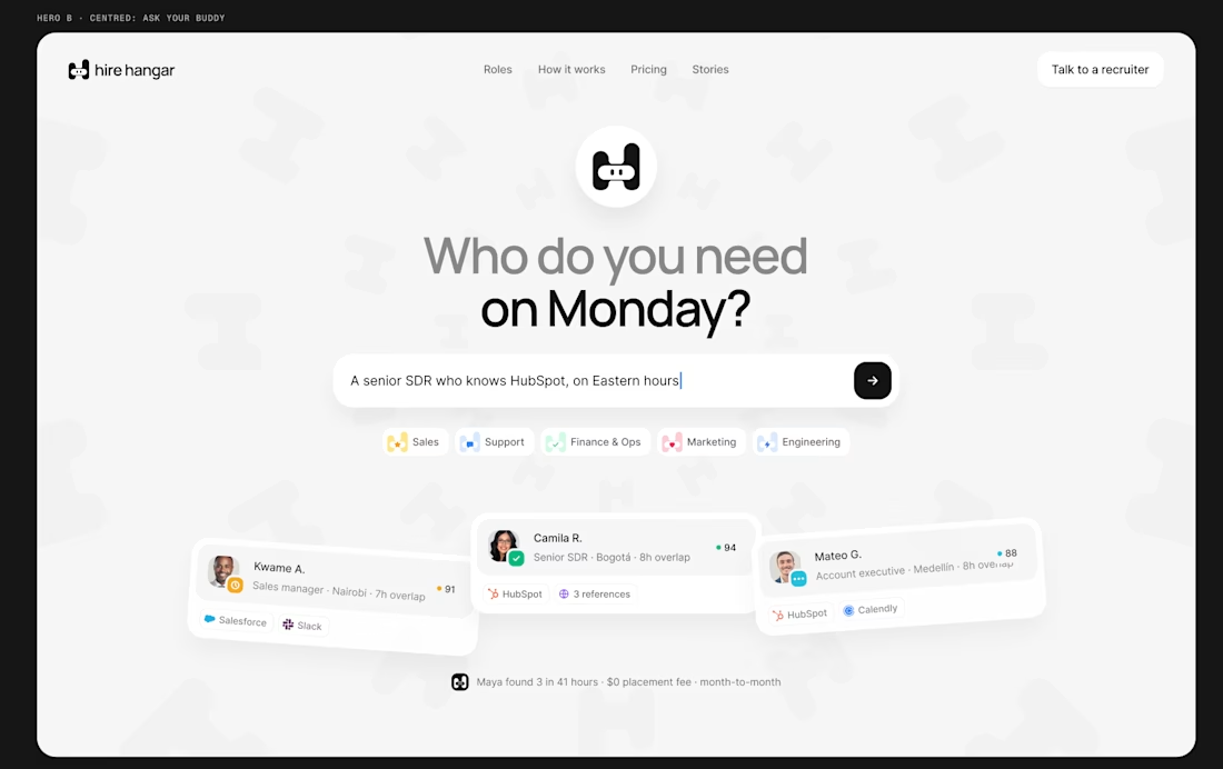
A good landing page shouldn’t make you work to understand it.
Been working on a new project where the goal was simple:
Make a complex product feel simple, clear, and easy to explore.
Less explaining. Less clutter. More visual hierarchy. A clearer path to the next step.
Still working through the details, but this one is coming together nicely.
Full case study soon.
This pairs well with the Hire Hangar screenshot because the design itself demonstrates the point—you don't need to reveal the whole project yet.



This is nice 👌

A polished website doesn't have to start from scratch.
Braid gives creative brands a modern Framer foundation that can be quickly adapted to your own visual identity.
Grab Braid FREE → https://framer.link/ahePHmM


Just built a clean, fast single-page website using WordPress + Elementor.
Focused on:
• Clean UI
• Mobile responsive design
• Fast loading
• Simple, conversion-focused layout
Less complexity. Better performance.
#WordPress #Elementor #WebDevelopment #WebDesign

