The network for creativity
Join 1.25M professional creatives like you
Connect with clients, get discovered, and run your business 100% commission-free
Creatives on Contra have earned over $150M and we are just getting started
Back to feedPost
Taste Test

Which one's more cooked for LayerDock's Chrome Store screenshot? 👀
3 voted
15%
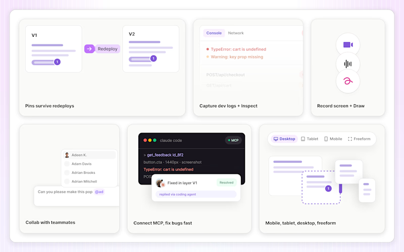
17 voted
85%
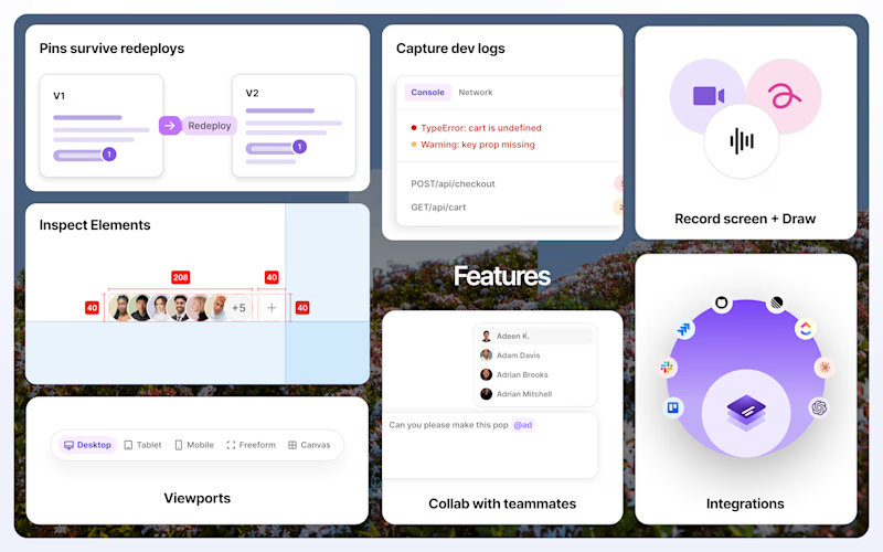
20 votes
Closed

Bold detailed are better ❤️❤️


Premium design !


bold one, store thumbs are tiny

The LayerDock Chrome Store screenshot is a genuinely useful taste test — at thumb size the bold version carries the feature faster, but the clean version is what actually builds trust once someone clicks through to evaluate a browser extension. Ship the bold one as the store...

2 'pops' in the best way.

The network for creativity
Join 1.25M professional creatives like you
Connect with clients, get discovered, and run your business 100% commission-free
Creatives on Contra have earned over $150M and we are just getting started



Related posts

I took a screenshot of Juice Labs and tried to redesign it UI/graphically. Now I've put it up for voting to see which one is better.
2 voted
50%
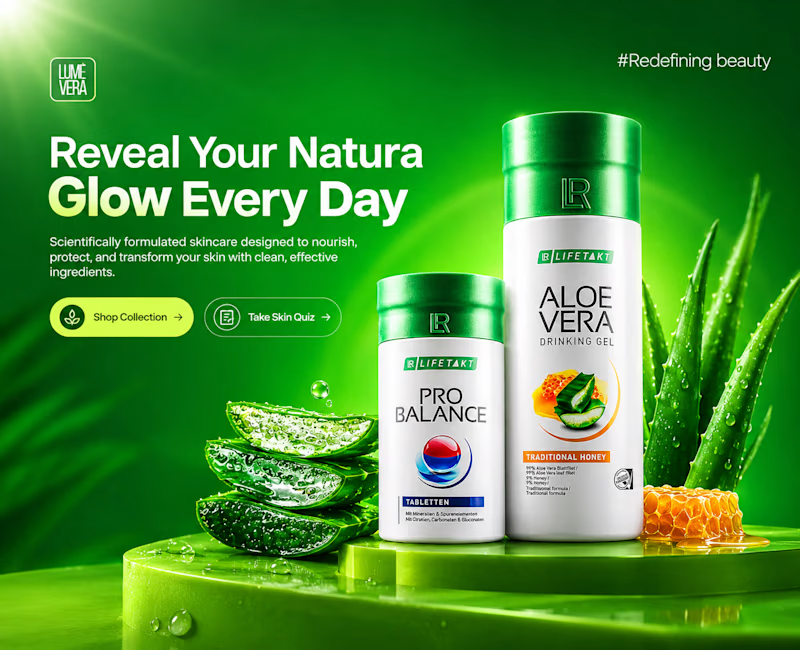
2 voted
50%
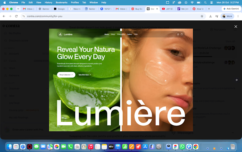
4 votes
Closed

Nice work Rohit! Your redesign feels much fresher and more premium compared to the original screenshot — the green is more vibrant, the product focus is clearer, and the "Reveal Your Natura Glow Every Day" hierarchy really pops. The aloe visuals and lighting make it feel more...

Playful sprinkles or a calm latte? ☕🍨 Same brand, two moods.
Which one makes you stop scrolling? Vote and tell me why! 👇

12 voted
67%
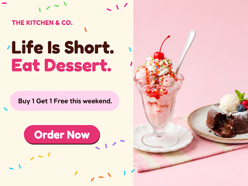
6 voted
33%
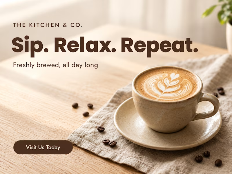
18 votes
Closed

Voted the latte one. The photo has more breathing room, so the headline reads cleaner.

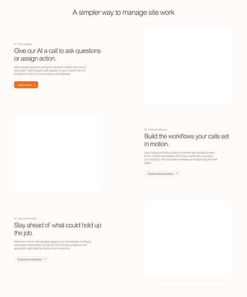
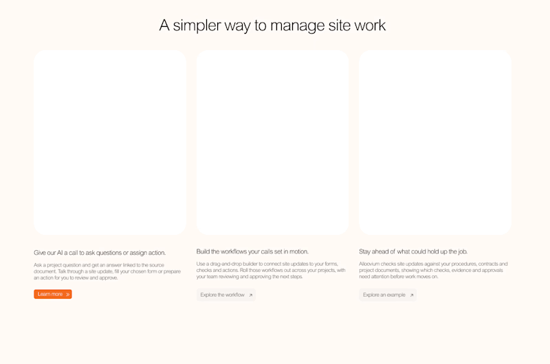
Voted B. Seeing the whole flow at once makes the section easier to scan for someone new to the product.