The network for creativity
Join 1.25M professional creatives like you
Connect with clients, get discovered, and run your business 100% commission-free
Creatives on Contra have earned over $150M and we are just getting started
Back to feedPost
Taste Test

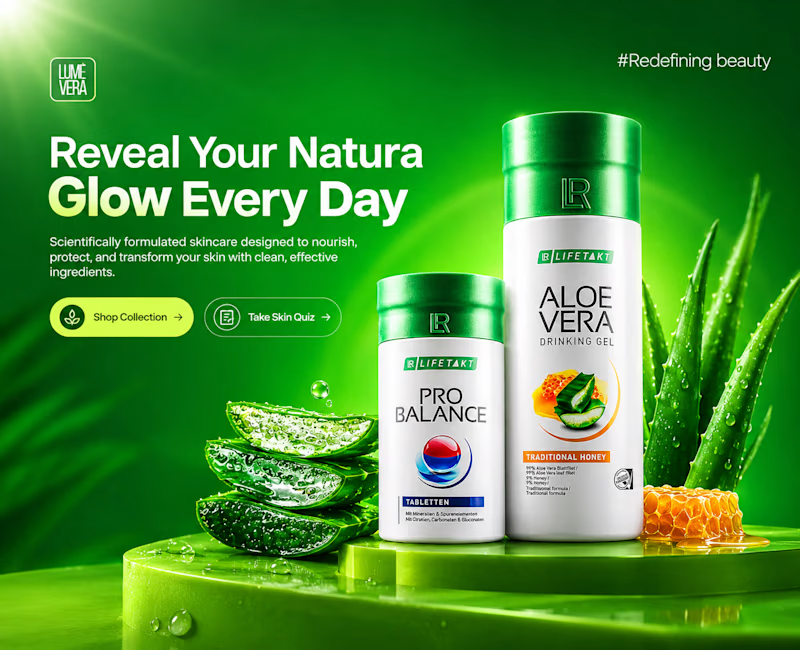
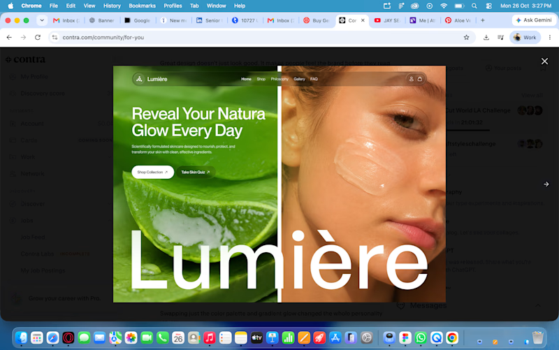
I took a screenshot of Juice Labs and tried to redesign it UI/graphically. Now I've put it up for voting to see which one is better.
3 votes
Ends in 1d

Nice work Rohit! Your redesign feels much fresher and more premium compared to the original screenshot — the green is more vibrant, the product focus is clearer, and the "Reveal Your Natura Glow Every Day" hierarchy really pops. The aloe visuals and lighting make it feel more...

💯 Option 1

Went with Option 1. The product shot and the green gradient make the headline pop much more.
The network for creativity
Join 1.25M professional creatives like you
Connect with clients, get discovered, and run your business 100% commission-free
Creatives on Contra have earned over $150M and we are just getting started





Related posts

Brand identity exploration
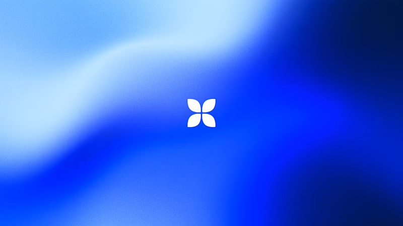
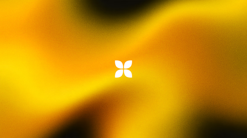
Which one do you think it fits better?
36 voted
77%
11 voted
23%
47 votes
Closed

Cobalt is great Gold is unique 🎉🎉🔥🔥

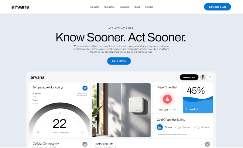
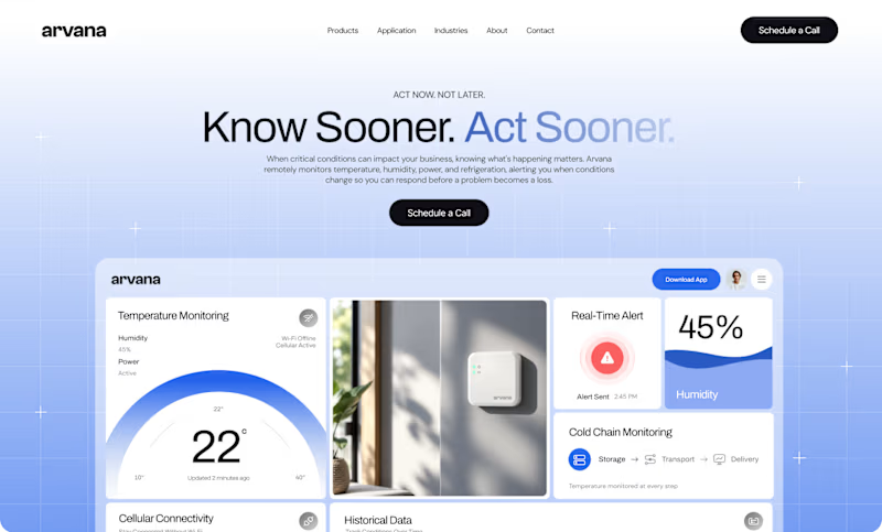
Worked on two hero directions for Arvana. Both show the same dashboard UI but the background treatment changes everything.
Which one do you click? 👇

6 voted
18%
27 voted
82%
33 votes
Closed

🔥


Which feels more established to you?
22 voted
30%

52 voted
70%

74 votes
Closed
