The network for creativity
Join 1.25M professional creatives like you
Connect with clients, get discovered, and run your business 100% commission-free
Creatives on Contra have earned over $150M and we are just getting started
Back to feedPost


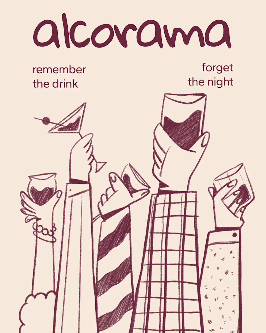
Loved the Branding 😉
The network for creativity
Join 1.25M professional creatives like you
Connect with clients, get discovered, and run your business 100% commission-free
Creatives on Contra have earned over $150M and we are just getting started



Related posts

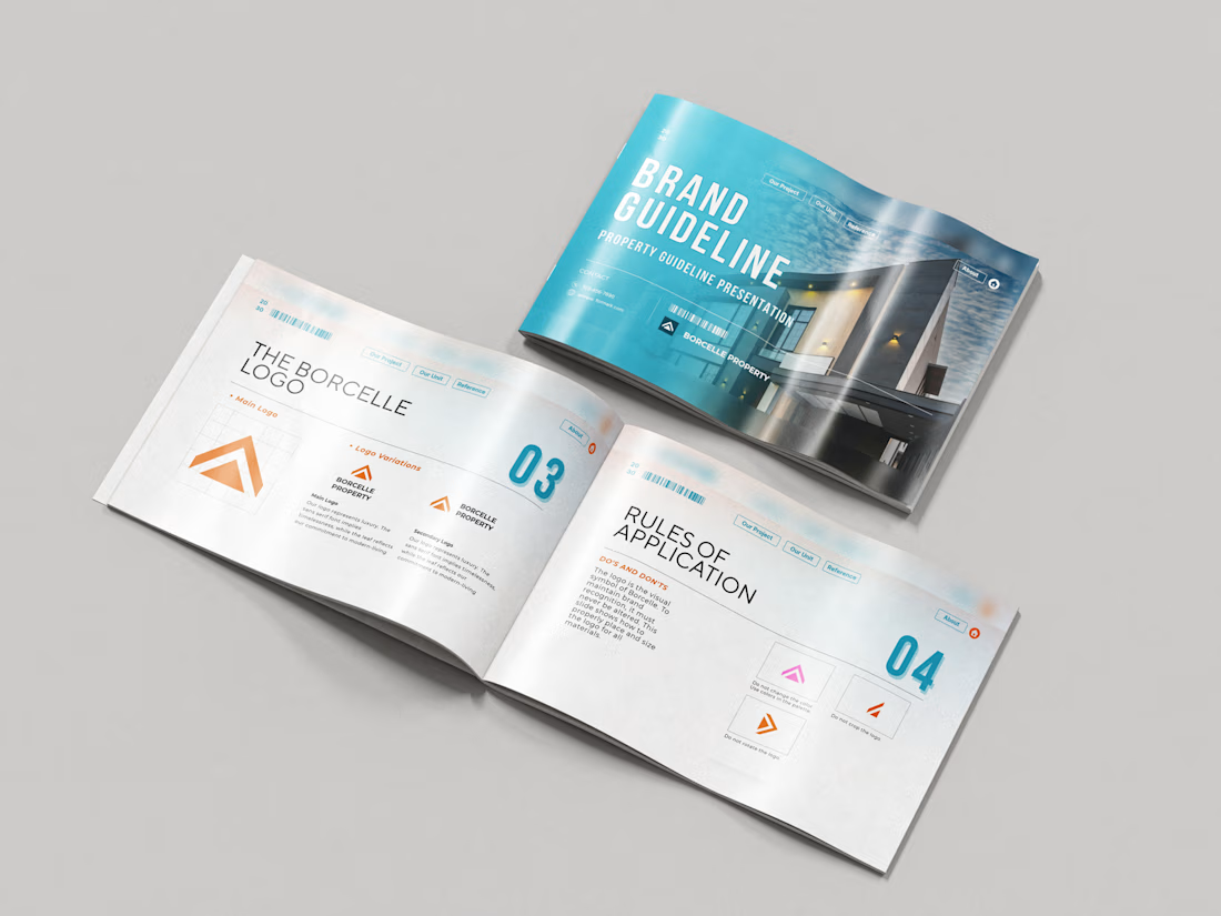
Just wrapped a brand identity concept for Haven Ridge Properties, a real estate developer selling to first-time buyers and investors.
The challenge: feel premium without feeling cold.
The answer was two ideas shelter and growth.
The mark is a roofline that doubles as an upward arrow: home and long term value in one symbol.
What's inside the guidelines:
• Primary and secondary logo lockups
• Logo usage rules
• Typography system
• Colour palette with clear roles
• Imagery direction
• Digital and print applications
Which detail stands out most to you?
#branding #brandidentity #logodesign #brandguidelines #realestate

Ovéa — care with character.
One skincare identity across bottles, jars and tubes. I designed the wordmark, pink-and-cobalt packaging system, campaign applications and digital mockups, then brought the collection into motion.
A consistent visual language, with room for each product to feel individual.
View the full case study. Building a skincare brand? Let’s talk about your identity and packaging.

Love the colour direction and the visual language. Everything feels so well thought out. The overall look is beautiful.

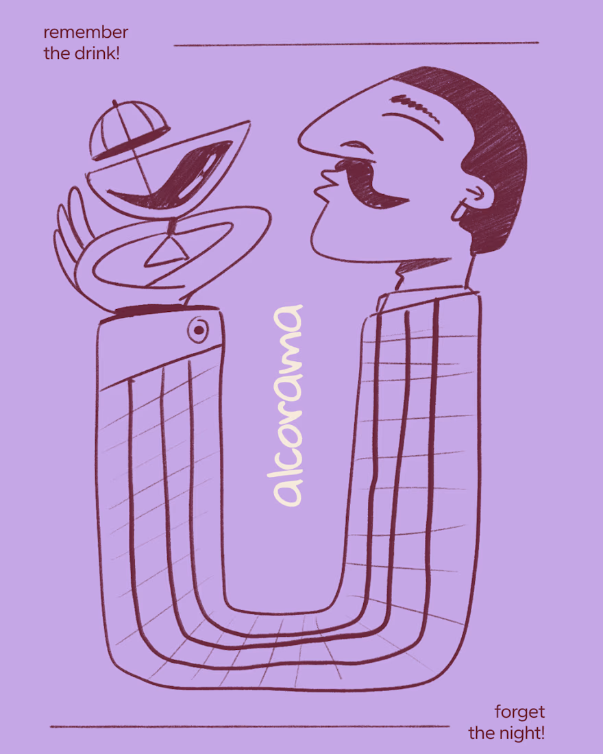
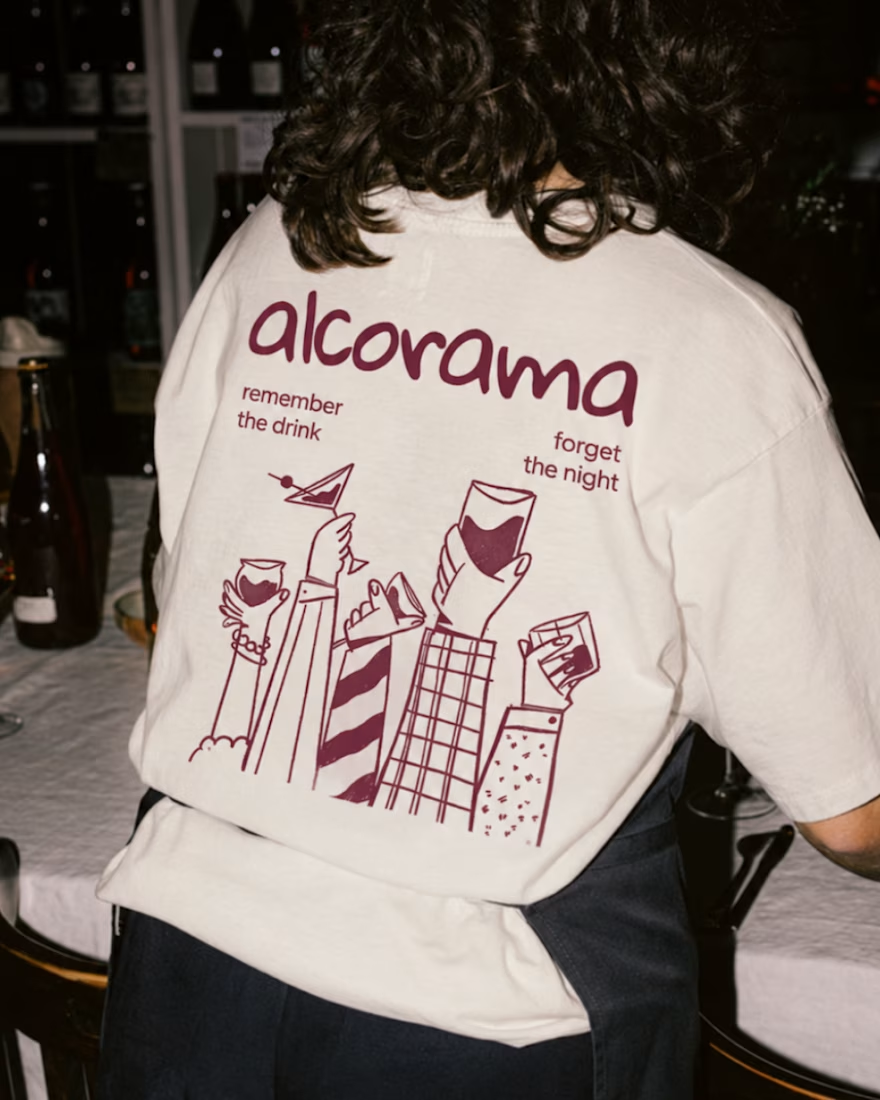
Final direction picked! I love when brands use custom illustration as the main way to communicate with their audience.
Direction discovery should not take more than one week and it should be full of personality! Ready to upgrade your brand?


Amazing work!