The network for creativity
Join 1.25M professional creatives like you
Connect with clients, get discovered, and run your business 100% commission-free
Creatives on Contra have earned over $150M and we are just getting started

The network for creativity
Join 1.25M professional creatives like you
Connect with clients, get discovered, and run your business 100% commission-free
Creatives on Contra have earned over $150M and we are just getting started




Related posts

Inspired by the Japanese word "Yokocho (横丁)", meaning the lively side streets lined with small eateries and hidden food spots, this identity was designed to capture the warmth, energy, and charm of Asian street food culture.
The visual identity combines bold typography, a playful octopus mascot with a ramen bowl hat, and vibrant colors to create a brand that's approachable, memorable, and full of personality.
Every element was crafted to make Yokocho feel like more than just a place to eat, it's an experience that brings people together over comforting food and bold flavors.


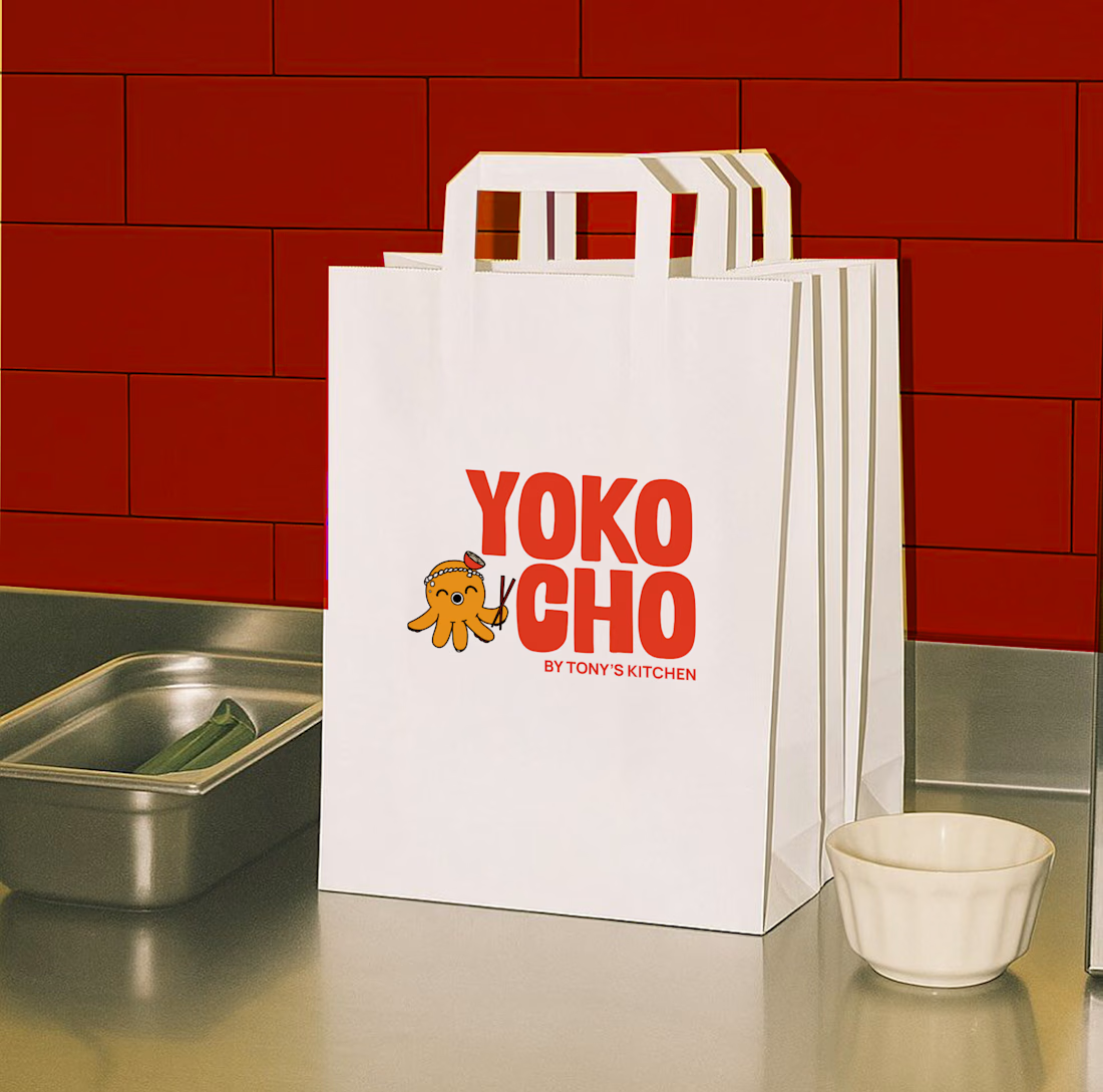

The stacked YOKO / CHO lockup with the octopus tucked into the split is a smart move, the mascot doubles as the divider instead of sitting off to the side. Coral on that dark tile reads warm and genuinely appetizing. One thing I would prep next: a simplified octopus for tiny...


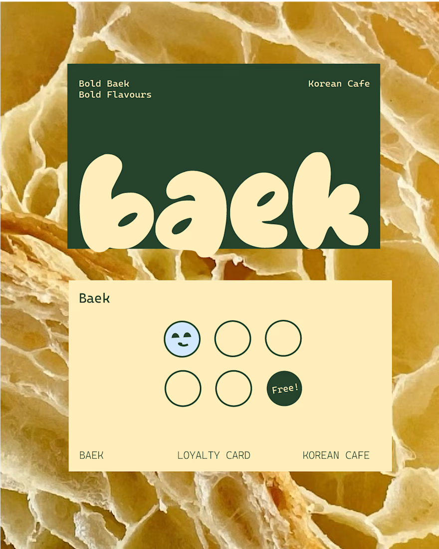
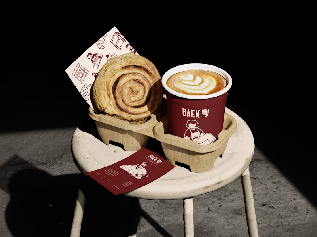
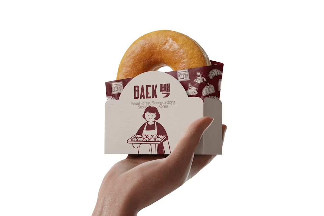
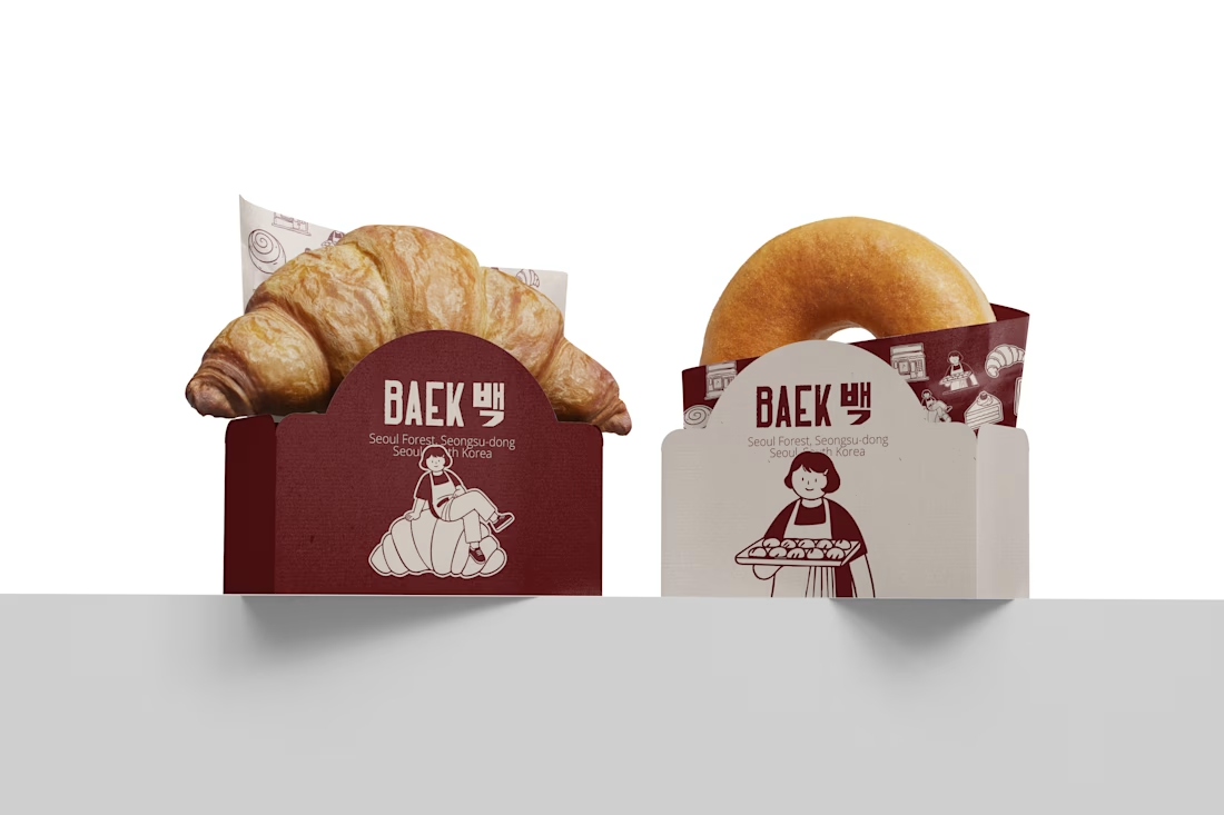
BAEK — a soft and minimal bakery identity inspired by warm pastries and Korean café culture. 🥐☕
.

Excellent.

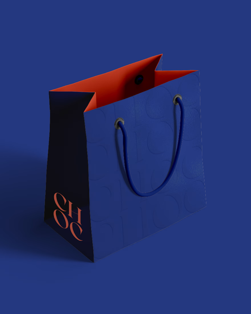
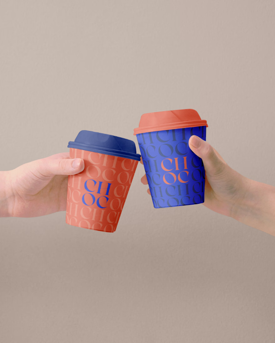
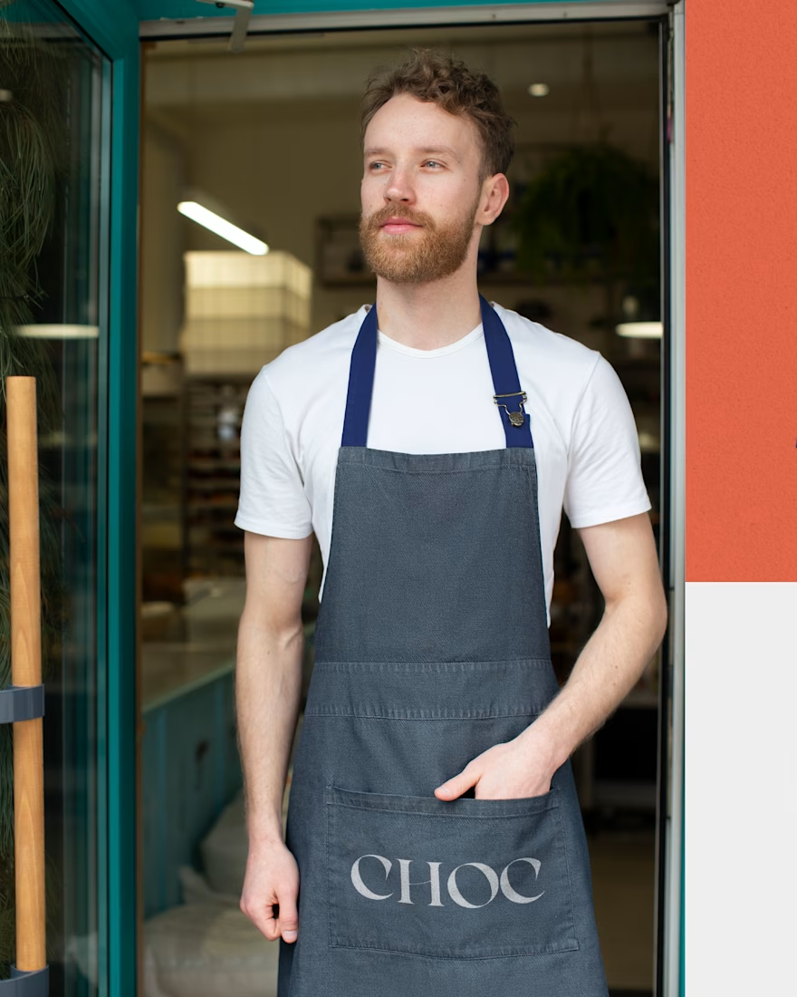
Brand Identity Design for Choc, a bakery based in Dubai! 😊