The network for creativity
Join 1.25M professional creatives like you
Connect with clients, get discovered, and run your business 100% commission-free
Creatives on Contra have earned over $150M and we are just getting started
Back to feedPost


Meet Darkroom: A high-converting, dark-mode landing page that refuses to be ignored.
Featuring scroll-stopping 3D assets, fluid transitions, and dynamic scroll animations, this design is built to command attention.
It perfectly balances a premium, futuristic aesthetic with a revenue-first layout designed to turn visitors into buyers. A true showcase of immersive web design.


The network for creativity
Join 1.25M professional creatives like you
Connect with clients, get discovered, and run your business 100% commission-free
Creatives on Contra have earned over $150M and we are just getting started



Related posts

Not every website needs more elements.
Sometimes, it needs better decisions.
A thoughtful layout.
A strong typographic hierarchy.
The right images.
Consistent spacing.
A clear navigation.
And enough room for the design to breathe.
These details might seem small, but together they shape how people experience a website.
That's one thing I appreciate about working with Framer: the opportunity to explore layouts, interactions, and visual details while keeping the experience intentional.
For me, good web design isn't about adding more.
It's about knowing what to keep, what to remove, and what deserves attention.
Less noise. More meaning. Better experiences.
What's one small design detail that immediately makes a website feel premium to you?
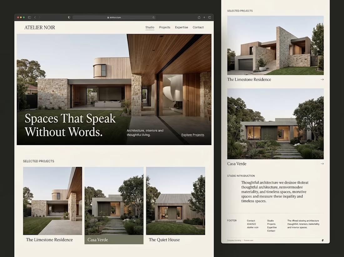

Generous whitespace for me. The serif headline over the photo on your Atelier Noir layout is a good example.

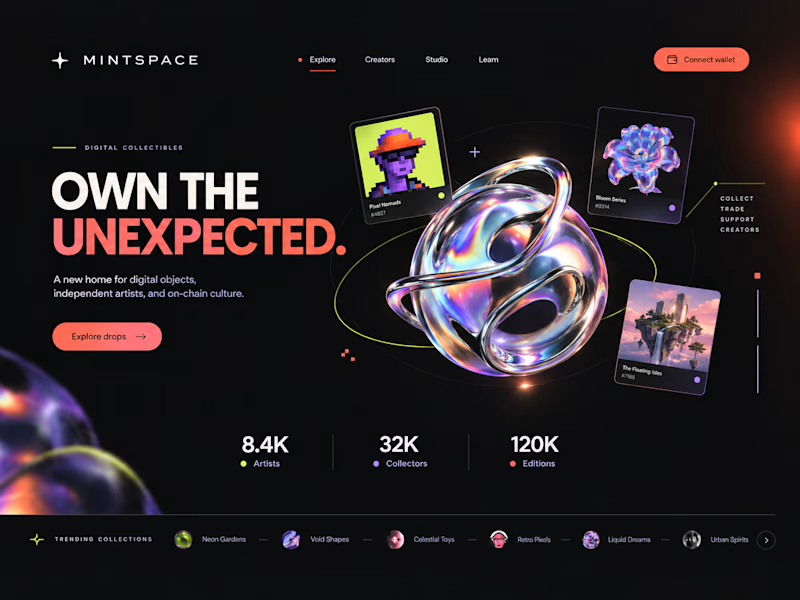
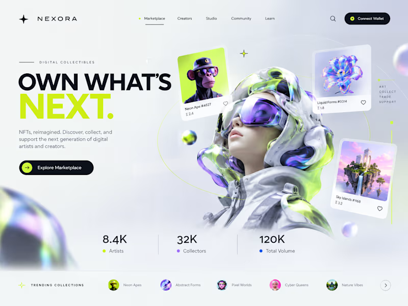
Two directions. One NFT marketplace.
Which visual direction would you choose?
🖤 A — Dark & Futuristic
🤍 B — Bright & Minimal
Both explore the future of Web3, but with completely different visual identities.
Drop your vote in the comments: A or B?
#UIUXDesign #WebDesign #NFT #Web3 #ProductDesign
10 voted
29%
25 voted
71%
35 votes
Closed

Strong design, well done

2nd variation of a landing page for a B2B search analytics platform
For this variation, I went with a lighter background where the CTA is visually focused instantly.
You might have 3~5 seconds to get the user's attention, so it's very important how the design looks and feels.
Full landing page coming tomorrow.

