The network for creativity
Join 1.25M professional creatives like you
Connect with clients, get discovered, and run your business 100% commission-free
Creatives on Contra have earned over $150M and we are just getting started
Back to feedPost

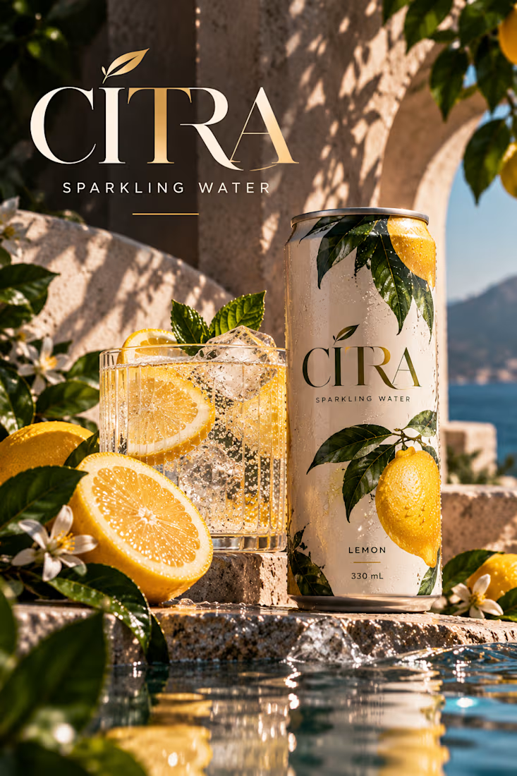
CITRA — Premium Sparkling Water Beverage Mockup
A sun-drenched beverage packaging concept bringing together Mediterranean-inspired art direction, elegant typography, and photorealistic product presentation.
CITRA is a self-initiated product mockup concept developed to explore how premium beverage packaging can be presented through sophisticated editorial photography and immersive visual storytelling.
The project centers on a refreshing lemon sparkling water, combining natural citrus imagery, tactile packaging details, and a carefully art-directed environment to communicate freshness, simplicity, and understated luxury.
The Creative Concept
The creative vision was to capture the feeling of a refreshing drink enjoyed on a beautiful Mediterranean afternoon.
Rather than placing the beverage against a conventional studio backdrop, the product is presented within a sunlit architectural setting that evokes coastal relaxation and effortless sophistication.
Natural stone, warm sunlight, distant blue water, fresh lemons, and botanical details establish an atmosphere directly connected to the product's citrus flavor.
The concept transforms a simple beverage can into the centerpiece of an aspirational lifestyle image.
Packaging Design & Visual Identity
The CITRA can features a restrained visual identity built around elegant typography and natural imagery.
A soft ivory background creates a premium foundation, while rich green botanical illustrations and vibrant yellow lemons communicate the flavor immediately.
The wordmark uses refined, high-contrast serif lettering, establishing a sophisticated visual character.
Subtle gold-toned details introduce warmth without overwhelming the packaging.
The result is a packaging design that feels clean, recognizable, and contemporary.
Typography & Visual Hierarchy
Typography plays an important role in establishing the premium character of the product.
The large CITRA wordmark creates immediate brand recognition, while smaller supporting text communicates the product category and flavor.
The packaging follows a deliberate hierarchy:
CITRA — Primary brand identity.
SPARKLING WATER — Product category.
LEMON — Flavor identification.
330 mL — Product volume.
The wider editorial composition repeats the CITRA identity at a larger scale, reinforcing the product's presence without overwhelming the photography.
This balance allows typography to remain impactful while keeping the beverage itself as the visual hero.
Photorealistic Product Presentation
The hero product is a slim, chilled aluminum can positioned prominently on a textured stone surface.
Condensation droplets create a convincing sense of coldness and freshness, while natural lighting reveals the packaging's material qualities.
A crystal glass filled with sparkling water, ice, and lemon slices supports the central product.
The glass introduces visual movement through bubbles, reflections, and transparent textures.
Fresh lemon halves, botanical leaves, and small blossoms surround the product, reinforcing the flavor identity without creating unnecessary visual clutter.
Art Direction & Composition
The environment draws inspiration from Mediterranean architecture and natural coastal landscapes.
Warm stone arches provide depth and structure, while distant blue water introduces a refreshing contrast to the golden lighting.
Soft botanical shadows create natural patterns across the scene.
A reflective water surface in the foreground adds another layer of depth and introduces subtle movement through highlights and ripples.
The composition uses a restrained palette of ivory, lemon yellow, botanical green, warm sandstone, and coastal blue.
Together, these elements establish a sophisticated visual atmosphere that feels luxurious yet approachable.
Product-Focused Visual Storytelling
Every supporting element was selected to reinforce the beverage's identity.
The lemons communicate flavor, the ice and condensation suggest refreshment, and the coastal setting establishes an aspirational lifestyle context.
The surrounding photography supports the packaging rather than competing with it.
This approach allows the mockup to function as both a product presentation and a premium advertising visual.
Project Outcome
The completed CITRA concept demonstrates how beverage packaging can be elevated through thoughtful art direction, realistic material rendering, and expressive visual composition.
It showcases an approach to product mockups that prioritizes clarity, atmosphere, and the emotional appeal of the product.
The final design balances sophisticated typography with natural imagery, creating a cohesive presentation that communicates the product's identity at a glance.
The result is a premium beverage mockup designed to make a simple lemon sparkling water feel refreshing, desirable, and visually memorable.
Self-initiated portfolio concept created to demonstrate beverage packaging presentation, product mockup design, and editorial art direction.


The network for creativity
Join 1.25M professional creatives like you
Connect with clients, get discovered, and run your business 100% commission-free
Creatives on Contra have earned over $150M and we are just getting started
Related posts

Packaging design collection across skincare, food and beverage.
Each label designed to stop someone mid-shelf and make them pick it up. Different products, different moods, same intention.
Botanical lotions. Fruit jams. Herb teas. A bourbon that means business. 🎨

Great Presentation of Packaging 🙌

Created a collection of Instagram poster designs focused on clean layouts, engaging visuals, and consistent brand aesthetics. ✨
Each design combines thoughtful typography, color, and visual hierarchy to create content that stands out on social media.
#GraphicDesign #InstagramDesign #SocialMediaDesign #ContraPortfolio
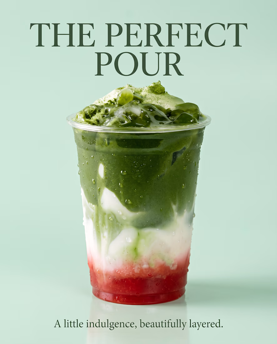
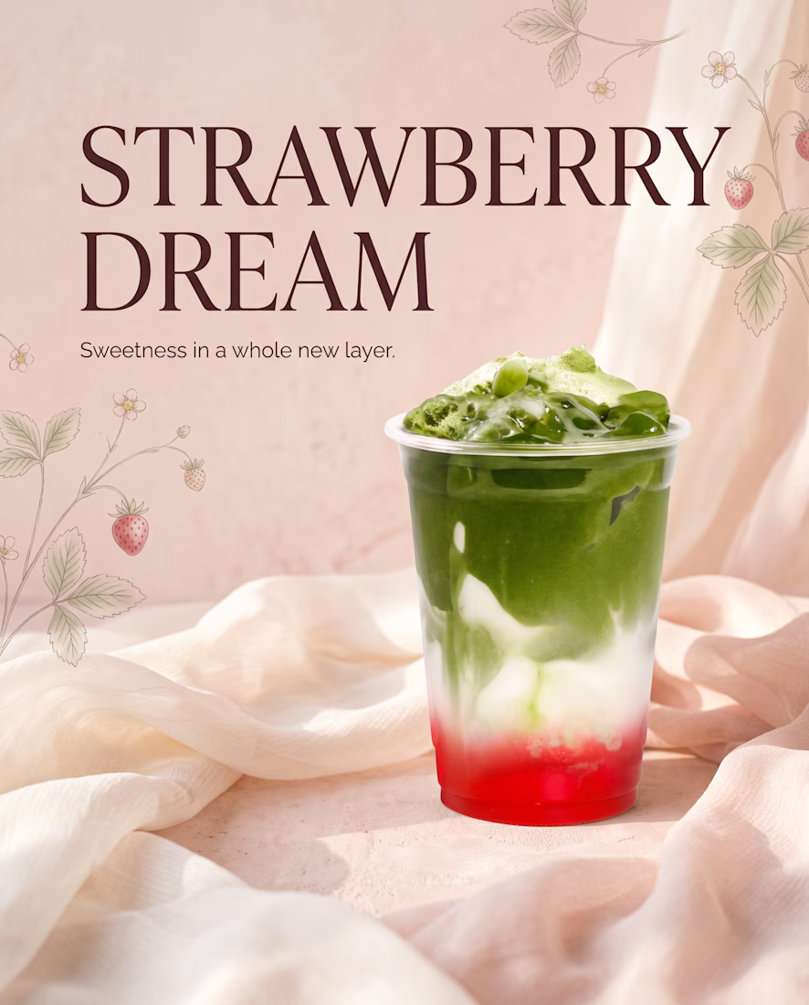
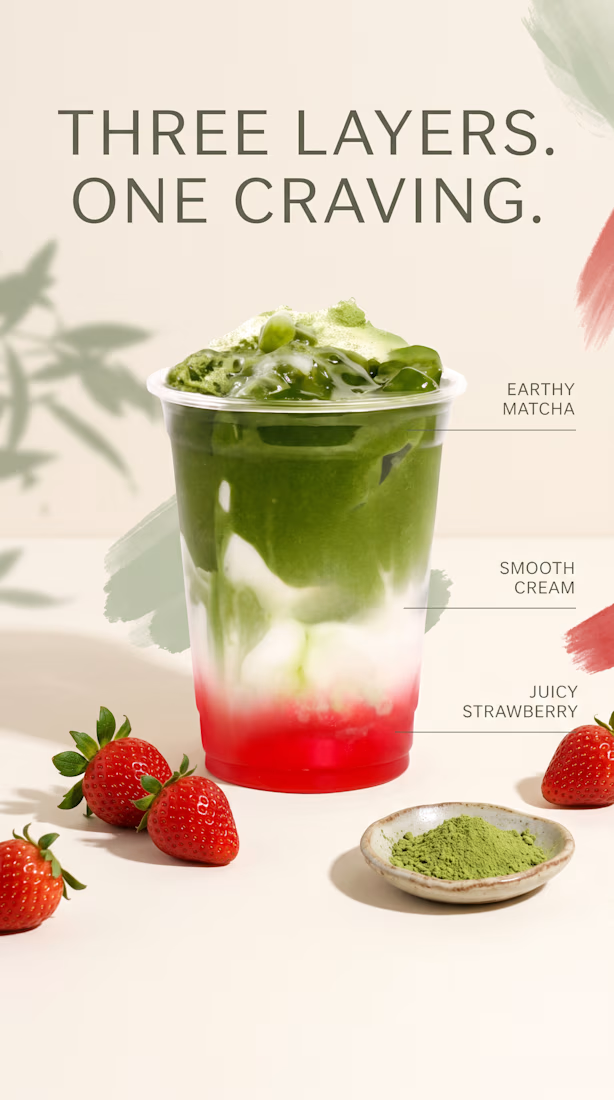
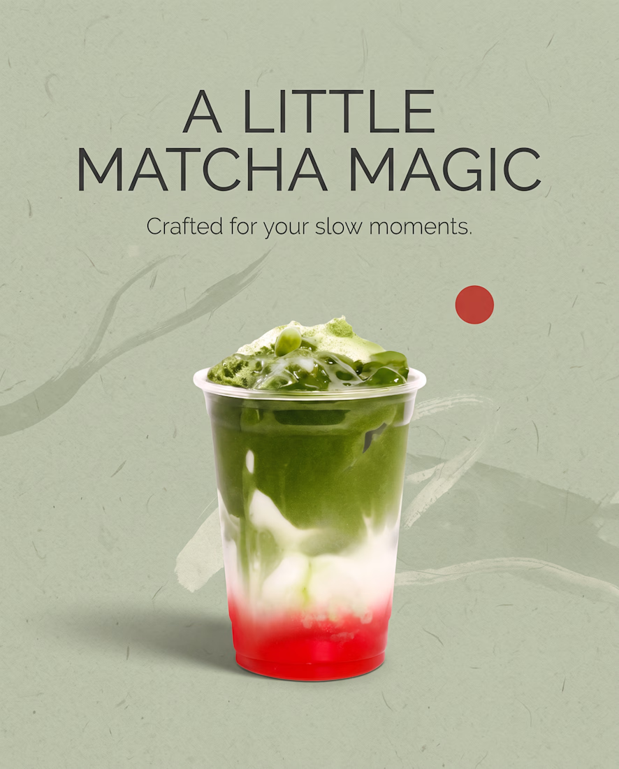

The background changes per tile while the matcha cup stays the hero, so the set feels varied but still like one family. The mint one and the strawberry blush one are my favorites. One idea: vary the cup crop a bit (close-up, a pour, a top view) so the grid gets more rhythm, and...

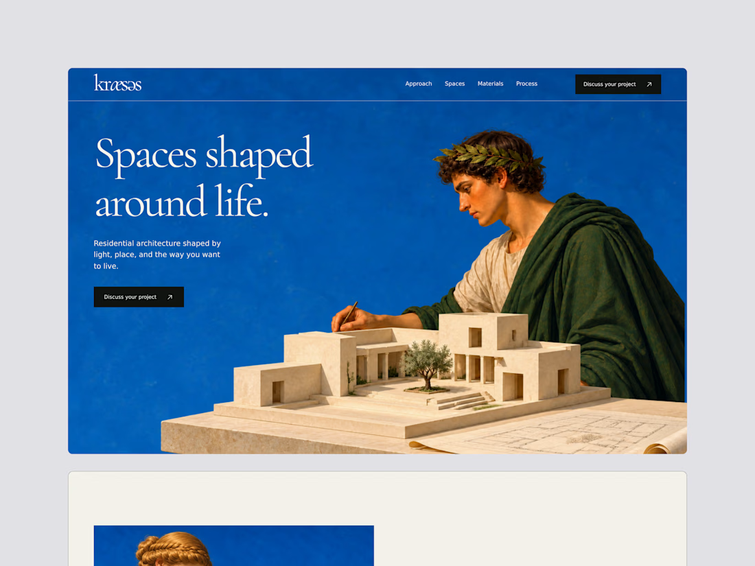
Trying to dip into that Neoclassical trend, yeah its AI, but results are just gorgeous. Working on a template for architecture.




OMG I love this!