The network for creativity
Join 1.25M professional creatives like you
Connect with clients, get discovered, and run your business 100% commission-free
Creatives on Contra have earned over $150M and we are just getting started
Back to feedPost

First impressions are a binary outcome: You are either a commodity or an authority. For this project, we chose authority.
The Concept: Digital Brutalism. We stripped away the 'web design' tropes to let the raw engineering shine.
The Innovation: We abandoned the standard 12-column layout for a 16-column asymmetric grid. This creates a "spatial rigor" that feels intentional and expensive.
The Experience: Non-linear physics. Every element on this hero section has "mass." The spring-loaded animations bridge the gap between a static website and a mission-critical tool.
I build for founders who understand that 'good enough' is a growth ceiling. This isn't just a hero section; it’s the heartbeat of the brand.


The network for creativity
Join 1.25M professional creatives like you
Connect with clients, get discovered, and run your business 100% commission-free
Creatives on Contra have earned over $150M and we are just getting started








Related posts


Three weeks into building the Pasted website, after the design was approved, an 11-page document arrived with a whole new vision.
It was beautiful work, and it described a different project at the agreed price.
I asked them to decide: keep the approved scope, or pause and price the new idea separately. On day six, they chose the original. We shipped two weeks later.


Offering to price the new vision as its own phase also lets the client see what the idea costs without it feeling like a no. Was a change-order process already written into your contract, or did you build that path on the spot?

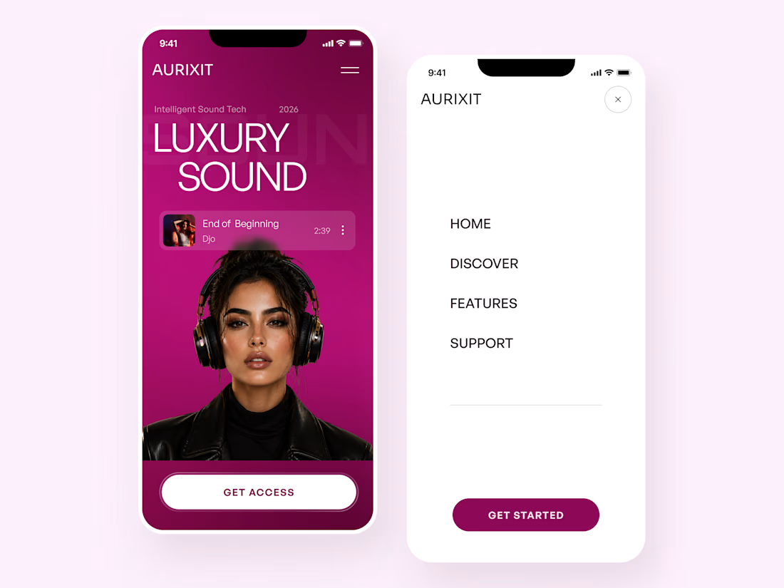
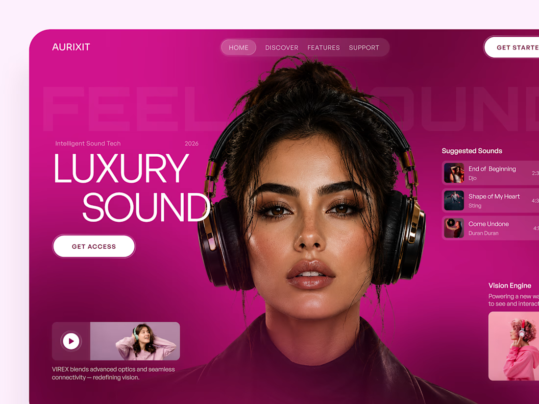
AURIXIT — Luxury Headphones Landing Page 🎧💗
A vibrant landing page concept for a premium audio brand, combining luxury sound, fashion-inspired visuals, and a bold digital experience
The design brings together bright magenta tones, oversized typography, lifestyle photography, and clean UI elements to create a modern, eye-catching aesthetic
Special attention was given to:
• Bold lifestyle-focused hero composition
• Vibrant pink and magenta color palette
• Clean, oversized typography
• Music playlist and suggested tracks
• Premium headphone presentation
• Clear CTA and minimal navigation
• Responsive mobile experience
The result is a fresh, stylish landing page that connects premium audio technology with fashion, music, and personal expression ✨

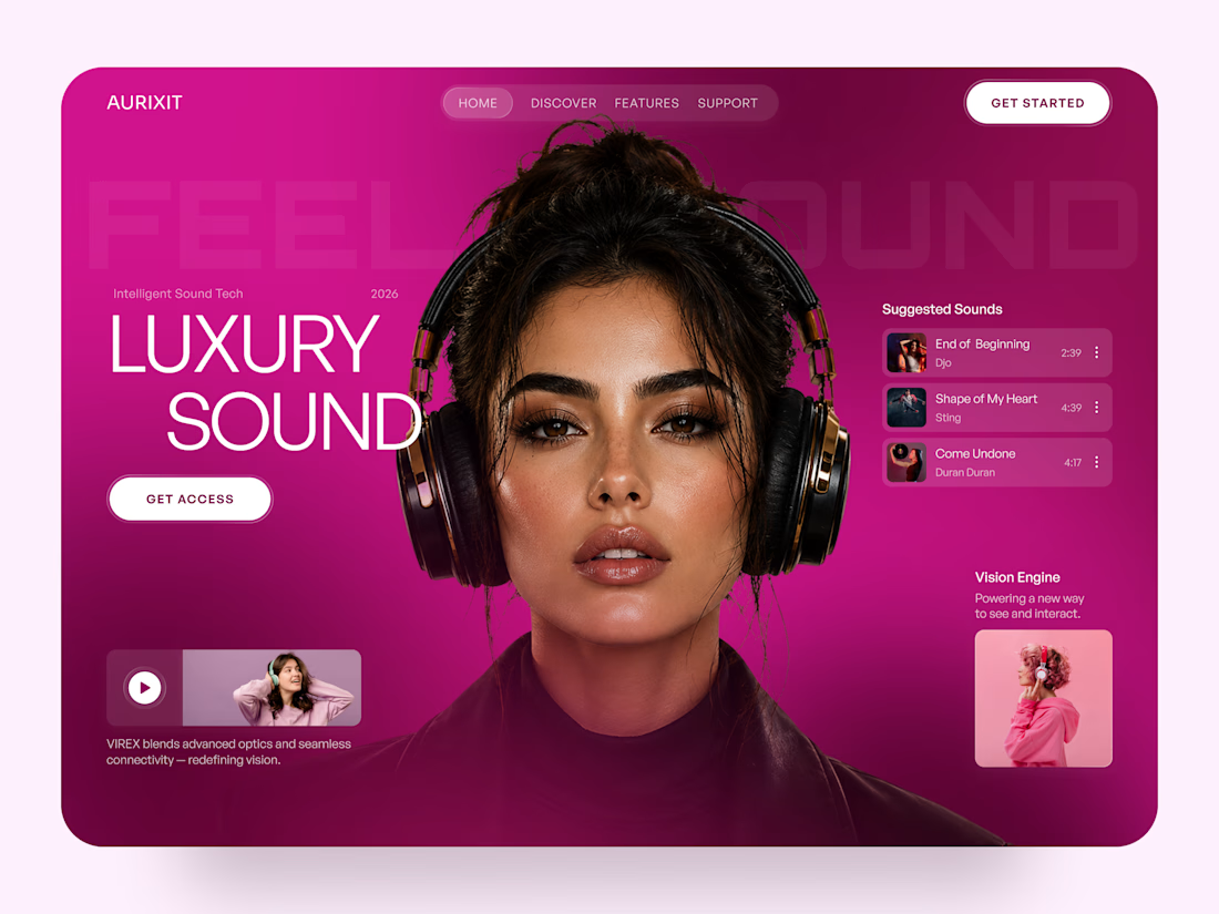

Magenta with the black headphones really pops. Was the small playlist text on pink tricky for contrast?

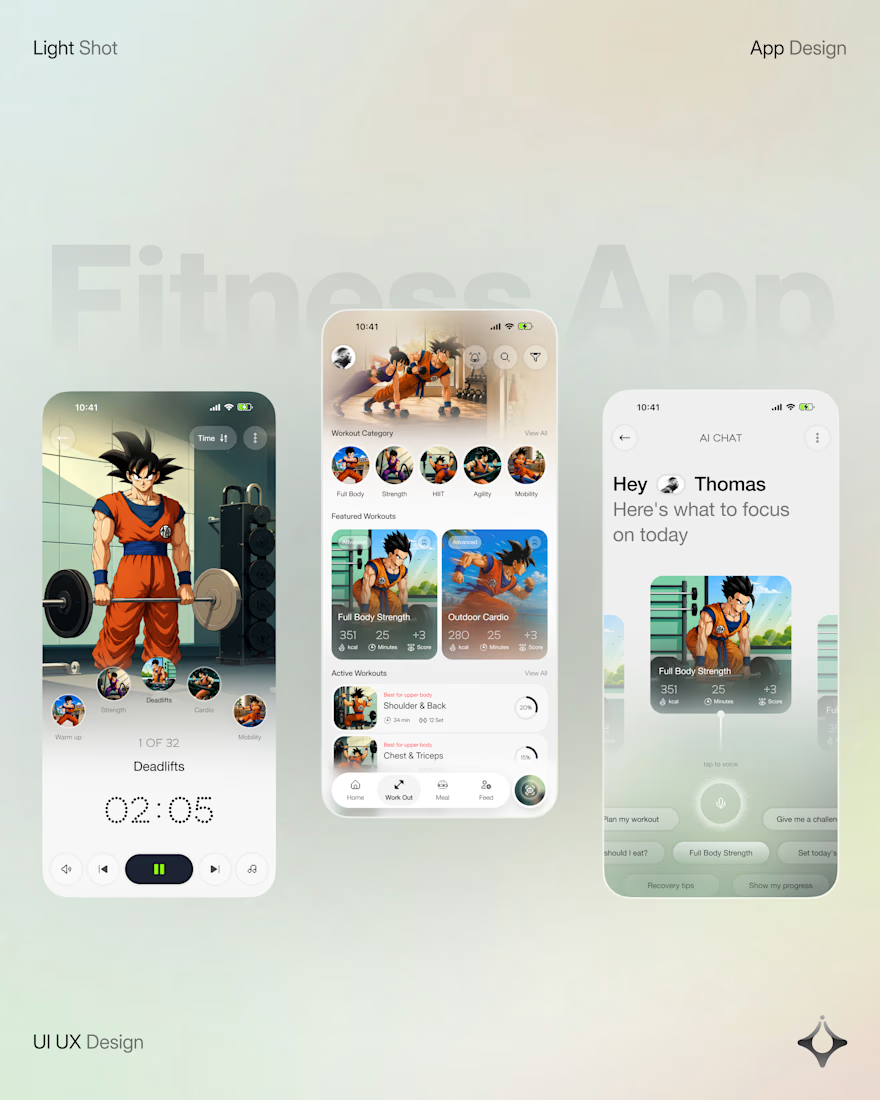
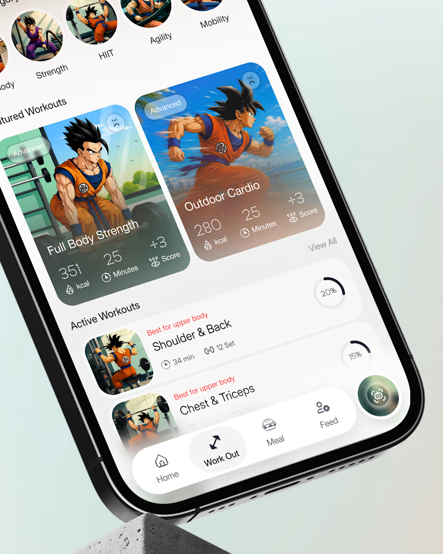
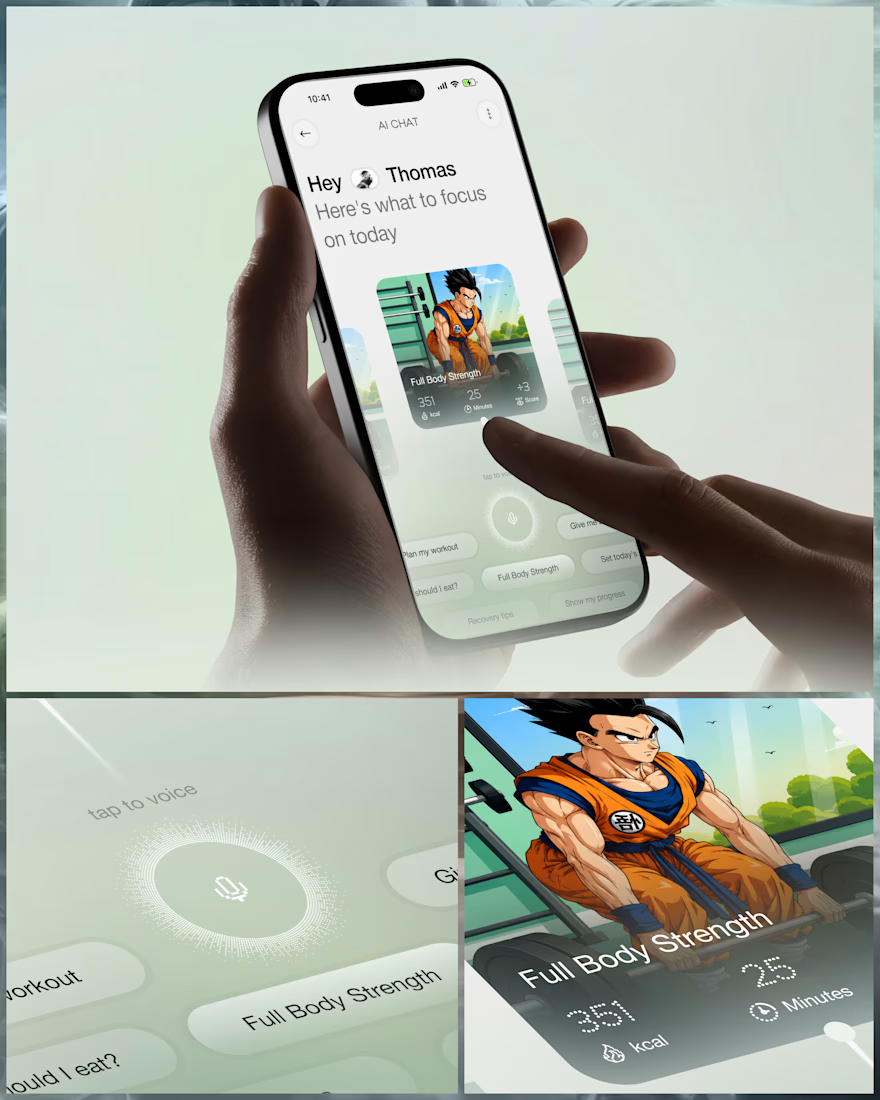
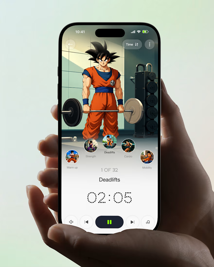
What if your fitness app felt like having a personal trainer in your pocket?
Meet your new workout companion. A bold fitness app concept combining personalized workouts, AI coaching, and a seamless mobile experience to make every session count.
Would you use this to level up your fitness journey?



Ye le Jani Juice Lab wali post ke liye copy-ready:
Love this concept Juice Lab! A fitness app that feels like a personal trainer in your pocket is exactly what's needed — combining personalized workouts with AI coaching and a seamless mobile experience is a great approach. The...