The network for creativity
Join 1.25M professional creatives like you
Connect with clients, get discovered, and run your business 100% commission-free
Creatives on Contra have earned over $150M and we are just getting started
Back to feedPost

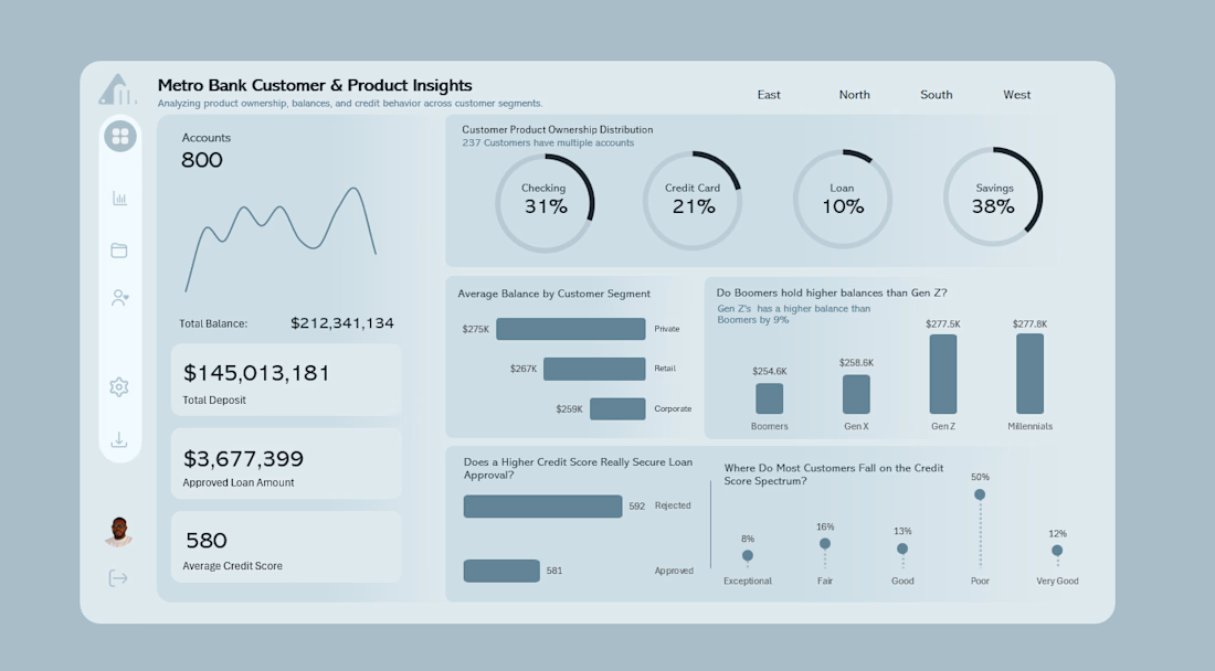
This time, we dove deeper into customers and product insights, looking at who holds what, how much they keep in balances, and what their credit stories are saying.
But here’s the twist after seeing the same dashboard color style over and over, I decided to shake things up. Instead of sticking to the usual, I pulled inspiration from a clean UI design I stumbled upon.
Then, I jumped straight into PowerPoint, layered my visuals, and built a design that actually felt like it was telling the story I wanted for this Excel Dashboard.

Really refreshing approach! Most dashboards repeat the same visual style, so breaking away from the usual template instantly improves the storytelling.
The fact that you started with customer + product insight analysis and then shaped the visual language around the story instead...
The network for creativity
Join 1.25M professional creatives like you
Connect with clients, get discovered, and run your business 100% commission-free
Creatives on Contra have earned over $150M and we are just getting started











