The network for creativity
Join 1.25M professional creatives like you
Connect with clients, get discovered, and run your business 100% commission-free
Creatives on Contra have earned over $150M and we are just getting started
Back to feedPost
Taste Test
Exploring two visual directions for a data visualization component.
Light & minimal vs Dark & bold - which one feels better for a modern dashboard?
Vote below 👇 Would love to know why.
#UIDesign #UXDesign #DashboardDesign #DataVisualization #ProductDesign #Figma


0 voted
0%

9 voted
100%

9 votes
Closed

Light one is making the data easier to scan. 😊


Thanks Leena for feedback I appreciate it! feel free to follow along I share more SaaS and product design work here.
Thanks Leena for feedback I appreciate it! feel free to follow along I share more SaaS and product design work here.
Cool, sure. I also posted a poll, would love to see your take on it 😊

2nd one 🙌
Thanks Umer for feedback I appreciate it! feel free to follow along I share more SaaS and product design work here.

Thanks Nirooz for feedback I appreciate it! feel free to follow along I share more SaaS and product design work here.


the dark donut chart wins for me Umair. the 57% is easy to read
The network for creativity
Join 1.25M professional creatives like you
Connect with clients, get discovered, and run your business 100% commission-free
Creatives on Contra have earned over $150M and we are just getting started











Related posts

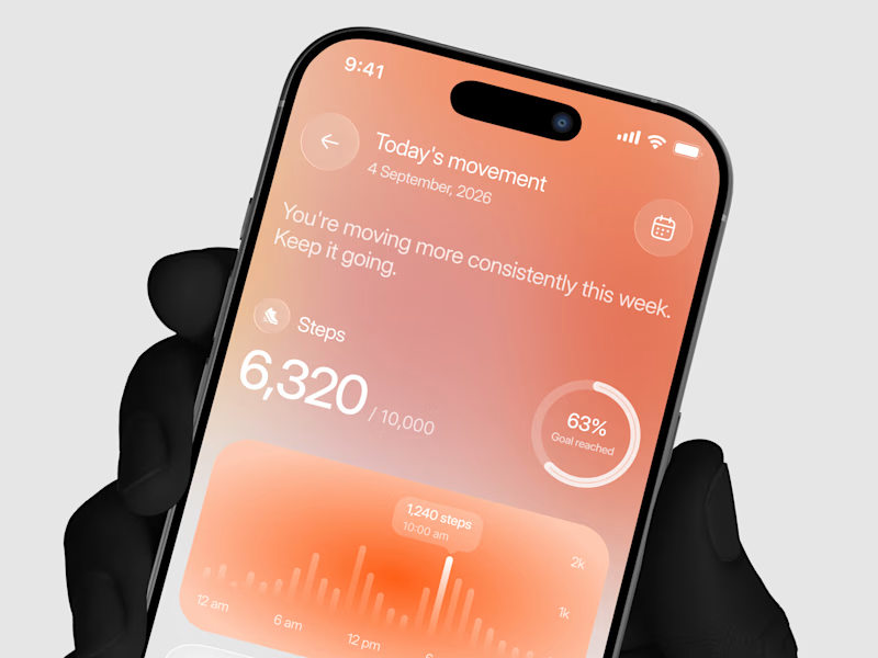
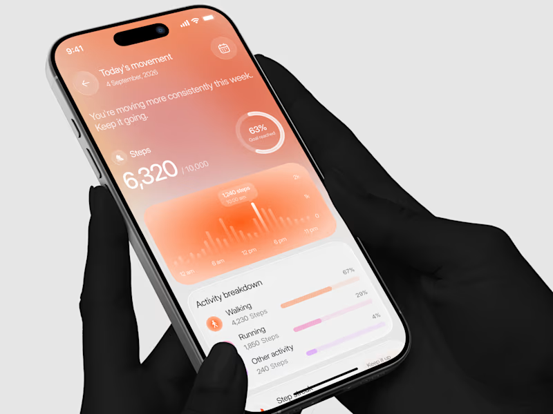
Designed a step tracking screen where you can see your daily progress and weekly trend in one glance.
Same screen, two shots. Which one would stop your scroll? 👀

11 voted
73%
4 voted
27%
15 votes
Closed


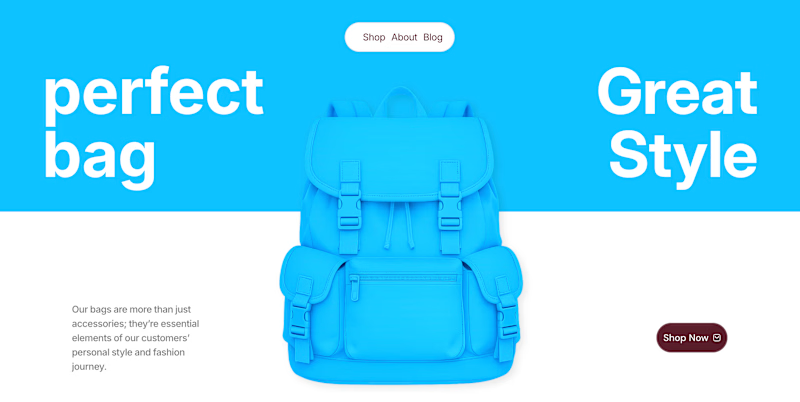
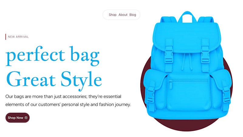
✨ Two Hero Concepts. One Bag Brand. Which One Wins? 👜
Exploring two different visual directions for Vellato, a fictional bag brand designed around everyday style, bold aesthetics, and modern fashion.
🔵 Option A: Bold Vibrant
🤍 Option B: Clean Editorial
If you were designing the digital experience for Vellato, which direction would you choose?
Option A or Option B?
Drop your vote in the comments! I'd love to hear which one catches your eye and why.

3 voted
60%
2 voted
40%
5 votes
Closed

Option A: Bold is great choice but you need make the blue tape darker to increase contrast ❤️❤️
Great job Orlerx🔥🔥


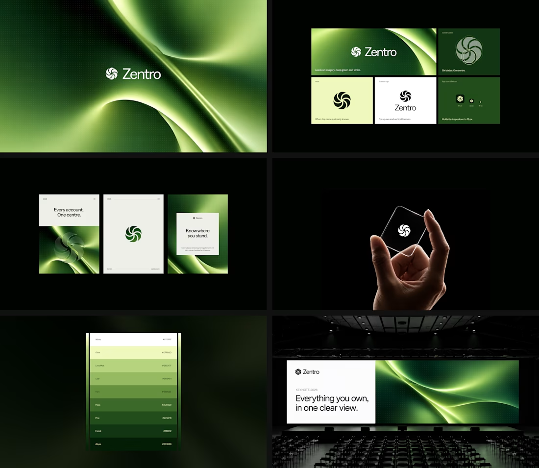

Clean and confident work! The green gradient with the mark feels very modern for fintech - trustworthy but not boring. The app screens look really polished. Curious how you landed on this mark, does it represent growth / movement?