The network for creativity
Join 1.25M professional creatives like you
Connect with clients, get discovered, and run your business 100% commission-free
Creatives on Contra have earned over $150M and we are just getting started
Back to feedPost

Yesterday, I decided to audit my own website, Designify, from the perspective of someone visiting it for the first time.
Not as the designer who built it, but as the user who has no context about how it works.
That immediately exposed several small UX gaps.
One of them was in the pricing flow.
The pricing section sits at the bottom of the page. Once a user reached it, there was no obvious way to get back to the top without manually scrolling through the entire page.
The solution was simple:
→ The “Plan” button takes the user directly to pricing.
→ Once there, it transforms into “Back to top.”
→ Clicking it brings the user straight back to the beginning.
Nothing groundbreaking. Just removing unnecessary friction.
This was a good reminder that good UX isn't always about adding more.
Sometimes, it's about noticing the small moments where you're asking the user to do more work than necessary and eliminating them.


Good work🔥👏👏
Thank you so much! 😃
The network for creativity
Join 1.25M professional creatives like you
Connect with clients, get discovered, and run your business 100% commission-free
Creatives on Contra have earned over $150M and we are just getting started
Trending
retrofuturism
Share your favorite designs from the past exploring the distant future. Or your own take on the aesthetic 🚀
halftone
Dots. Texture. Grain. Let's see your designs using the halftone technique.

Midjourney
Creatives are showing off what they're making with Midjourney.
colorgrade
Video editors sound off: How do you enhance the mood of your video in color grading?
Related posts

While working on a website, I explored two different approaches for the header design. Same brand, same content, just a different feel and interaction style.
Option 1 - Classic
Option 2 - Modern
Would love your honest UX/UI take, which direction feels cleaner, more functional, and better suited for the overall experience, and why?
7 voted
23%
23 voted
77%
30 votes
Closed

Modern gives a really good feeling and make everything is clear

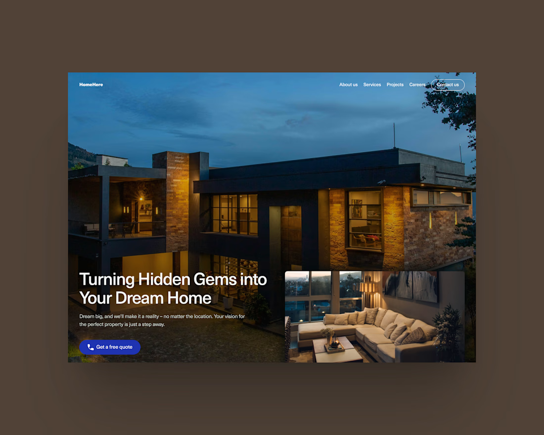

Clean & Creative :)

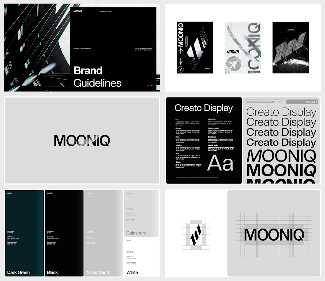
What happens when a digital agency stops looking like every other digital agency?
For MOONIQ, the answer was a visual identity built around exploration, ambition, and limitless growth.
MOONIQ is a digital marketing agency specializing in social media, blockchain, and Web2 consulting. The challenge was to create a brand that could communicate its futuristic vision without sacrificing sophistication, trust, or strategic clarity.
The identity was developed as a complete visual system — from the logo and typography to the color palette and supporting applications — creating a distinctive presence designed to position MOONIQ as a guide for brands reaching new heights.
A bold identity for a brand built to move forward.
Featured twice on Behance — Branding & Stock.
Building a brand that deserves to be remembered? Let’s talk.



Pretty cool! Is this website live ?