The network for creativity
Join 1.25M professional creatives like you
Connect with clients, get discovered, and run your business 100% commission-free
Creatives on Contra have earned over $150M and we are just getting started
Back to feedPost
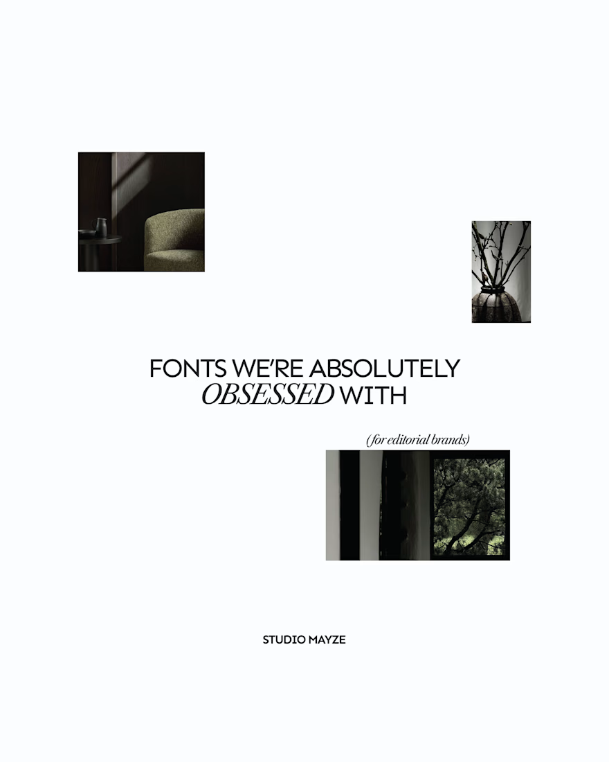
A few editorial typefaces we’re absolutely obsessed with right now.
These are some of the fonts we keep coming back to at Studio Mayze when we want a brand to feel considered, distinctive and a little more editorial without pushing the design too far.
Good type can do a lot of the heavy lifting. The right one can completely change how a brand feels before you’ve even added anything else.
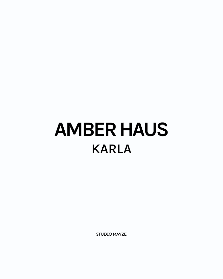
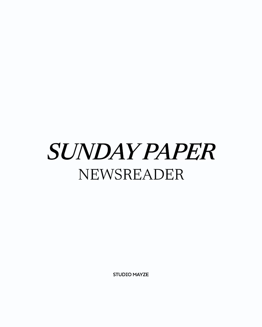
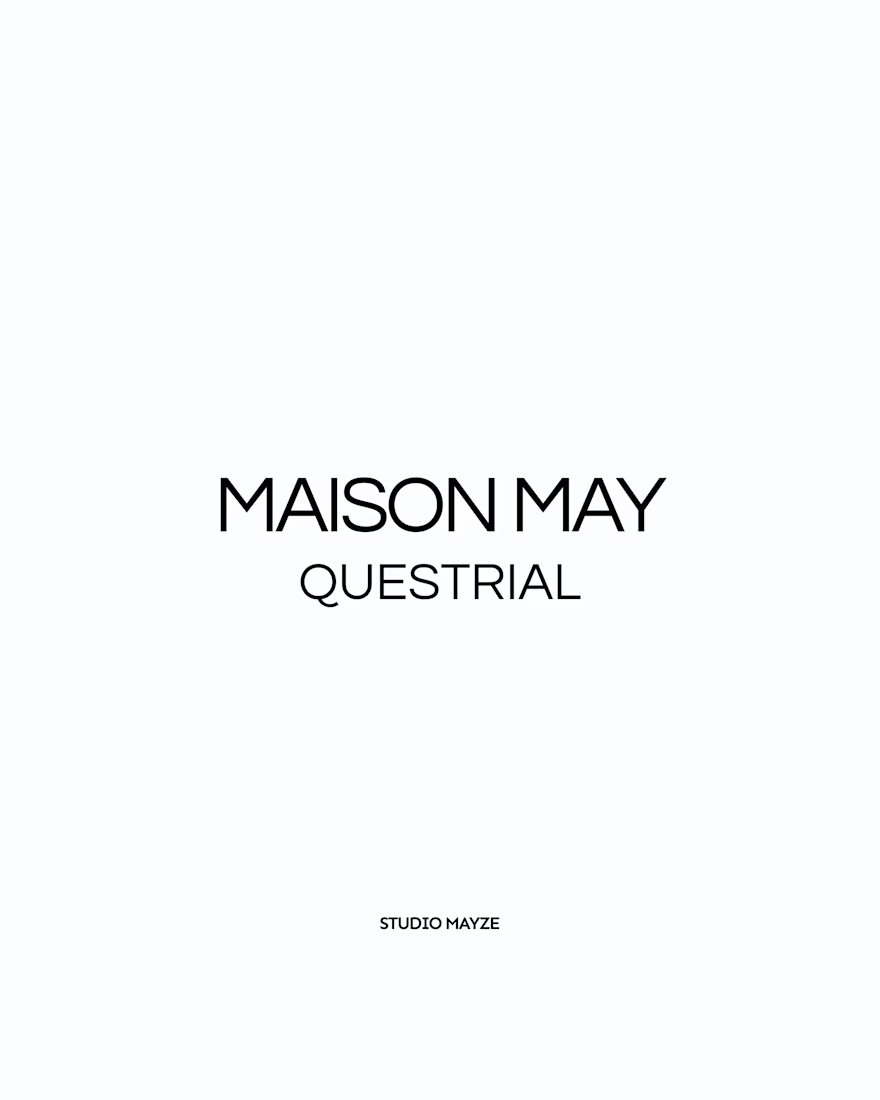
Each slide shows the typeface in use at the top, with the font name underneath, so you can see how it could look in context rather than just as a specimen.
These are three of our favourites at the moment. Want to see the full selection? We’ve shared all of our favourites over on Instagram.
Which one would you pick? 👀



Ye le Jani:
Totally agree - good type does so much heavy lifting! Love your curation here. AMBER HAUS in Karla, SUNDAY PAPER in Newsreader, MAISON MAY in Questrial... all feel so considered and editorial without being overdone. Saving this for my next brand project at Studio Mayze!

Showing each typeface in context rather than as a bare specimen is such a good idea, you can feel the mood before you even read the name. Sunday Paper in Newsreader is my pick, that slanted serif has real character. Do you tend to reach for one of these for the body of a brand, or are they mostly headline voices for you?

Thank you! Newsreader is such a good pick 👀 It really depends on the typeface and the brand, but I tend to use these more expressive editorial fonts for headlines and accent typography. Some work beautifully for body copy too, as long as readability holds up. Otherwise, I like...

Good list. Which of these do you reach for most on client work?


Good typography can completely change a brand’s personality. Always interesting to see how much impact the right font can have.
The network for creativity
Join 1.25M professional creatives like you
Connect with clients, get discovered, and run your business 100% commission-free
Creatives on Contra have earned over $150M and we are just getting started











Related posts

more visuals from iki, a matcha shop i’ve been working on 🍵
the project is getting close to its final stage, and it’s been really interesting to see how the initial concept has gradually turned into a complete brand.
from the strategy to the visual identity, every decision has helped shape a more cohesive and distinctive world for iki.
almost there. excited to share more of the final result soon
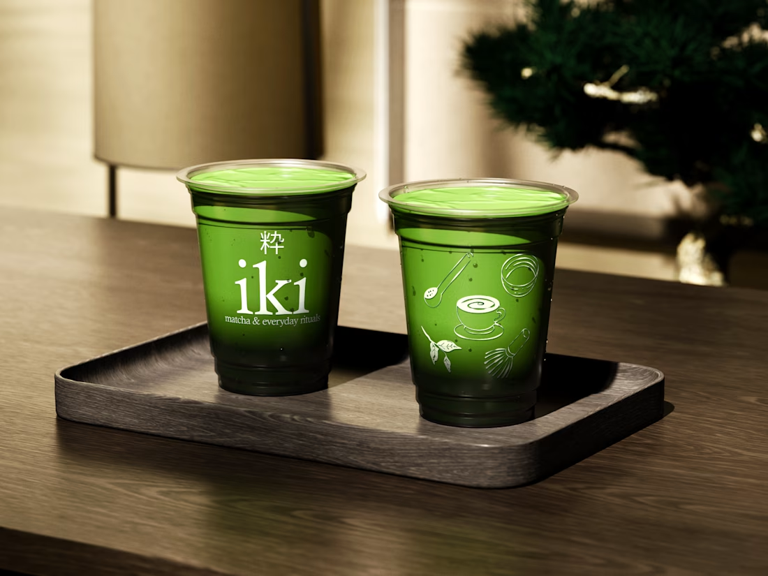
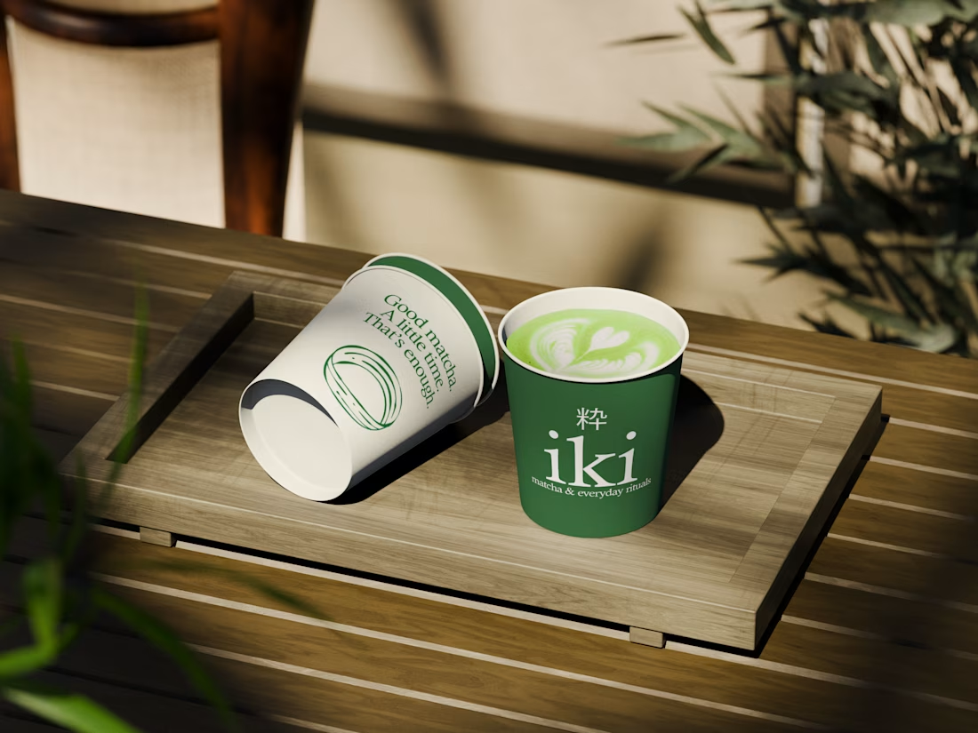
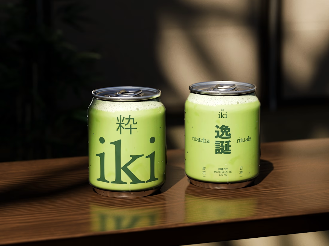
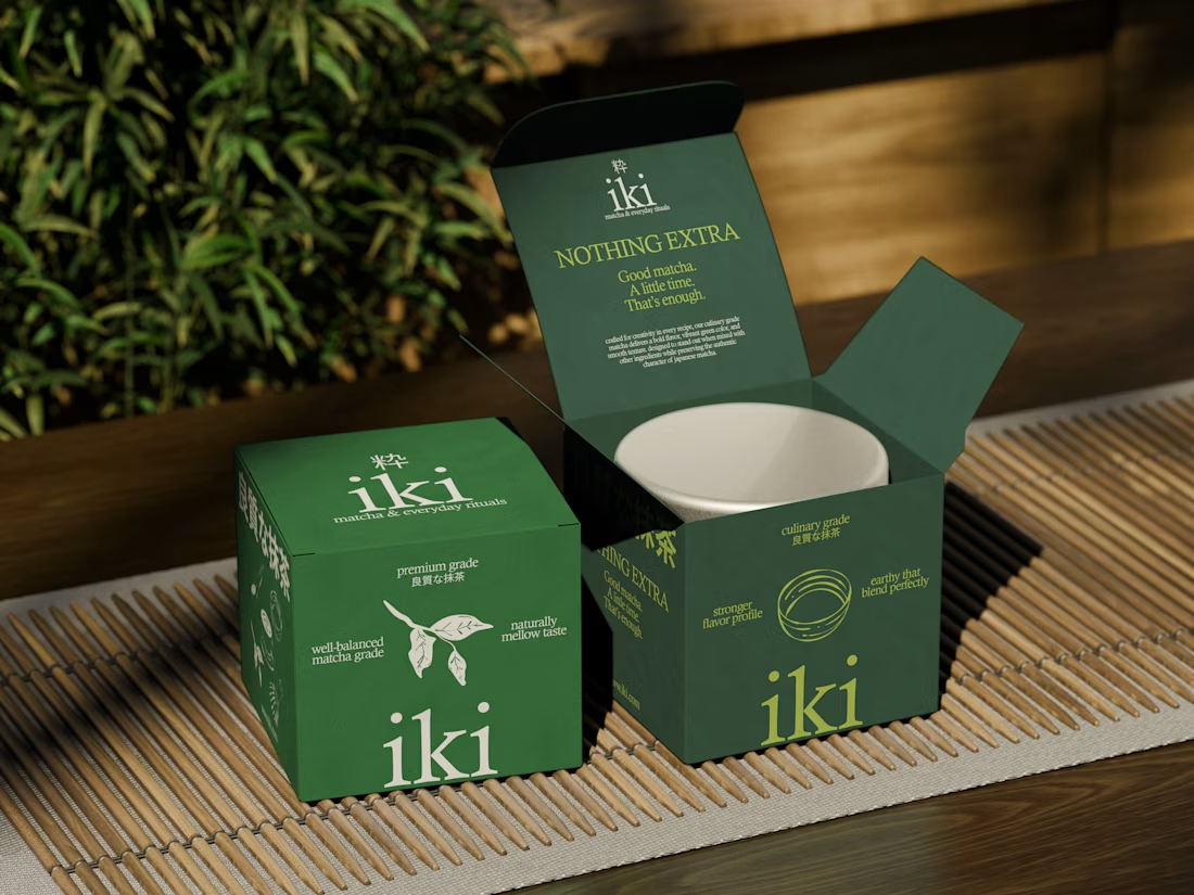

Strong concept and thoughtful execution. The logo feels distinctive and communicates the brand identity clearly.

From the cover to what’s inside 👀
Thank you to everyone who voted in my cover test. This time, I’m trying two short previews of DCS 654: my library of 654 dessert-inspired colors and matching textures, with ready-made palettes for your own design work.
Which video makes you more curious to explore the library: A or B?
And what made you choose that one?
You can take a closer look here: https://dcs.mariya.design/

36 voted
61%
23 voted
39%
59 votes
Closed
I’d pick B. It makes the colors and textures feel more engaging and makes me want to explore the full library.

This is my biggest client success story of my carreer.
It's hard to capture 3+ years of work into a single use case page.
Though I gave it a try (it's never perfect 😉)
Read the use case here and let me know what you think of the work. Thanks!🤙🏻
Distilling three years of multidisciplinary work into one use case page is the real craft here, Tim. Long-term client relationships are the best portfolio proof there is. Congrats on the DeFi brand journey.