The network for creativity
Join 1.25M professional creatives like you
Connect with clients, get discovered, and run your business 100% commission-free
Creatives on Contra have earned over $150M and we are just getting started
Back to feedPost

So true:
Back to craft.
Back to taste.
Back to judgment.
https://www.linkedin.com/posts/jasonshanks_sponsored-designthinking-creativity-activity-7419465368219557888-NDap?utm_source=share&utm_medium=member_desktop&rcm=ACoAAABa4zgBtPgJE6LQR-fIywUYYVhP8ee33h4
The network for creativity
Join 1.25M professional creatives like you
Connect with clients, get discovered, and run your business 100% commission-free
Creatives on Contra have earned over $150M and we are just getting started

Challenges
View all


Related posts

I focus so much on how modern my designs would look like and I forgot that the basic principles are what makes it look the best.
I ain't gonna lie "Claude will kill XXX" never bothered me, until the message I got today.
I am 100% sure that the designs I make are way better than Claude (by now, we will see in future) and I am completely way more understanding to the client desires and their audience BUT...
What I was doing in the last 4 months, was working without creativity, just using my experience to create and finish a task.
And waking up this morning to a message "Hey, let's take a step back on the design and try to simplify it, maybe use Gestalt Principles" was a SLAP on the face.
A message to me and to my fellow designers, having creative blockers: SLOOOOW DOOOOWN.
- We should stop rushing to be faster (we are competing with a machine).
- We should stop scrolling. It kills the creativity.
- We should SLOW down. Watch a sunset. Visit a beautiful building. Look at old photos and get some memories.
I am getting back to basics.

My own portfolio site, designed, coded and deployed by me from scratch.
The goal: A portfolio that works as proof of skill on its own. Instead of just listing projects, the site itself had to show how I think about layout, typography, motion and user flow.
What I did:
Concept & positioning: Built the site around one idea, “Tools change. Taste doesn’t.”, presenting branding, social media, UI/UX and web as one practice held to one standard.
UI design: A bold editorial hero, clean typographic hierarchy, and a scroll-driven layout that moves visitors from introduction to work to contact.
Interaction & motion: Animated skill marquees, hover states on project cards, and a clear five-step process section (Discover, Define, Ideate, Design, Test) that walks clients through how I work.
Content structure: Featured case studies linked to Behance, a dedicated section for live websites I’ve shipped, and direct contact links for low-friction enquiries.
Development & deployment: Hand-coded, fully responsive, and deployed on Netlify.
Result: A fast, live portfolio that showcases my work while proving I can take a website from concept to launch on my own.


Love making the portfolio itself proof of craft!

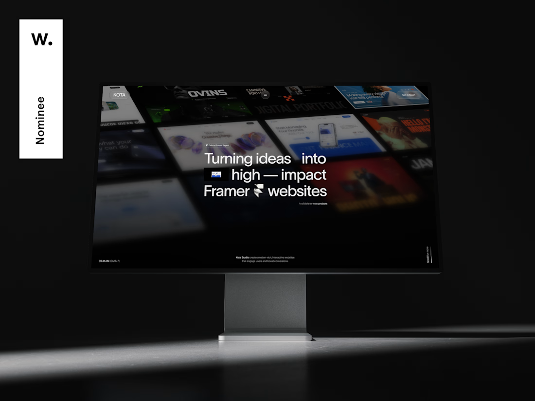
When I redesigned my studio site, I set myself one goal: get it recognized on Awwwards
First step is done — It's nominated 🎉
Public voting is open, and every of your vote mean a lot to me.
If you have 10 seconds, I'd really appreciate yours 👇
Vote here → https://awwwards.com/sites/kota-studio
Thank you, it means a lot ❤️


Done man , Lets connect ✨