The network for creativity
Join 1.25M professional creatives like you
Connect with clients, get discovered, and run your business 100% commission-free
Creatives on Contra have earned over $150M and we are just getting started
Back to feedPost
The Beauty Drink redesign stemmed from the challenge of repositioning the brand within an increasingly competitive category, shifting the perception from a functional supplement to a desirable beauty brand. The design strategy sought to translate the world of self care through a more sophisticated, feminine, and emotional identity, without sacrificing the clarity of technical information.
The new visual language incorporates a vibrant, unique color palette for each product, paired with metallic details that elevate the perception of quality and create a striking presence at the point of sale. Delicate illustrations and organic lines reinforce femininity, lightness, and well being, while the typographic hierarchy intuitively organizes benefits, making the shopping experience faster and more engaging. Replacing plastic packaging with a premium can enhances perceived value, improves product preservation, and differentiates the brand within the category. The visual system was developed to create unity across the entire product line, allowing for easy identification of variants and strengthening brand recognition.
More than just a redesign, the project repositions Beauty Drink as an aspirational brand capable of blending science, beauty, and lifestyle into a contemporary, elegant, and memorable identity. The result is packaging that conveys confidence, sparks desire, and transforms a supplement into a true premium consumer product.


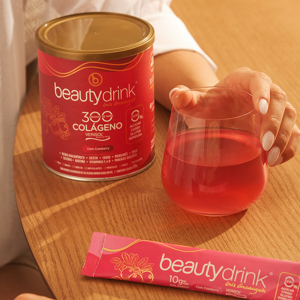
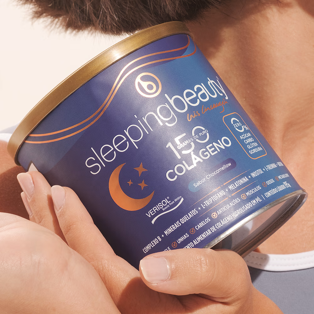
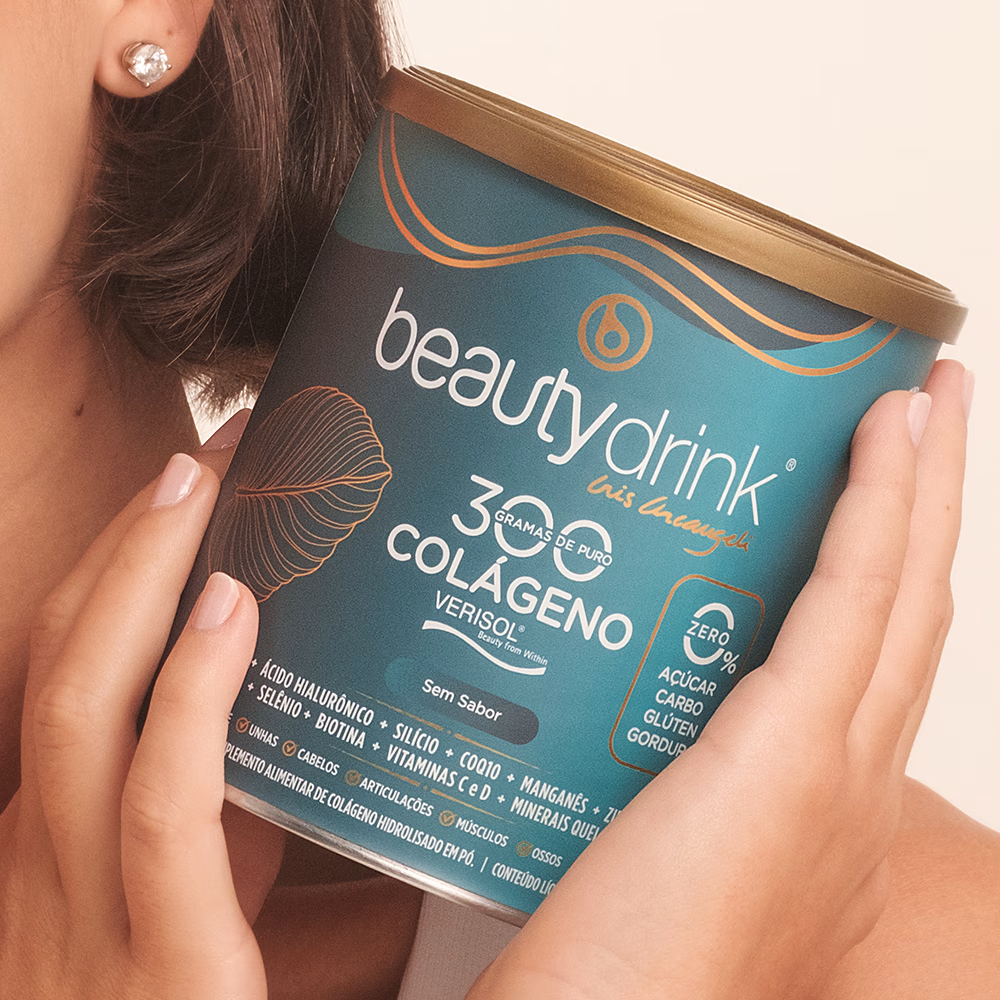
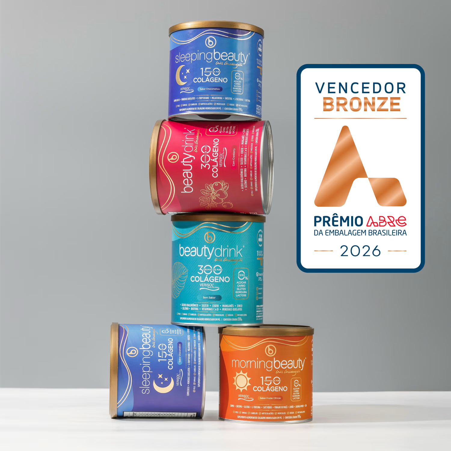

With a different saturated color per flavour, the metallic detail and the type hierarchy are what hold the range together. Did you test how far you could push the colors before the cans stopped reading as one family on the shelf?

Thank you for your question, we initially tested it only with small-scale surveys, but after the product launch, we became certain that it worked very well! And then came recognition with a Bronze award at the 2026 ABRE Awards, in the packaging redesign category.
The network for creativity
Join 1.25M professional creatives like you
Connect with clients, get discovered, and run your business 100% commission-free
Creatives on Contra have earned over $150M and we are just getting started



Related posts

Hey Everyone! I've been a little quiet on here lately, but I'm finally back with lots of amazing branding and packaging design case studies which I was working behind the scenes.
Keep an eye out for lots of verified case studies coming your way. 👀
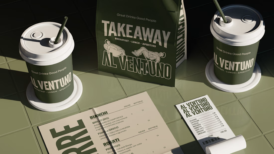
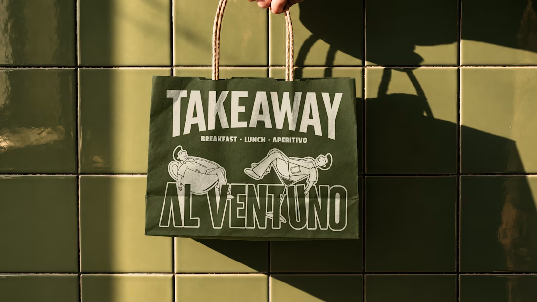
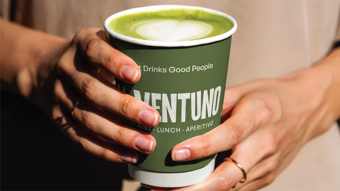
For now, here’s a little peek at some of the work I’ve created lately for a contemporary Italian cafe in Lecce.

Love it! Great work!


The movement flow so naturally, it feels effortless to watch.


The little green dot moving through the grid is so satisfying