The network for creativity
Join 1.25M professional creatives like you
Connect with clients, get discovered, and run your business 100% commission-free
Creatives on Contra have earned over $150M and we are just getting started
Back to feedPost
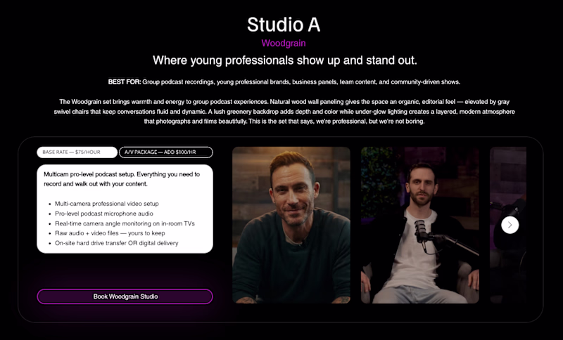
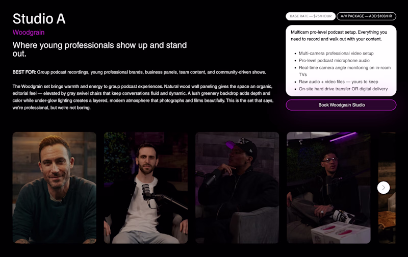
Taste Test


I’m back with another design question for this podcast rental studio site I’m working on. In my last post, I shared two hero section options for the homepage. If you were about to reserve a studio, which booking layout would feel clearer and make you more confident to click “Book Woodgrain Studio” and why?


6 votes
Ends in 1d

The copy is overwhelming tho
The whole layout is crowded
Working on it. Yeah, it feels like a lot.

🔥

Top, left and right it’s easily to read!
The network for creativity
Join 1.25M professional creatives like you
Connect with clients, get discovered, and run your business 100% commission-free
Creatives on Contra have earned over $150M and we are just getting started
Related posts

Use Cases section exploration for an AI translation SaaS doing real-time dubbing for eSports teams 🕹️
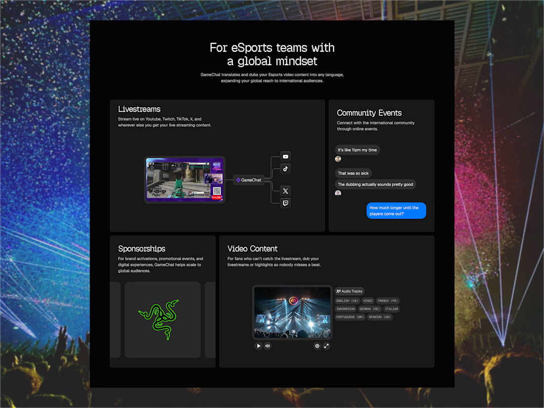

Really interesting direction 👏
Clear use cases like this make complex AI products much easier to understand and sell — especially in something as dynamic as eSports.
Curious how you approached structuring these use cases for different user types?

This is the first version of my new portfolio, created entirely with Claude Code. However, it’s not just any AI-generated portfolio. I've designed a new version that showcases me as a designer while telling small stories through the items in the hero section. It reveals where I’m from, my favourite movie, and my hobbies, all as a way to express my designer personality.
The case studies offer different narratives; I envision sharing my work with a friend over dinner at my house. The biggest challenge with designers' portfolios is the limited time viewers have to see them and get to know me better. Therefore, I aim to create an experience that allows users to play and explore.


WIP (1/3)
I am building a throwing experience for my friend's ceramic studio website.
Before getting into Omma, i am playing around with my idea (like a sketch). The challenge I arrived at is figuring out how users can get a tactile sense that they are close to ruining the pot. Perhaps I should use sensory substitution with sound or cues like subtle shaking of the pot. What do you think?

Oh this is awesome! Could this work with hand tracking too?


Trending


Notion
Notion isn’t just where you work, it’s starting to work for you. What agents are you building?
portfolioreview
The best portfolios tell a story, not just show a grid. Share yours for feedback.
brandguidelines
Brand guidelines are becoming living systems, not static documents. What are you building for your clients?
aivideo
AI video tools are moving at warp speed. Which ones are you experimenting with?
freelancerlife
Freelancer life is wins, pivots, and everything in between. What’s yours right now?