The network for creativity
Join 1.25M professional creatives like you
Connect with clients, get discovered, and run your business 100% commission-free
Creatives on Contra have earned over $150M and we are just getting started
Back to feedPost

#branding

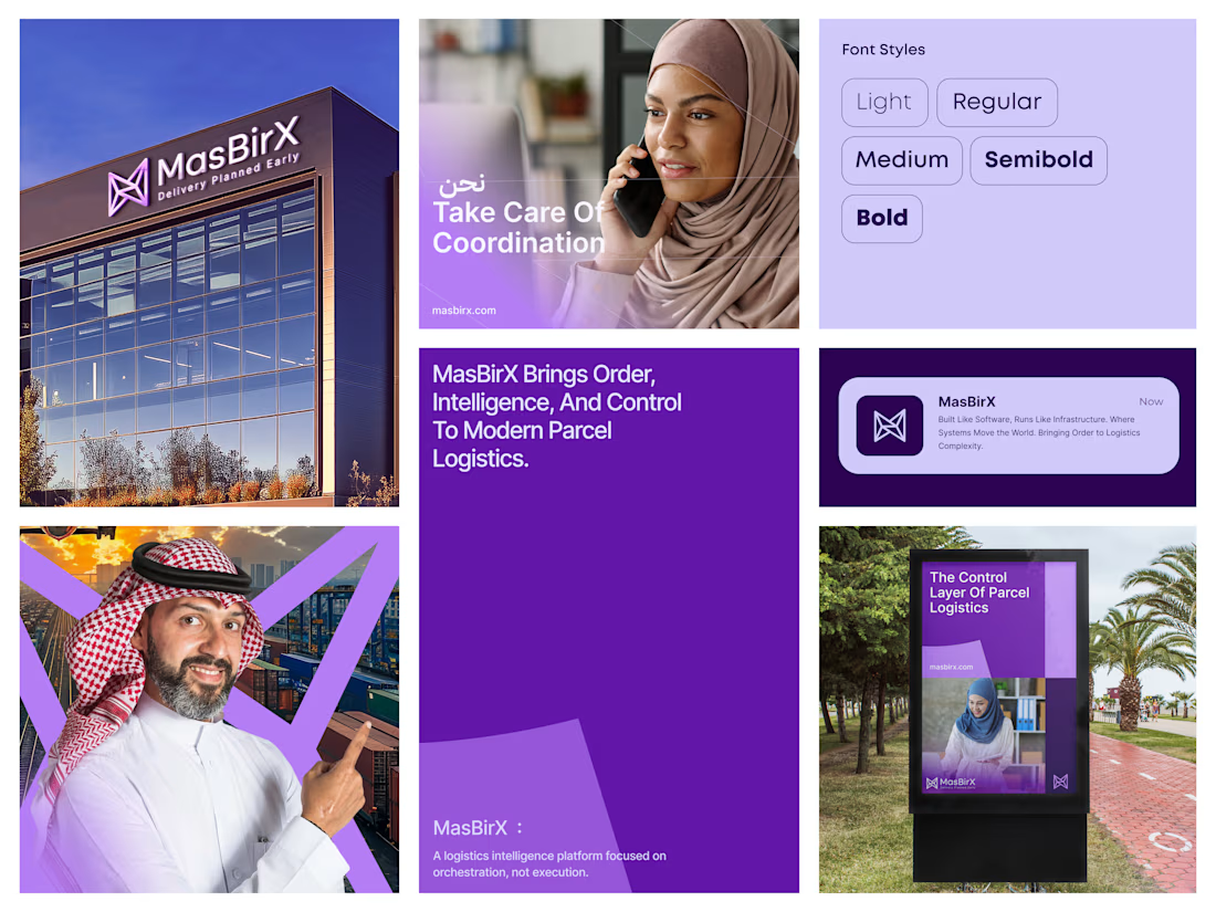
MasBirX , a bold brand identity for modern parcel logistics. ✦
A cohesive visual identity built around coordination, clarity, and control. Distinctive logo design, a purple color palette, and clean typography connect every touchpoint, from digital communication to signage and...
The network for creativity
Join 1.25M professional creatives like you
Connect with clients, get discovered, and run your business 100% commission-free
Creatives on Contra have earned over $150M and we are just getting started
Related posts

A little behind-the-scenes look at a brand identity coming together.
I'm currently working on a new identity for a coworking space in Austin, TX, with a vintage-inspired direction, warm colors, and a logo that brings a bit of nostalgia into a modern setting.

Carrying the vintage idea onto the coasters and the dot pattern gives the identity somewhere to live besides the logo.


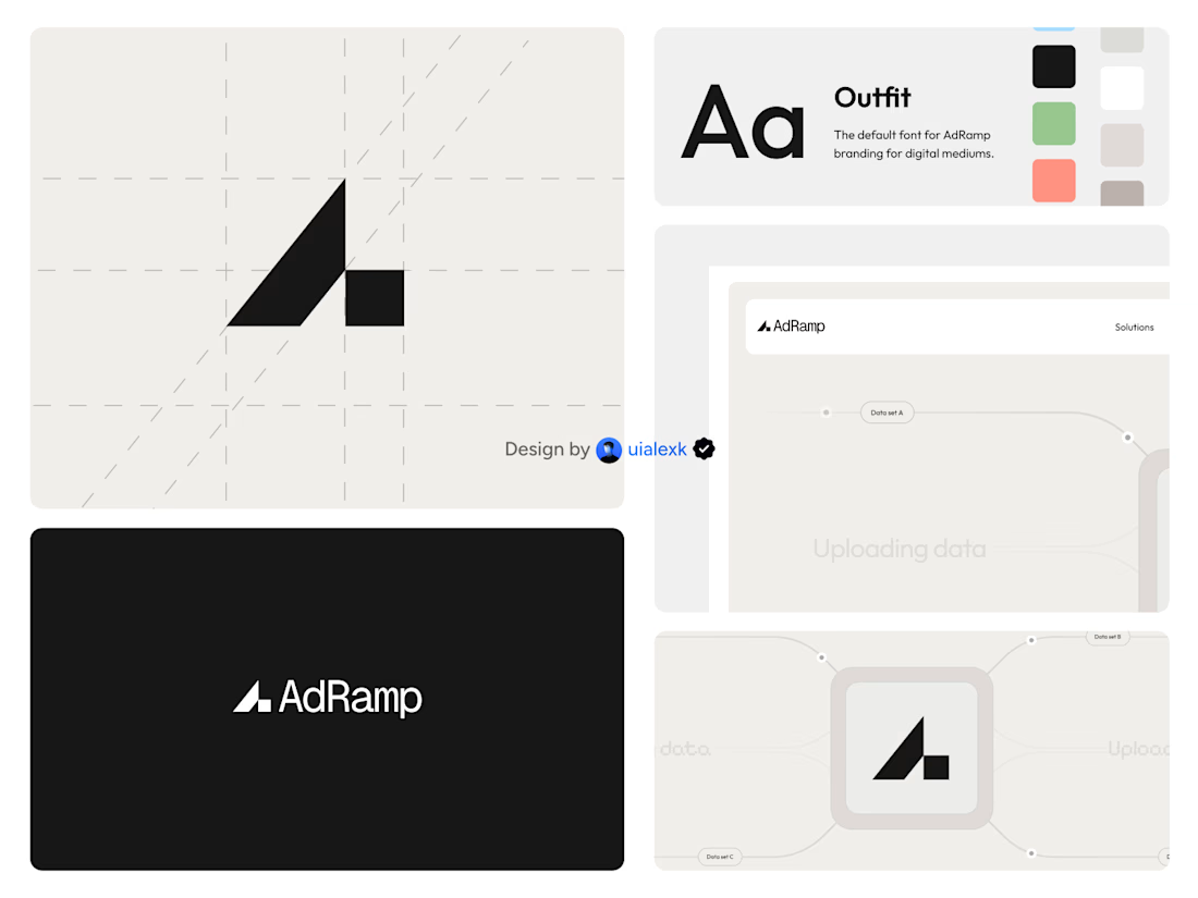

The A mark built on a diagonal grid, with the ramp stepping up on the right, is simple and holds up on the black AdRamp card. My challenge: the palette shows green and salmon swatches next to the black, but every application tile is black, white or grey. If the accent colours...

A little more about the inspiration behind Tindara.
I wanted the identity to have a connection to Tindari, Sicily. The Madonna di Tindari statue was the starting point for the symbol, while Sicilian decorative patterns inspired the graphics around it.
For the colors, I chose mustard yellow, deep green, and burgundy, balanced with cream. I wanted to bring some of that warmth and richness into the packaging, while keeping the different elements comfortable together.
For me, these references are what give the project its character and sense of place.

