The network for creativity
Join 1.25M professional creatives like you
Connect with clients, get discovered, and run your business 100% commission-free
Creatives on Contra have earned over $150M and we are just getting started
Back to feedPost

Portfolio refresh is finally live: rahulg.com.np
What I do: help teams design the software their own employees use — dashboards, admin tools, internal AI features, and the design systems that hold it all together.
Why internal products? Because that's where design has the biggest leverage and the least attention. A 10% workflow improvement across 500 employees compounds fast.
Available for a couple of engagements this quarter. DMs open.

rahulg.com.np
Rahul Gupta | Product Designer
Rahul Gupta — Product Designer focused on design systems, enterprise SaaS, and AI-native UX.
The network for creativity
Join 1.25M professional creatives like you
Connect with clients, get discovered, and run your business 100% commission-free
Creatives on Contra have earned over $150M and we are just getting started



Related posts


Which homepage would make you more likely to explore the platform?
HackStack features bold typography, teal gradients, and a centered layout focused on AI tools and automation. DataVistaHQ uses purple accents, a split layout, and a prominent dashboard preview to introduce its business intelligence platform.
I would like your perspective on the visual design, clarity, and first impression. Which approach communicates its value more effectively and makes you want to take the next step?
Vote for your preferred design and share what influenced your choice: the colors, headline, layout, dashboard preview, or overall presentation.
#WebDesign #AIWebsites #UIUXDesign #SaaSDesign #TransformedDesign


2 voted
17%

10 voted
83%

12 votes
Closed

Visually, I lean toward DataVistaHQ, but the cognitive load is really high. The value proposition and the stats feel like they're competing for attention.
On the other hand, HackStack has a much better visual hierarchy. The value proposition and CTA group immediately give me a...

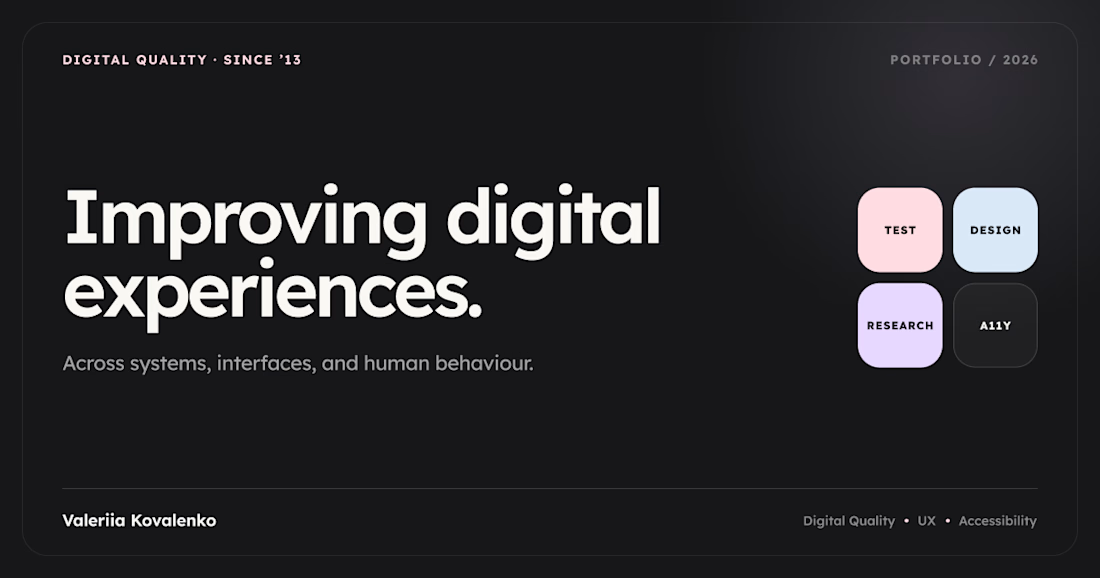
I’ve been working on different projects for a while, but only recently felt ready to bring them together in a portfolio. I decided to combine Codex and Framer to see what I could build.
Somewhere along the way, I realised the design was probably more influenced by the Promova app than I’d initially noticed.
I wanted to keep the layout simple and avoid cramming too much into it. I’ve also been getting more into accessibility and preparing for the CPACC certification, so I’ve been paying closer attention to typography and readability. I went with Lexend for the site.
So here’s my little portfolio — a collection of UX research and design projects, finally brought together.



Congrats on bringing it all together!

I shouldn't have been able to make this from my desk. 👁️🗨️
Game is entirely rewritten. How are you leveraging next-gen tools in your freelance stack?


Cinematic!