The network for creativity
Join 1.25M professional creatives like you
Connect with clients, get discovered, and run your business 100% commission-free
Creatives on Contra have earned over $150M and we are just getting started
Back to feedPost

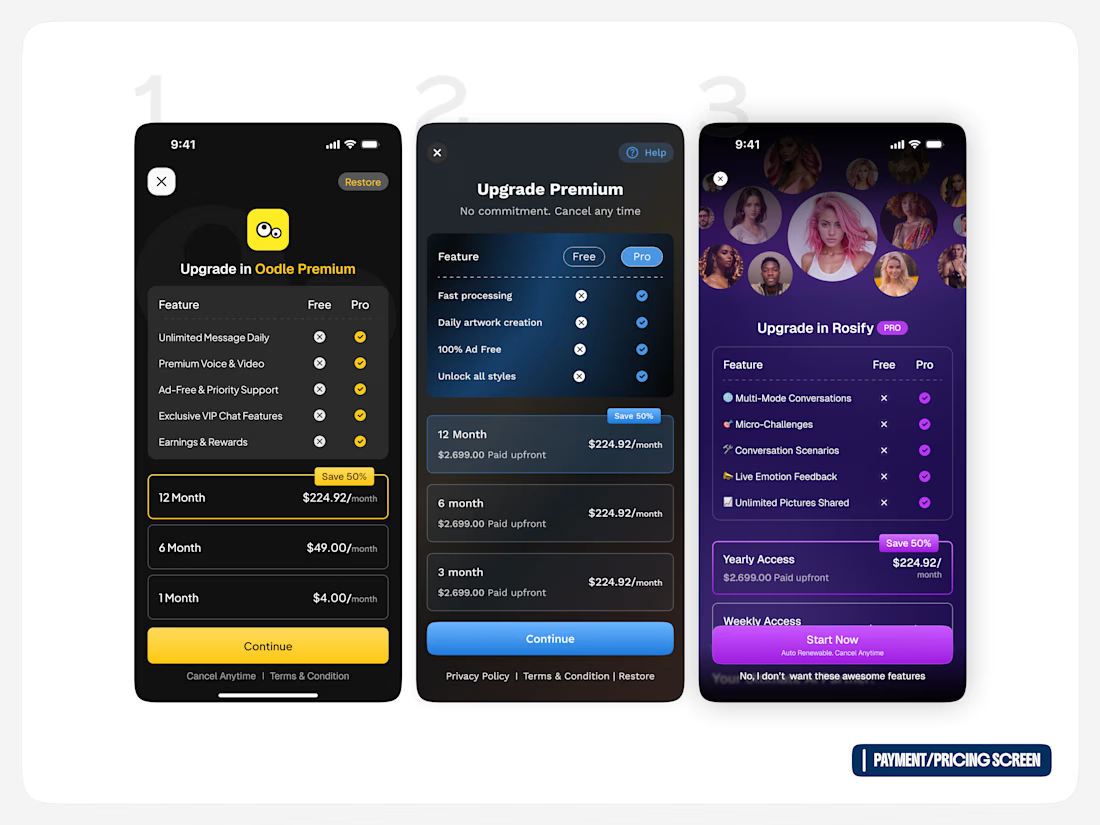
3 pricing screens. 1 goal: make upgrading feel simple. 💳
Exploring different pricing directions for a mobile app — balancing plan comparison, pricing hierarchy, feature visibility, and clear CTAs.
The challenge was to show enough information to help users make a decision without making the screen feel overwhelming.
I explored different approaches for:
→ Free vs Pro comparison
→ Monthly & yearly plans
→ Highlighting the best-value option
→ Clear upgrade messaging
→ Strong, focused CTAs
Which direction would you choose? 👀
1, 2, or 3 — drop your pick 👇
#UIDesign #ProductDesign #PricingUX #MobileDesign

The network for creativity
Join 1.25M professional creatives like you
Connect with clients, get discovered, and run your business 100% commission-free
Creatives on Contra have earned over $150M and we are just getting started





Related posts

I’ve always liked products that solve a very specific problem instead of trying to do everything.
So for the Lovable Challenge, I picked a simple question that event-tent rental businesses hear all the time:
“Can I book a tent for my wedding?”
The problem is… a tent can’t really be booked until you know if the whole event will work.
How many guests?
How much usable space?
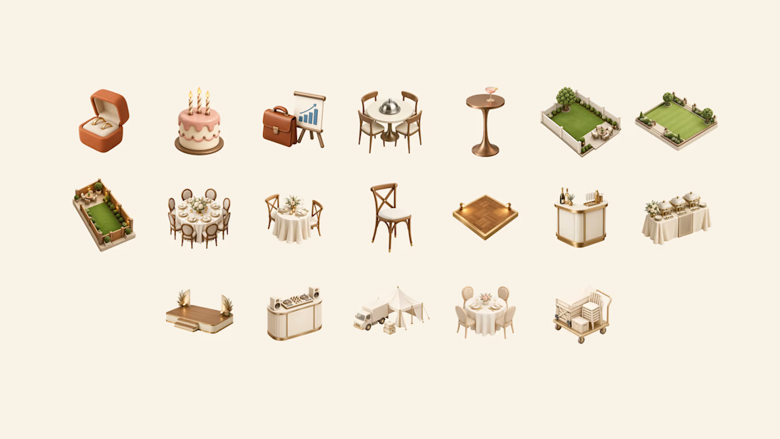
Tables? Dance floor? Bar? Stage?
Will the layout actually fit?
Can the crew set it up and pick it up on time?
Usually, the owner has to figure all of that out manually through messages, calls and calendar checking.
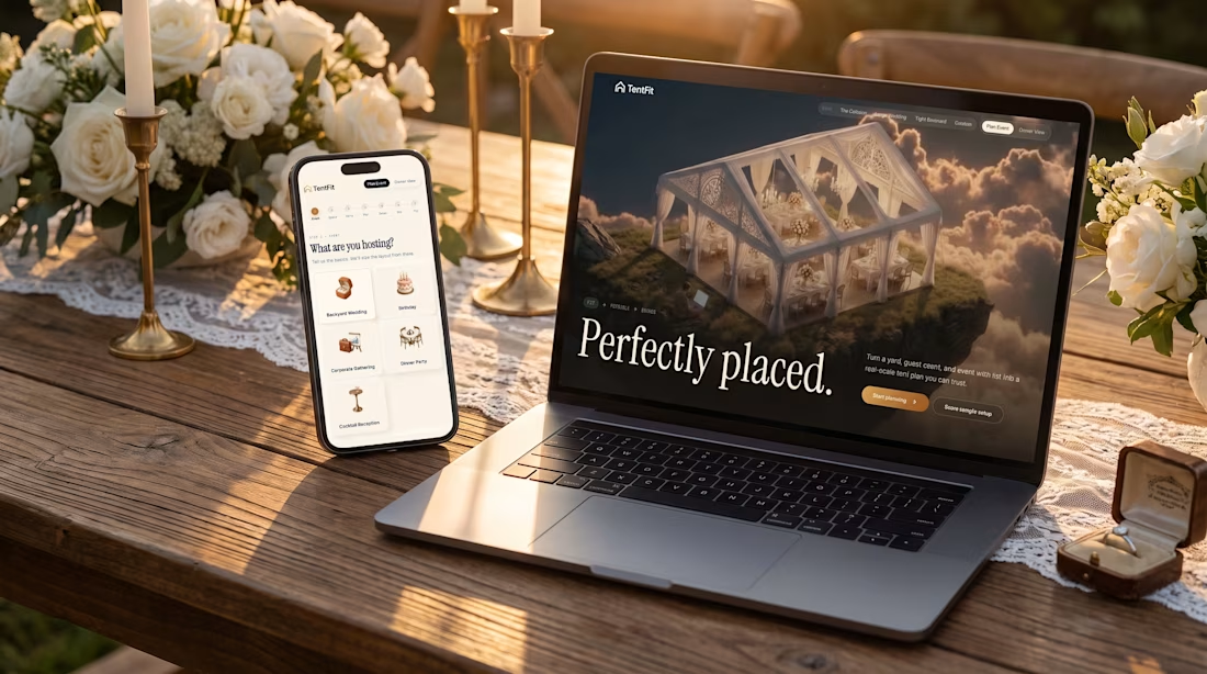
So I built TentFit — a spatial booking experience for event tent rentals.
The customer starts by planning the event, then maps out the space and everything they want inside it. TentFit checks the layout and highlights conflicts.
And instead of just saying “doesn’t fit,” it helps solve the problem:
Switch the tent. Move the layout. Remove an element.
Once everything works, TentFit checks the logistics and turns the final setup into a booking.
The goal was simple:
Make the customer’s decision easier, and make the owner’s job easier.
The flow is basically:
FIT → FEASIBLE → BOOKED
I had a lot of fun building the spatial planning part of this one.
X/Twitter post: https://x.com/brjanov/status/2105630218492731501?s=20
Built with @Lovable
#LovableChallenge #ProductDesign #UXDesign #NoCode #SaaS #WebDesign



Nice stuff!


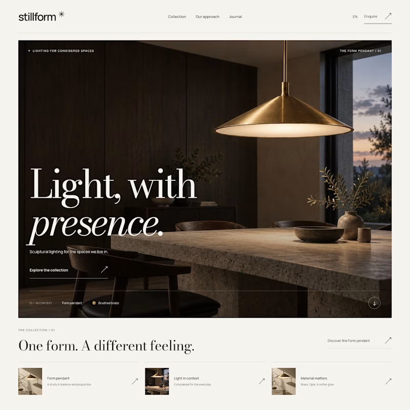
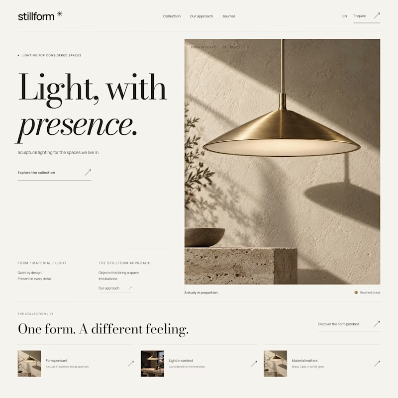

Atmospheric, and it was the photography that decided it. A lamp is a product you buy for what it does to a room, so seeing the warm glow pooling across a dark surface sells the feeling before the layout even registers. Sculptural is gorgeous but shows the object, Atmospheric shows the outcome.


Well done !