The network for creativity
Join 1.25M professional creatives like you
Connect with clients, get discovered, and run your business 100% commission-free
Creatives on Contra have earned over $150M and we are just getting started
Back to feedPost
The easiest UI colour guide you will ever need
Great interfaces do not rely on many colours. They rely on clear roles.
Primary colour is for key actions like buttons and links. It should stand out and stay consistent.
Neutral colors handle backgrounds, surfaces, borders, and text. A strong neutral scale creates structure and readability.
Feedback colors cover success, warning, and error states. They guide users and should never be confused with primary actions.
Accent colour is used sparingly to highlight important details. Too many accents create noise.
When each colour has a job, your UI feels cleaner, more consistent, and easier to use.
The network for creativity
Join 1.25M professional creatives like you
Connect with clients, get discovered, and run your business 100% commission-free
Creatives on Contra have earned over $150M and we are just getting started
Related posts
WE INTERVIEW AND INTRODUCE OUR PRODUCT TO REAL LOCAL BARBERSHOP BUSINESS.
Yes! you read it right. We are confident with the product and show it to public.
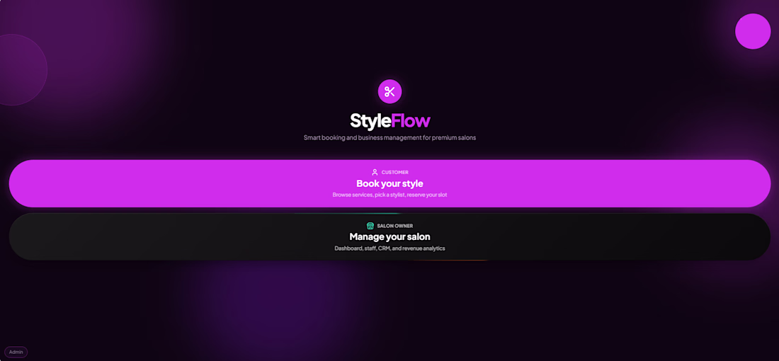
Introducing - "StyleFlow" powered with Ai and built in @Base44
I made an website where it will help the Hair salon/Barbershop for fast bookings or Drop in with also help of Ai.
🚀 PROBLEM:
The problem i see there are no Rewards for loyal customers, Ai integration and in Drop-In customer have no idea how many are in queue.
🧠 IDEA:
Keep the app simple and focused on what matters: Smooth for booking, Drop-ins, and showcasing the barbershop's services.
When i go to barbershop i usually google what hairstyle i want so now in Styleflow you can do it before and the staffs will see details about the bookings/Drop-in (Upload images about the haircut)
For DROP-IN customers, StyleFlow displays the current queue and provides real-time updates, so they know how many people are ahead of them and when it's their turn. Customer can do book DROP IN even they are at home/anywhere.
━━━━━━━━━━━━━━━━━━━━
😊 Automation:
Reservations/Booking
Email notifications
Customer and owner support
Daily report
Find hairstyles
Check bookings
Ai business insights
Customers receive email confirmations and appointment reminders. Drop-in customers are also notified when their turn is approaching.
━━━━━━━━━━━━━━━━━━━━
🎉 STYFLOW FEATURES:
Email reminder
Fast booking
Drop in & Booking
Loyalty program with rewards
Image input
Ai booking
Ai hairstyle helper
Ai support
Ai owner support
Announcement
Tip/Bonus points
Revenue tracker
Staff settings
Salon owner settings
Waitlist
Google map
Dark and light mode
Customer history
Owner/staff Dashboard & settings
━━━━━━━━━━━━━━━━━━━━
🙌 BEFORE:
it was just a simple app/website where customer would Book Appointments, simple Ui design, show the Salon services and a bit help with Ai.
💯 AFTER:
Improve the Ui & UX design
Faster booking.
Add DROP IN feature.
More Automations and Ai.
Announcement banner.
Loyalty program.
Google map
Adjusted staff services
Settings
Improve the buttons
Add a bit color in background
VERSION:
Mobile and Desktop.
Live :https://styleflow-hub.base44.app/
Video below: Walkthrough, Before & after, Interview
Hello folks, lately, I've been receiving some interesting job opportunities that are actually related to my profession. Unfortunately, I don't have the time to take them on right now, so instead of letting them go to waste, I'll be sharing them here. Hopefully, someone else can land a great project and make some money from it. 🚀
I love this. It's generous of you to share opportunities with the community instead of letting them go to waste. Really appreciate you for doing this
Yay! getting ready to share more about Brainrot, putting together the case study soon! Done as usual with the legend @Mary Delaney
Great execution. It feels very intentional.
Trending
Claude
Claude has entered the design space. How are you using Claude Design?
Contra University
Learn from expert creatives how to earn more using next-gen AI tools.
fifaworldcup2026
The World Cup is here and the whole world's watching. How are you designing for the world stage?
creativeaiflow
Creative AI workflows are evolving. What tools do you use, and what are their strengths and weaknesses?
freelancerlife
Freelancer life is wins, pivots, and everything in between. What’s yours right now?