The network for creativity
Join 1.25M professional creatives like you
Connect with clients, get discovered, and run your business 100% commission-free
Creatives on Contra have earned over $150M and we are just getting started
Back to feedPost

CIRCUS SKULL
visuals by reon labs x Studio Harv


The network for creativity
Join 1.25M professional creatives like you
Connect with clients, get discovered, and run your business 100% commission-free
Creatives on Contra have earned over $150M and we are just getting started




Related posts

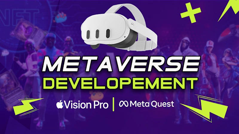
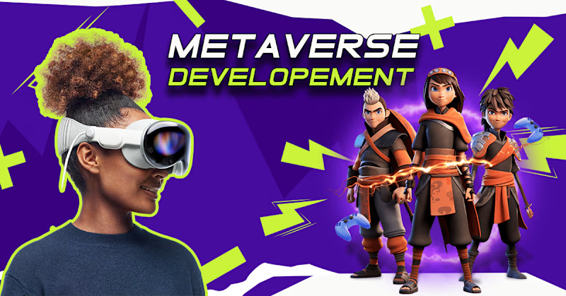
Fiverr Thumbnail Design — Visual Direction Exploration
Overview
Designed two visual directions for a Fiverr thumbnail, exploring different approaches to composition, typography, imagery, and visual hierarchy.
Direction 01: Centered Impact: A bold, center-focused layout that places the main message at the visual focal point for immediate readability and impact.
Direction 02: Dynamic Balance: A more dynamic composition using side-positioned typography with supporting imagery to create visual movement and stronger balance.
Both variations were created from the same core concept to explore how different layouts can influence attention, readability, and overall engagement.


3 voted
75%
1 voted
25%
4 votes
Closed

centered for me

LUMÉRA Face Moisturizer - From product photo to a scroll-stopping AI UGC ad.

A polished transformation from product photo to UGC ad.

Made this a year ago. Tried to show the 4 Pillars of media through simple visuals and crazy motion. Proud of how the timing and mood landed.
Would love your honest feedback - what worked, what felt off?🙌

The timing and mood land well; the simple visual language holds it together.