The network for creativity
Join 1.25M professional creatives like you
Connect with clients, get discovered, and run your business 100% commission-free
Creatives on Contra have earned over $150M and we are just getting started
Back to feedPost

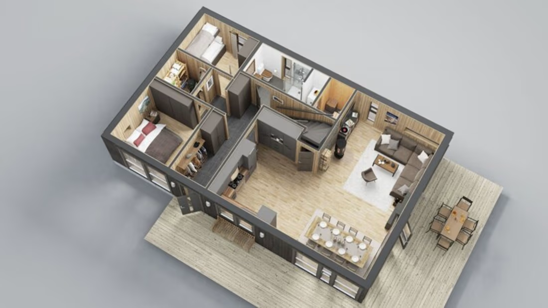
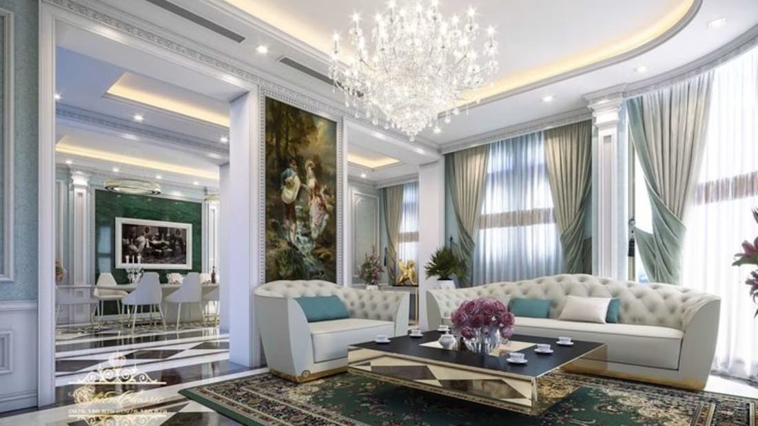
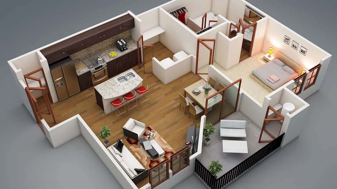
This project involved creating a detailed 3D model of an architectural space, focusing on accurate dimensions, furniture placement, materials, lighting, and overall design. The goal was to create a realistic visual representation that clearly communicates how the finished space would look and feel.


The network for creativity
Join 1.25M professional creatives like you
Connect with clients, get discovered, and run your business 100% commission-free
Creatives on Contra have earned over $150M and we are just getting started











Related posts

New case study is live.
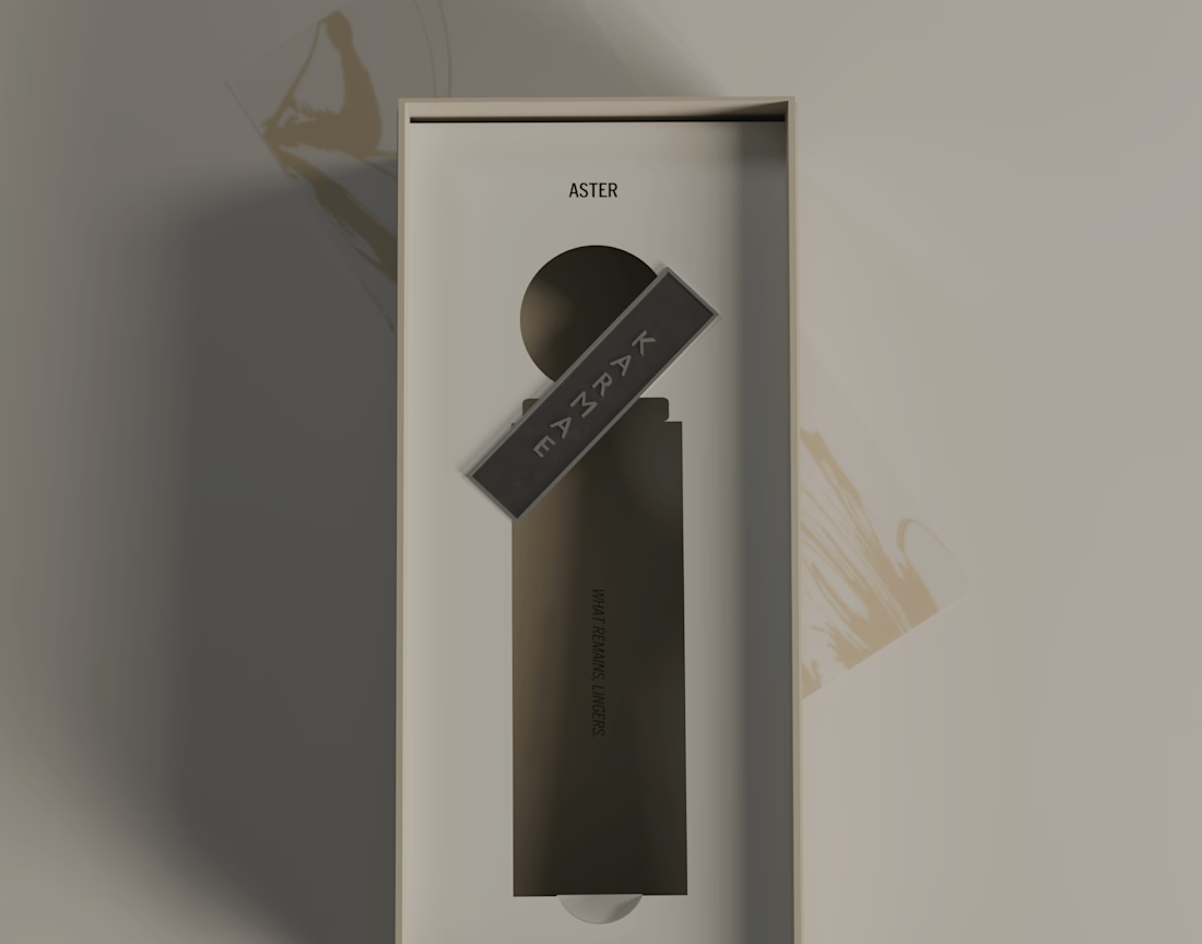
KARMAE is a contemporary fragrance house exploring the relationship between scientific precision and sensory experience. ASTER was developed as the softer side of the brand, combining a restrained visual identity with tactile materials, frosted glass, muted metallics and considered packaging details.
The goal was to create a cohesive brand experience where the identity, product and packaging feel like natural extensions of one another. Alongside the branding and packaging, I also developed the product visuals and final 3D renders in Blender.
A more in-depth look at the concept, design decisions and final applications can be found in the full case study.
Long story short, I really enjoyed bringing this one to life, especially exploring how material contrasts and subtle details could give ASTER its own character while keeping it connected to the wider KARMAE brand.


Beautiful presentation!! and love the product packaging!

This case study was featured on Behance last year.
We’d love to hear your thoughts on the design!


Ye le Jani:
Congrats on the Behance feature Abron Studio! This finance case looks fire - "Simplify Finance Amplify" + "Peace of Mind Security" messaging with that deep green palette is so premium. Love the layered card animation showcase and the lifestyle-tailored cards section. Well deserved feature!

Interactive smart house design
Explore the house in an interactive 3D animation where you can move individual rooms and floors to discover the layout and structure of the home. Easily separate levels, rearrange spaces, and view how each part fits together, giving you a clear understanding of the house’s design and architecture.