The network for creativity
Join 1.25M professional creatives like you
Connect with clients, get discovered, and run your business 100% commission-free
Creatives on Contra have earned over $150M and we are just getting started
Back to feedPost

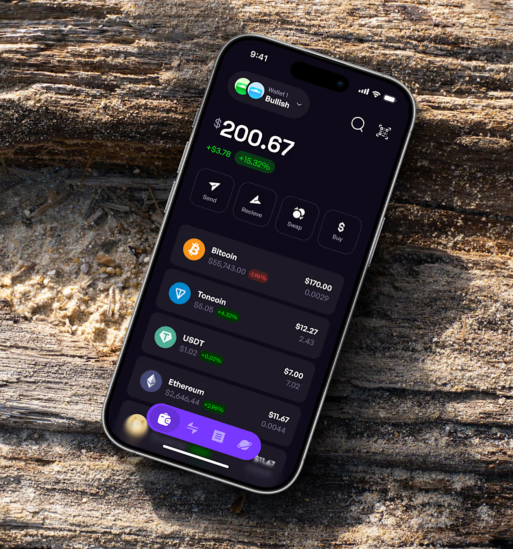
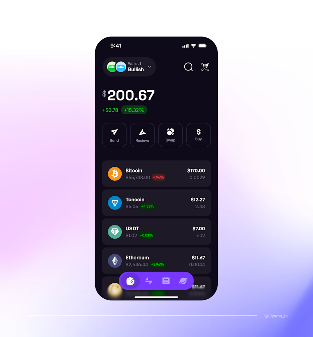
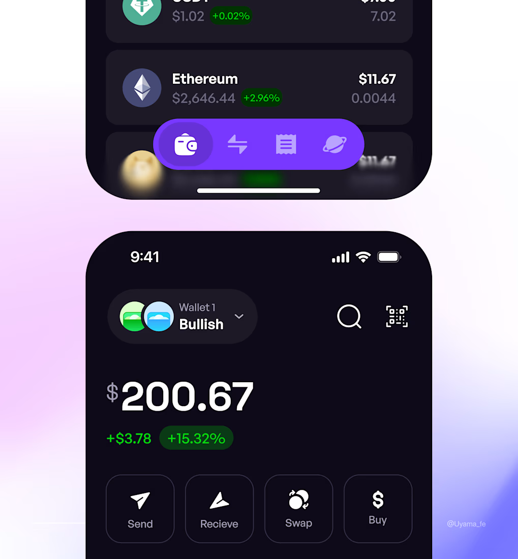
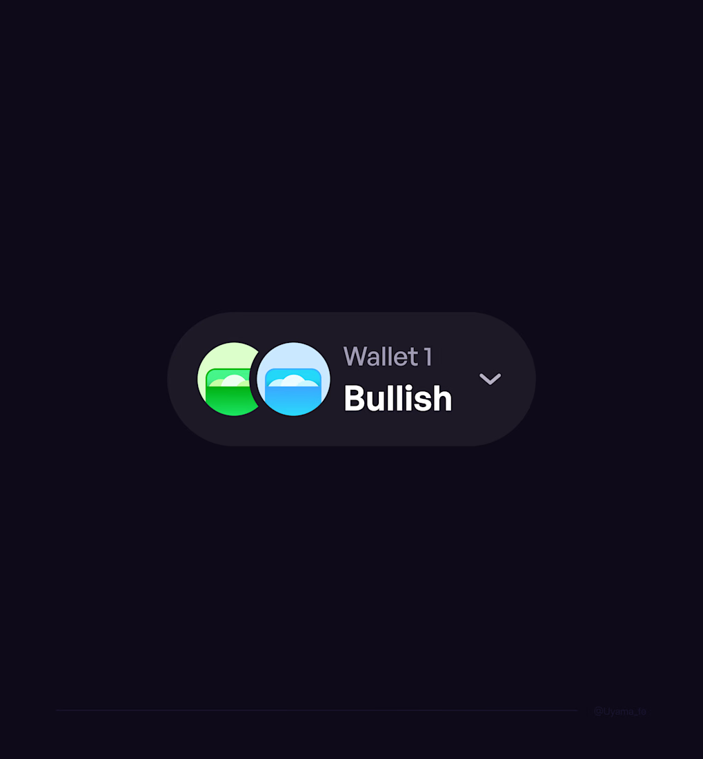
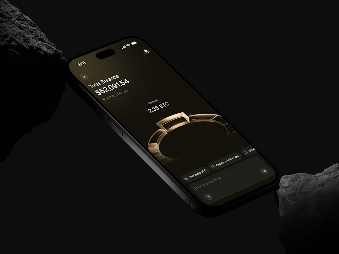
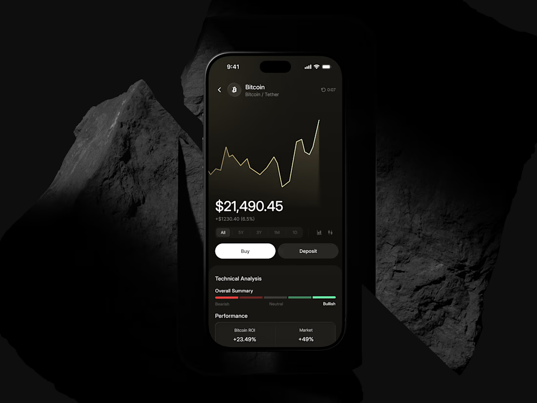
Crypto wallet interface from an ongoing exploration.
What do you think?
The network for creativity
Join 1.25M professional creatives like you
Connect with clients, get discovered, and run your business 100% commission-free
Creatives on Contra have earned over $150M and we are just getting started

Related posts

An AI agent that can move money is only useful if it can't move it on its own.
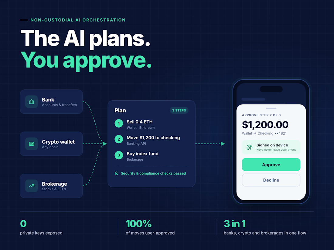
Haia lets people manage their banks, crypto wallets and brokerages from one place, just by saying what they want done.
I built the AI orchestration layer. The interesting design choice wasn't the model. It was deciding where the model is not allowed to act.
→ The agent turns a request into a step by step plan
→ Each step is routed to the right banking API, wallet, chain or brokerage
→ Security and compliance checks run before anything executes
→ The user approves every move, and transactions are signed on their own device It's fully non-custodial.
Zero private keys ever exposed, to us or to the model.
If you're building agents that touch money, health records or anything you can't undo, design the approval step first. Then the AI.


This design got rejected.
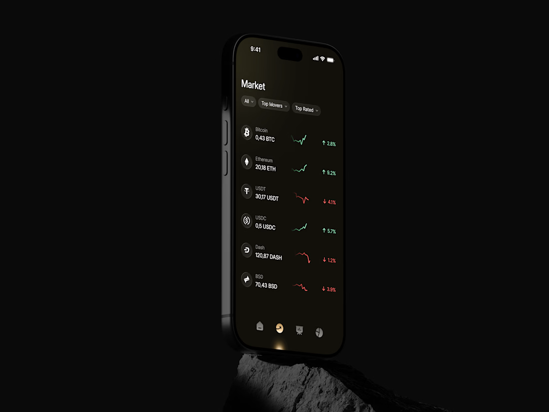
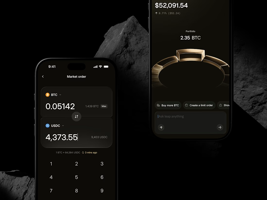
It was a dark, dramatic crypto app built around a 3D gold ring that grew with your portfolio. I was really proud of it.
I told him this would make Leap stand out from every other trading app.
He said:
"I don't want to stand out. I want people to find what they need and get it done."
Honestly, I was a bit annoyed at first. Then it hit me, and he was right.
Nobody opens a finance app to admire it. They want to check their balance, make a trade and get out.
We went with something much simpler and cleaner.
Design isn't about standing out. It's about making things work.

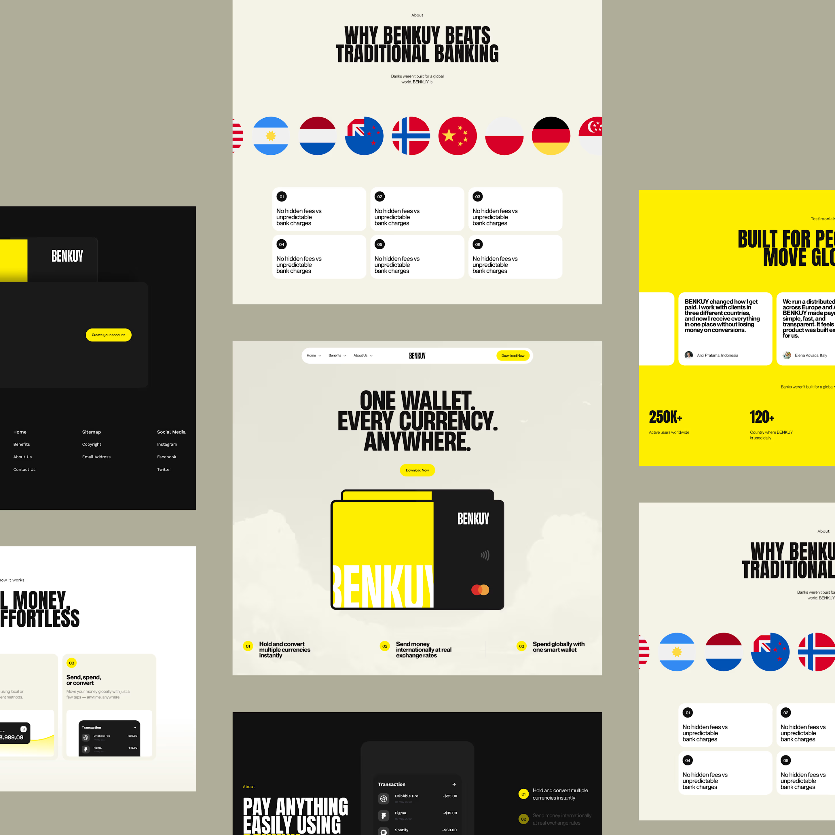
BENKUY - Finance Landing
International payments effortless by bringing multiple currencies together in a single wallet. The sleek interface uses structured layouts, bold typography, and vivid accents to deliver a smooth, modern, and intuitive experience.
Want to create something like this?
Let's Talk!