The network for creativity
Join 1.25M professional creatives like you
Connect with clients, get discovered, and run your business 100% commission-free
Creatives on Contra have earned over $150M and we are just getting started
Back to feedPost
Most people think design starts with colors and ends with pixels.
I see it differently.
For me, design starts with questions.
Why do users leave?
Why doesn’t the product convert?
Why does a feature make sense for the business but feel confusing to customers?
I’m Viktoriia, a UI/UX designer based in Denmark 🇩🇰 and originally from Ukraine 🇺🇦.
Over the years I’ve designed websites, mobile applications, and digital products across multiple industries, helping businesses transform complex ideas into clear and intuitive user experiences.
What I enjoy most is finding clarity inside complexity. Sometimes that means redesigning a user flow. Sometimes it means creating a design system. Sometimes it means helping a business understand what problem they’re actually trying to solve.
Lately I’ve also been exploring how AI can improve the design process—not to replace creativity, but to spend less time on repetitive work and more time on thinking, strategy, and user experience.
I’m joining Contra to meet founders, builders, and creative people who care about creating products that genuinely help people.
If you’re building something ambitious, I’d love to hear about it. 🚀


Hi Viktoriia! 😊 I love your perspective that design starts with questions, not pixels. And the visual you chose for this post immediately caught my attention — such a vibrant and memorable introduction.
Wishing you lots of exciting opportunities and meaningful connections on Contra! 🚀

Thank you, I really appreciate that! 😊

Welcome on Contra! 😍

Welcome-come- come on Contra. Super post

вітаю🙌 😊


Nice to have you here, Viktoriia, welcome! 🎉
Awesome insights. I love the way you approach the design not only in terms of visuals, but think from the business angle too.

hi and let's stay in touch!

Such an incredible cover!😍
Welcome on Contra!

Hello here 🔥

This really resonates. Especially the part about using AI to spend less time on repetitive tasks and more time on thinking things through. Feels like that's where the fun part of design starts 😊

A powerful insight into the design philosophy.

Finding clarity inside complexity that's such a great way to describe UX ✨Wishing you lots of meaningful connections here on Contra😍

Welcome to Contra 🚀


Welcome, Viktoriia! 👋

Your approach to design really resonates with me🙌
The network for creativity
Join 1.25M professional creatives like you
Connect with clients, get discovered, and run your business 100% commission-free
Creatives on Contra have earned over $150M and we are just getting started








Related posts


The app looks amazing, but do you think the number font might be a bit hard for people to read quickly when checking their money?

Should I go for left or right? Focusing on updating and finishing up my portfolio... and then I came across this crossroads. Another alternative is to make them switchable themes through a toggle, but I still need to decide which should be the default.
27 voted
75%
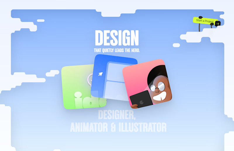
9 voted
25%
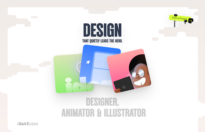
36 votes
Closed

Left is better because the text is readable, the overall blue background is not flashing to the eyes as compared to the right one.
For the top right button " Start a project ", you can add some animation so that it stands out and encourage users to click on it.

I recently built Starplayer, a music player for Windows, Linux, and Mac. Basically it lets you save a playlist and rate your own music, so you can play it when you are in the mood, not just in shuffle mode like the majority of the music players. And all of that with a very pretty UI.
I create a lot of skins for the app, but I want the default design to be the best one. I like the glass effect a lot, so I create two versions of this but with different colors. Which one do you think is better?
5 voted
45%
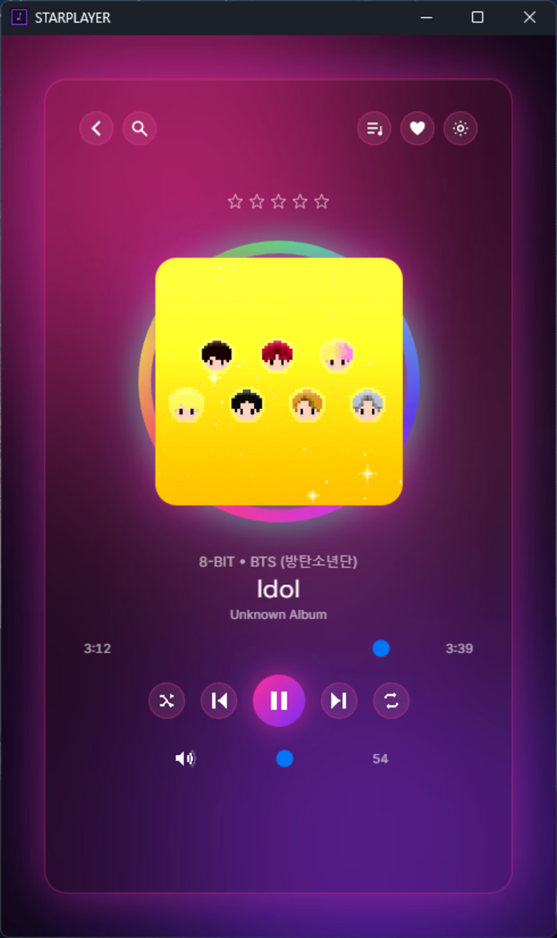
6 voted
55%
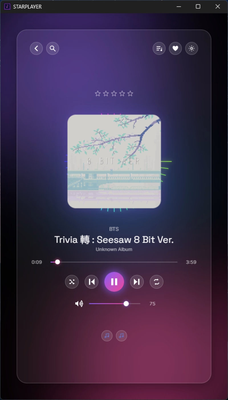
11 votes
Closed

V1 is more attractive it feels alive great job 🎉🎉🔥🔥