The network for creativity
Join 1.25M professional creatives like you
Connect with clients, get discovered, and run your business 100% commission-free
Creatives on Contra have earned over $150M and we are just getting started
Back to feedPost
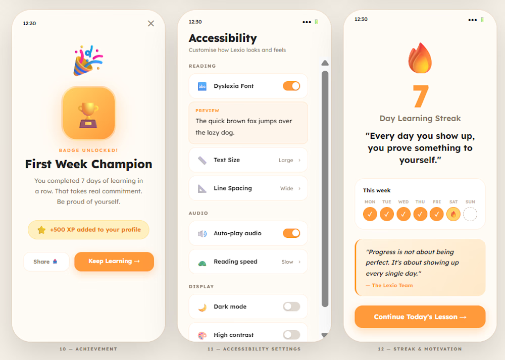
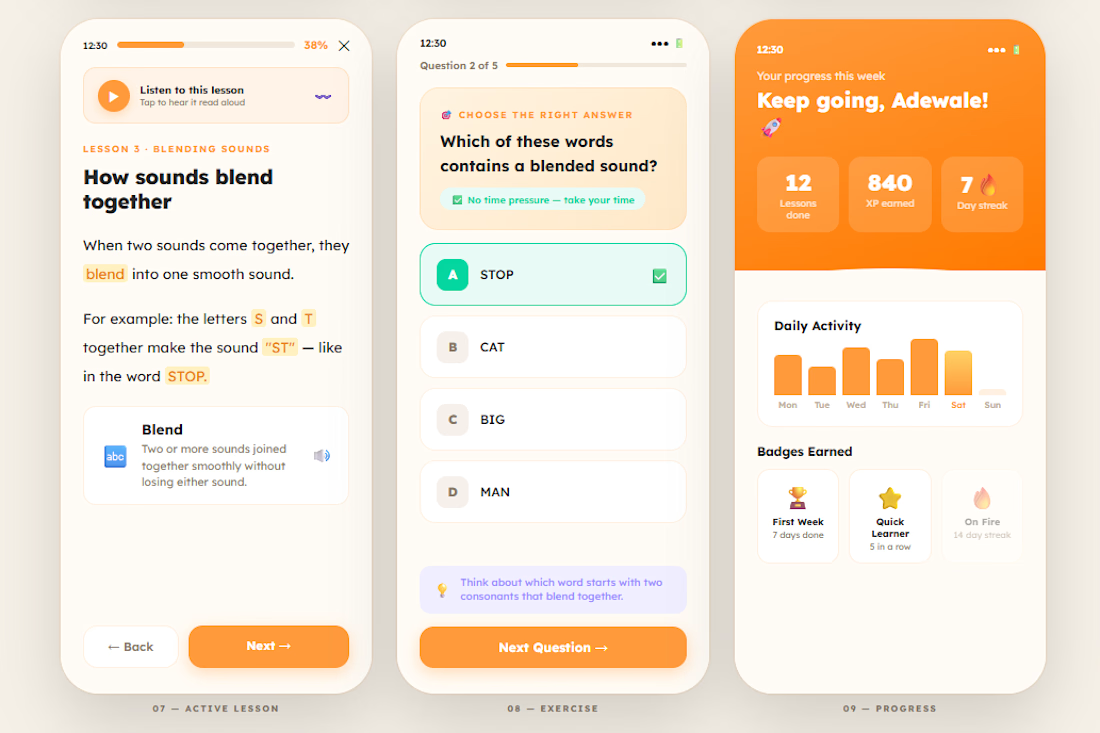
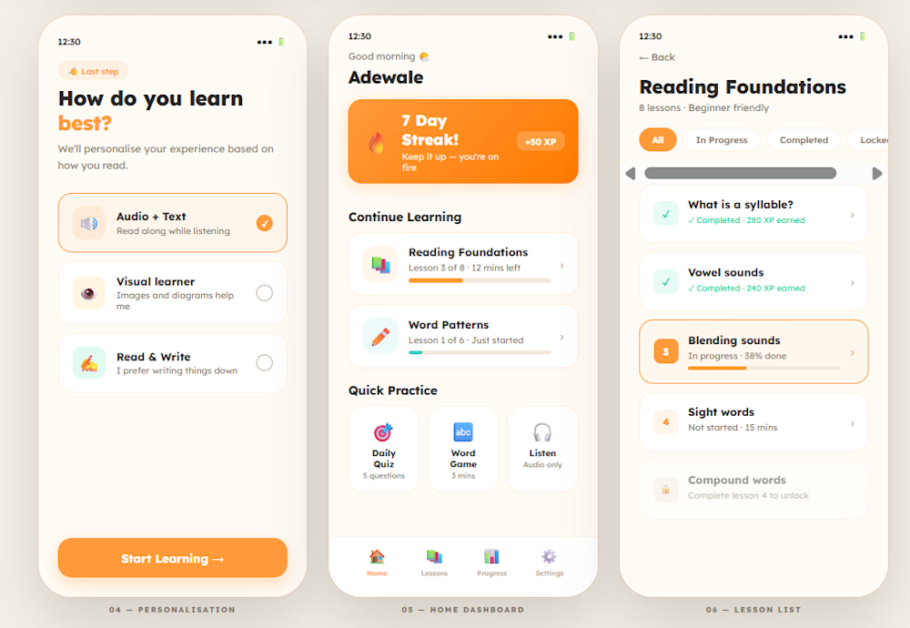
I didn't just design Lexio. I built it.
A dyslexia-friendly learning app built around one brief: make students feel capable. Not broken.
1 in 5 people have dyslexia. Most EdTech apps were designed for the other 4
What's inside:
📱 Full onboarding flow
🔊 Audio on every lesson
🎯 Zero time pressure exercises
🏆 Progress as celebration not grades
⚙️ Full accessibility settings
👉 Live prototype: https://lexioedtech.lovable.app
Open to remote contracts
📧 jesutofunmi.design@gmail.com




Cool, clean, and Amazing work...🔥👌🏻

Thank you so much

Nice work
Thank you very much
The network for creativity
Join 1.25M professional creatives like you
Connect with clients, get discovered, and run your business 100% commission-free
Creatives on Contra have earned over $150M and we are just getting started





Related posts




Option B feels nothing but premium


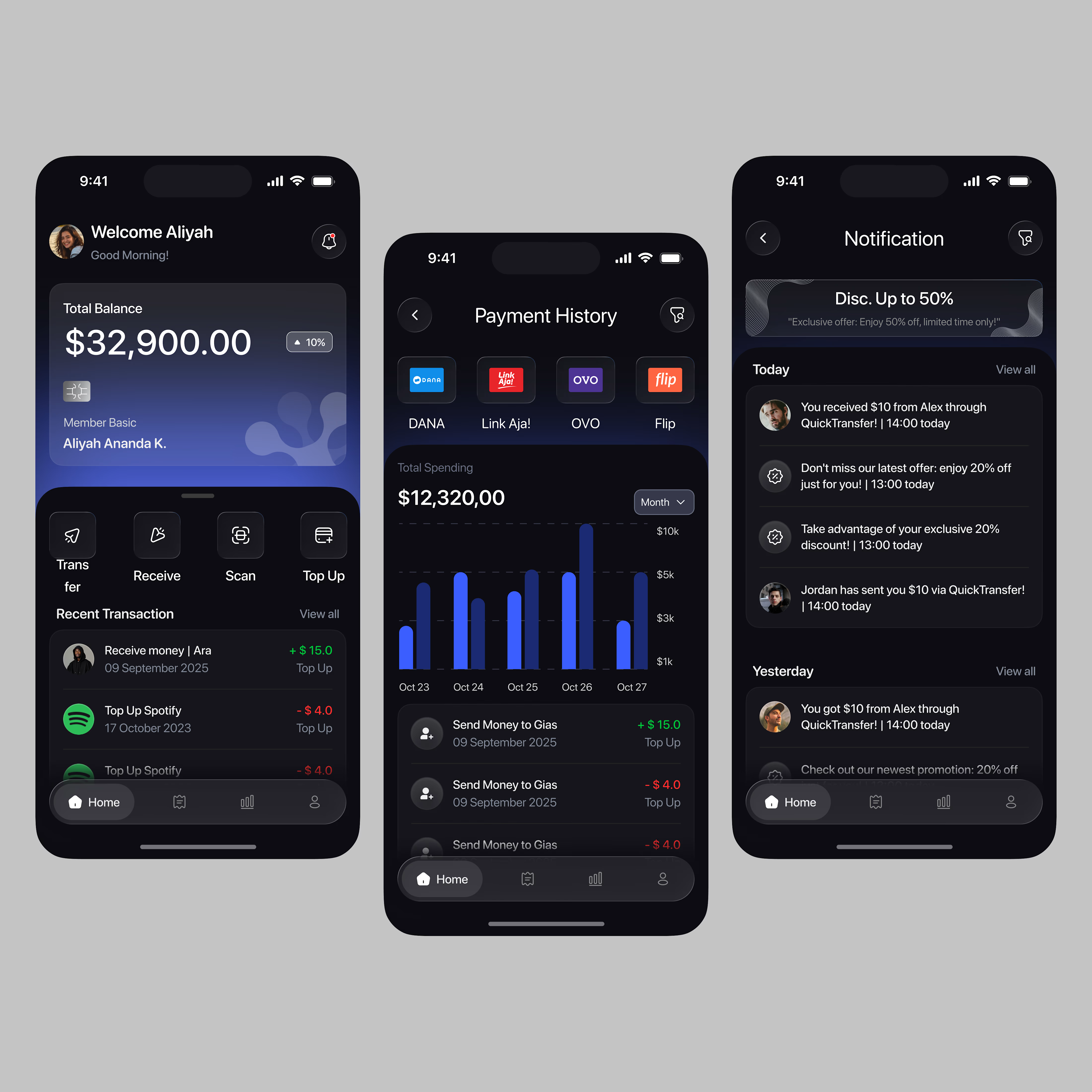
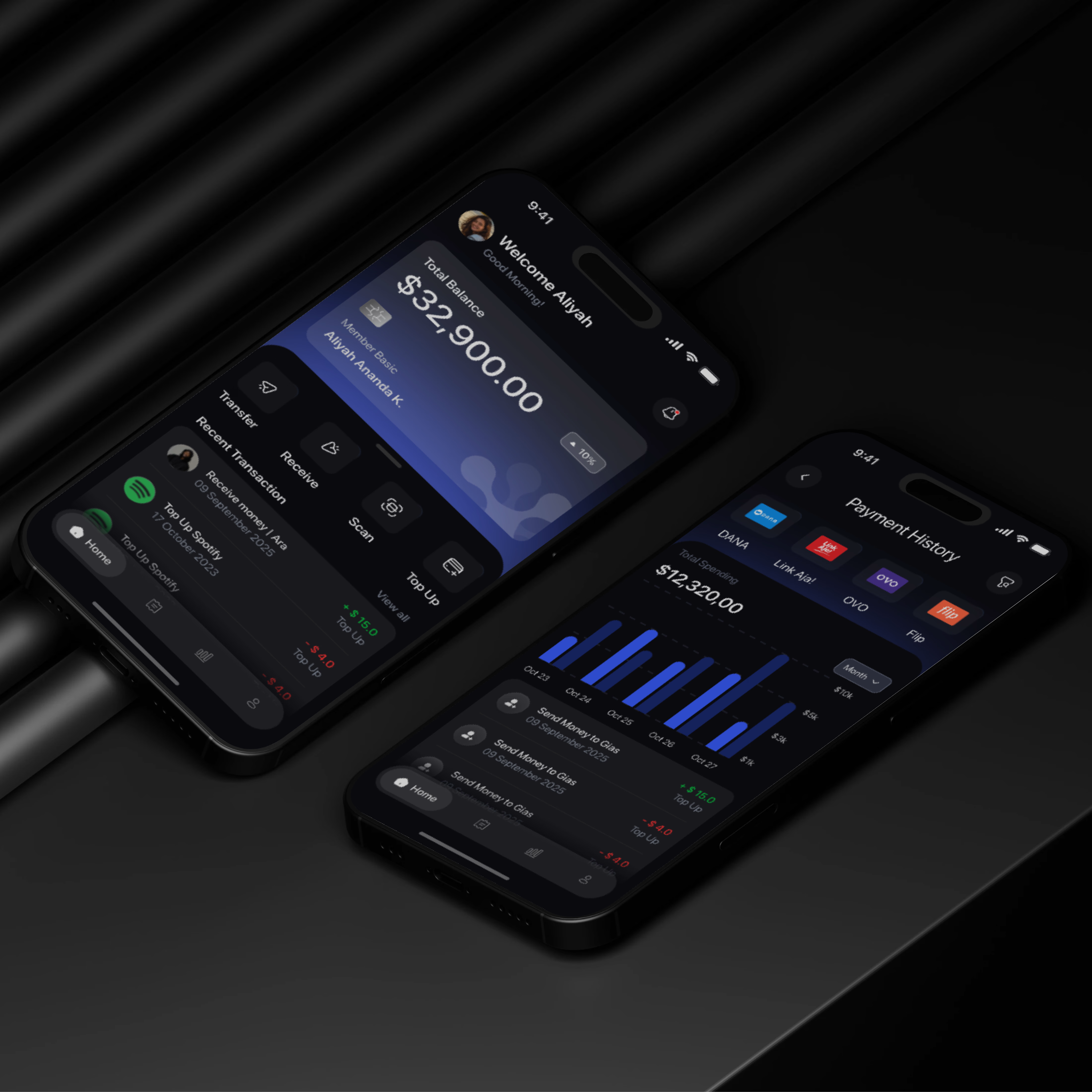

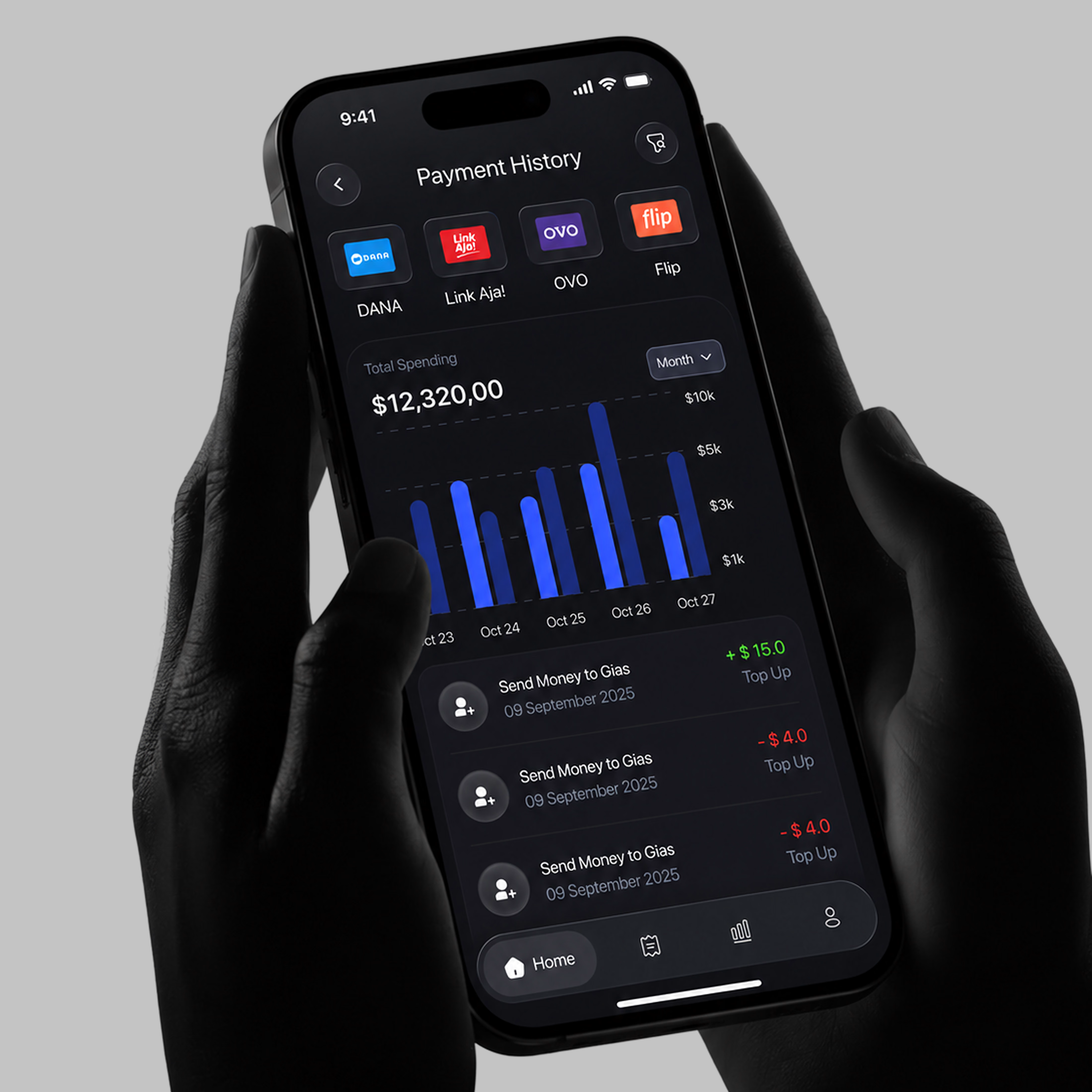

A little sneak peek at what I’ve been working on!


