The network for creativity
Join 1.25M professional creatives like you
Connect with clients, get discovered, and run your business 100% commission-free
Creatives on Contra have earned over $150M and we are just getting started
Back to feedPost

A small thing I have been thinking about lately. On product work, the grade is usually doing more repair than styling.
A packshot gets lit for the product. A lifestyle plate gets lit for the room. Any CG element arrives with no lighting history at all. They rarely agree with each other, and the grade is where they have to.
So I tend to start quietly. Everything to a believable neutral first, before reaching for a look. If I skip that step, whatever mood I add later ends up fighting the mismatch instead of covering it.
The one thing I try hardest to protect is the product colour itself. A slightly warm wall goes unnoticed. Packaging that does not match the shelf really does not.
Then a light look on top, and I usually stop a little earlier than I think I should.
Curious how others approach this, especially anyone grading a lot of CG against live plates.
The network for creativity
Join 1.25M professional creatives like you
Connect with clients, get discovered, and run your business 100% commission-free
Creatives on Contra have earned over $150M and we are just getting started





Related posts


What do you think of when you say, “this design doesn't feel premium”?
I've heard this kind of feedback from clients countless times. You know that “premium” can mean different things depending on the person, the product, and what they are comparing it against.
Recently, though, I found myself on the other side of a very similar conversation.
We've been developing a brand identity for one of our own projects, and I caught myself giving exactly the kind of feedback I've spent years receiving from clients.
“This doesn't feel right.”
“This isn't quite what I had in mind.”
There was a very specific image in my head. I just didn't have a neat explanation for it.
I was comparing what I was seeing against a pre-existing perception of what the brand should be. The gap was obvious to me because I could see both things at once: the design in front of me and the image in my head.
And that made me think back to all those conversations about making something feel more like “premium”, or trustworthy, sophisticated, playful, serious, whatever the brief happens to call for.
A client may have a very specific perception in mind that doesn't necessarily match what a designer would know to associate with that quality. They may be comparing the design against something the designer can't see yet.
The designer is checking against something too: years of seeing how visual choices, combinations and conventions tend to communicate, plus the context of the product, audience and brand.
The client is checking against the idea in their head. They may not always be able to articulate it, but they can still tell when what they're seeing doesn't match it.
So what are you actually checking against when you decide a design feels premium?
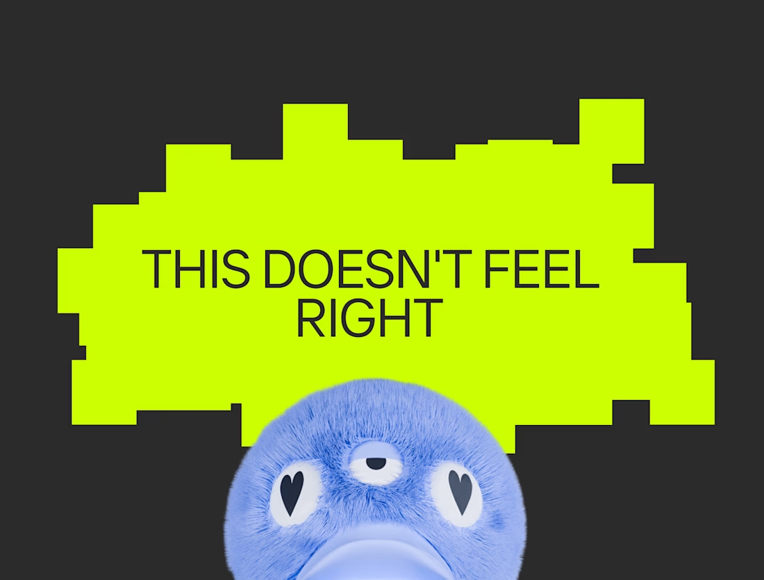

To me this would mean one thing - there was no strategic work done before touching visuals. Hence it's shooting in the dark and trying to magically match the client taste.
Strategy makes decisions informed, and put both parties on the same page way before the design work starts.

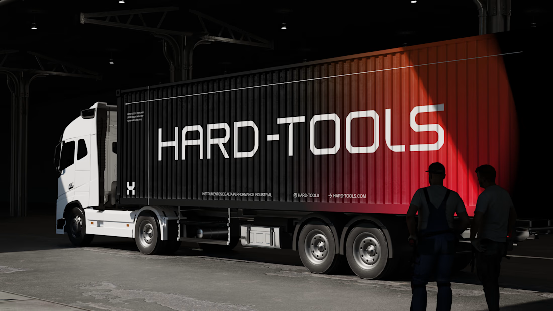
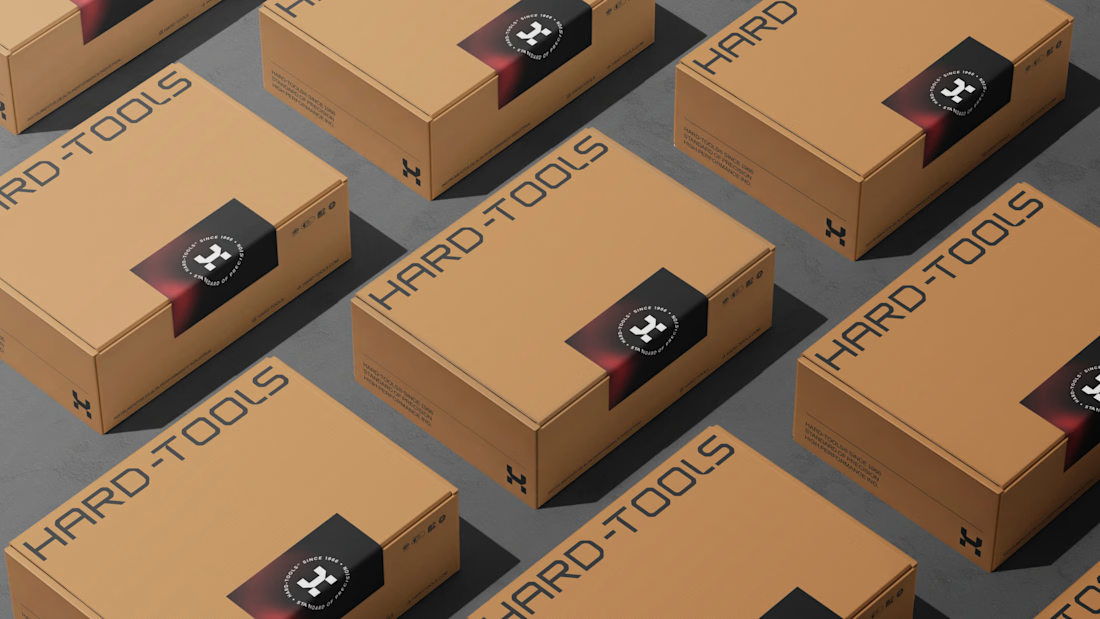
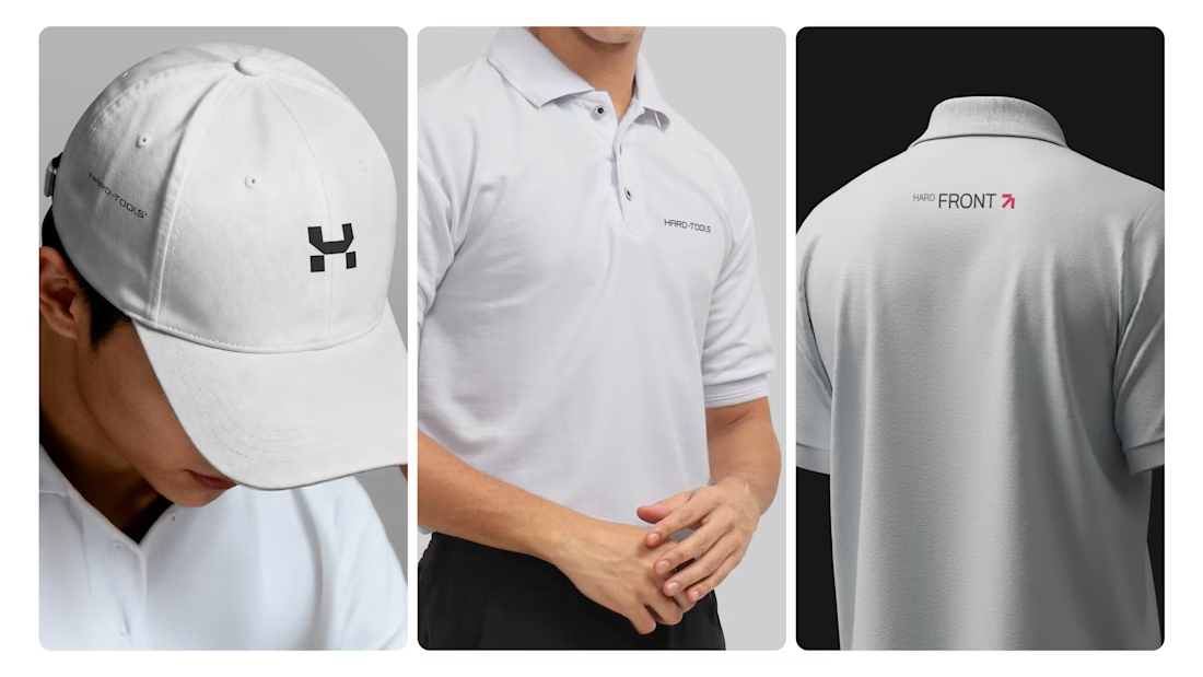
Hard-Tools needed to strengthen its brand presence and turn its communication into a clearer, more consistent, and more professional expression of the business.
The project started with a central question: how can a tools and equipment brand communicate strength, reliability, and expertise without falling into the generic visual language of the category?
The strategy focused on three main objectives:
01 — Strengthen perceived value
Build a visual communication system that conveys solidity, quality, and authority, bringing the brand’s perceived professionalism closer to the level it aims to occupy in the market.
02 — Create consistency across communication
Develop a visual language that could work across different touchpoints — campaigns, commercial materials, social media, and promotional assets — while maintaining recognition and coherence.
03 — Turn products into brand communication
Rather than simply showcasing tools and products, the visual approach was designed to communicate the attributes behind the brand: performance, precision, durability, and reliability.
Based on this strategic direction, I developed the creative and visual direction and designed the communication materials, working across composition, hierarchy, typography, image treatment, identity application, and commercial layouts.




TOP!!


even more captivating, wow!