The network for creativity
Join 1.25M professional creatives like you
Connect with clients, get discovered, and run your business 100% commission-free
Creatives on Contra have earned over $150M and we are just getting started
Back to feedPost

New to Contra, and warming up with some small brand work. Where vintage charm meets modern court culture.
For this project, I wanted to create something that felt classic without looking outdated. I played around with elegant typography, deep greens, warm neutrals, and subtle vintage details to give the brand that old-school tennis club feel.
The idea was to build an identity that could work just as well on a storefront as it does on clothing, packaging, and social media - I think it worked out well!


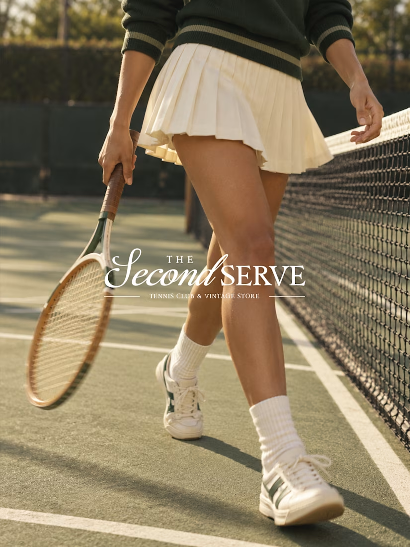
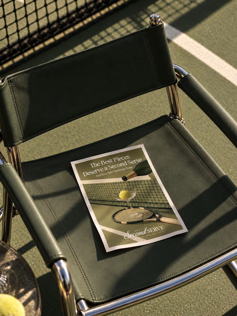
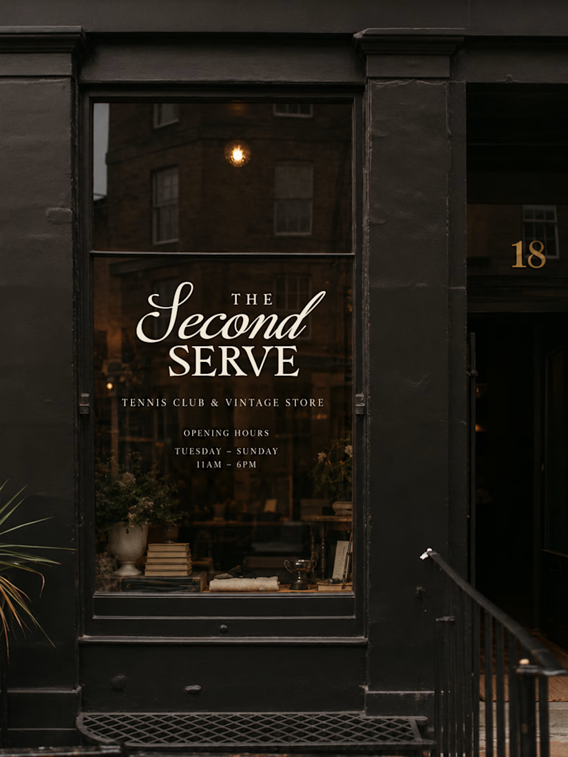
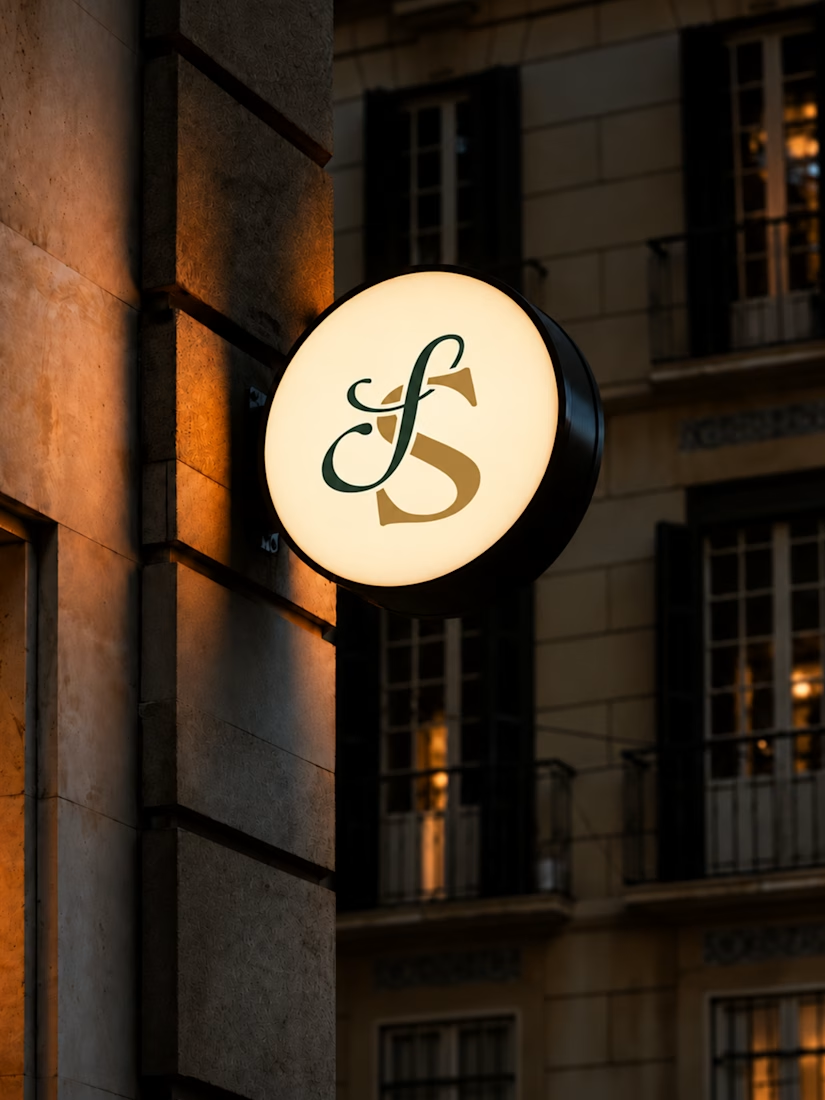

The deep greens and warm neutrals feel genuinely old-school tennis club without tipping into nostalgia for its own sake. I especially like that you designed the identity to work across a storefront, clothing and social, since that range is what proves a brand system holds up. Lovely balance of classic and modern.
The network for creativity
Join 1.25M professional creatives like you
Connect with clients, get discovered, and run your business 100% commission-free
Creatives on Contra have earned over $150M and we are just getting started



Related posts

Bold Illustrations make an instant impact
See full case study here for the branding evolution and website redesign for a B2B SaaS startup!


I loved these colours. Looking Stunning 😍


Which logo looks better for Lumia?
5 voted
56%

4 voted
44%

9 votes
Closed

Bold is heavy❤️
Which logo looks better for Lumia?
4 voted
57%
3 voted
43%
7 votes
Closed

Minimal and Elegant