The network for creativity
Join 1.25M professional creatives like you
Connect with clients, get discovered, and run your business 100% commission-free
Creatives on Contra have earned over $150M and we are just getting started
Back to feedPost

Light Themed Leaderboard UI designed in Flutter.
The network for creativity
Join 1.25M professional creatives like you
Connect with clients, get discovered, and run your business 100% commission-free
Creatives on Contra have earned over $150M and we are just getting started











Related posts

A fresh look at a gamified learning dashboard designed to make progress tracking more engaging, visual, and easy to understand.

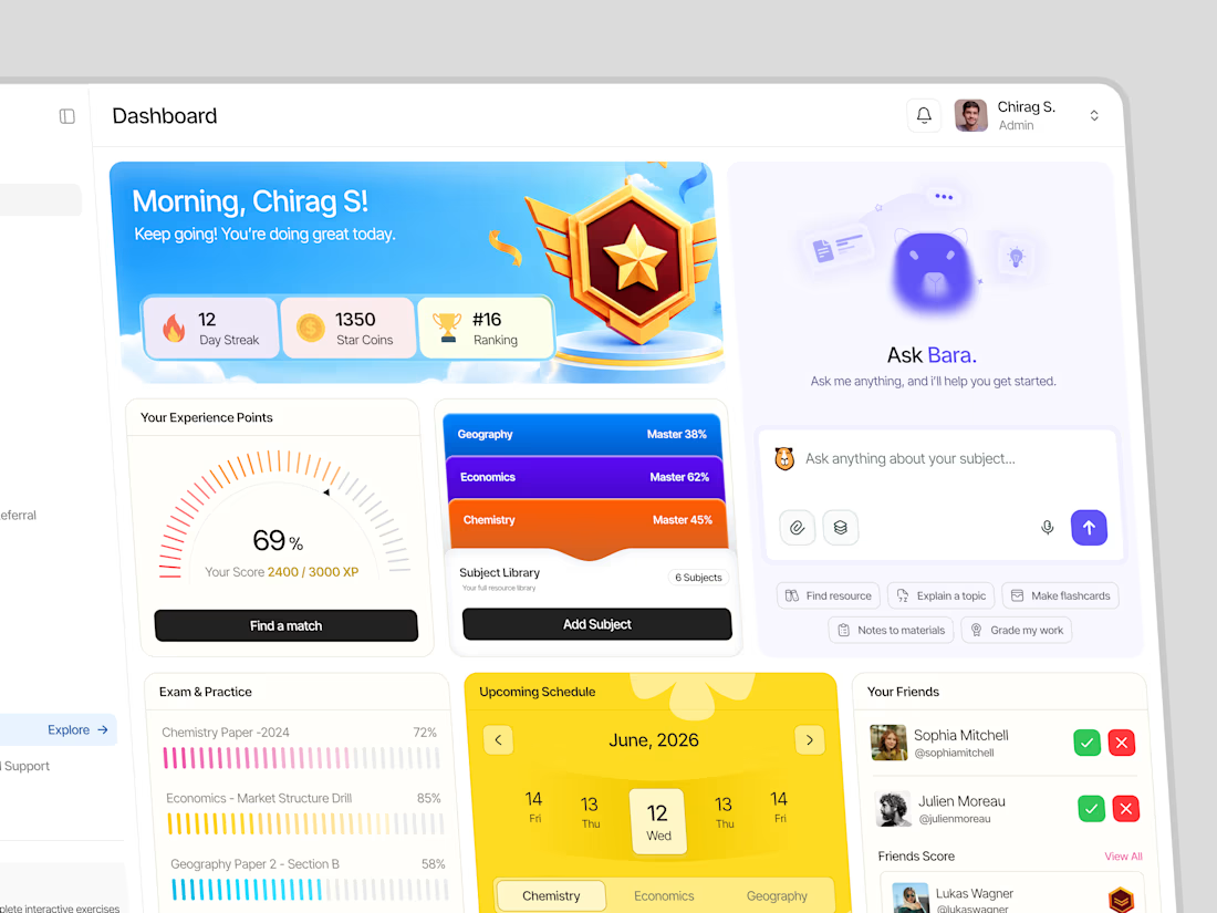

Great job Nikanth🔥🔥

Home & Map view for our simple Pulse Athletics app...
more on this project in my case study:)
#athletics #sportsapp # community #communityapp #cleanui #modernui #productdesign #uidesigner #userresearch #uxdesigner #brandstrategy #brandvisuals #brandassets #runclub #running #runningapp
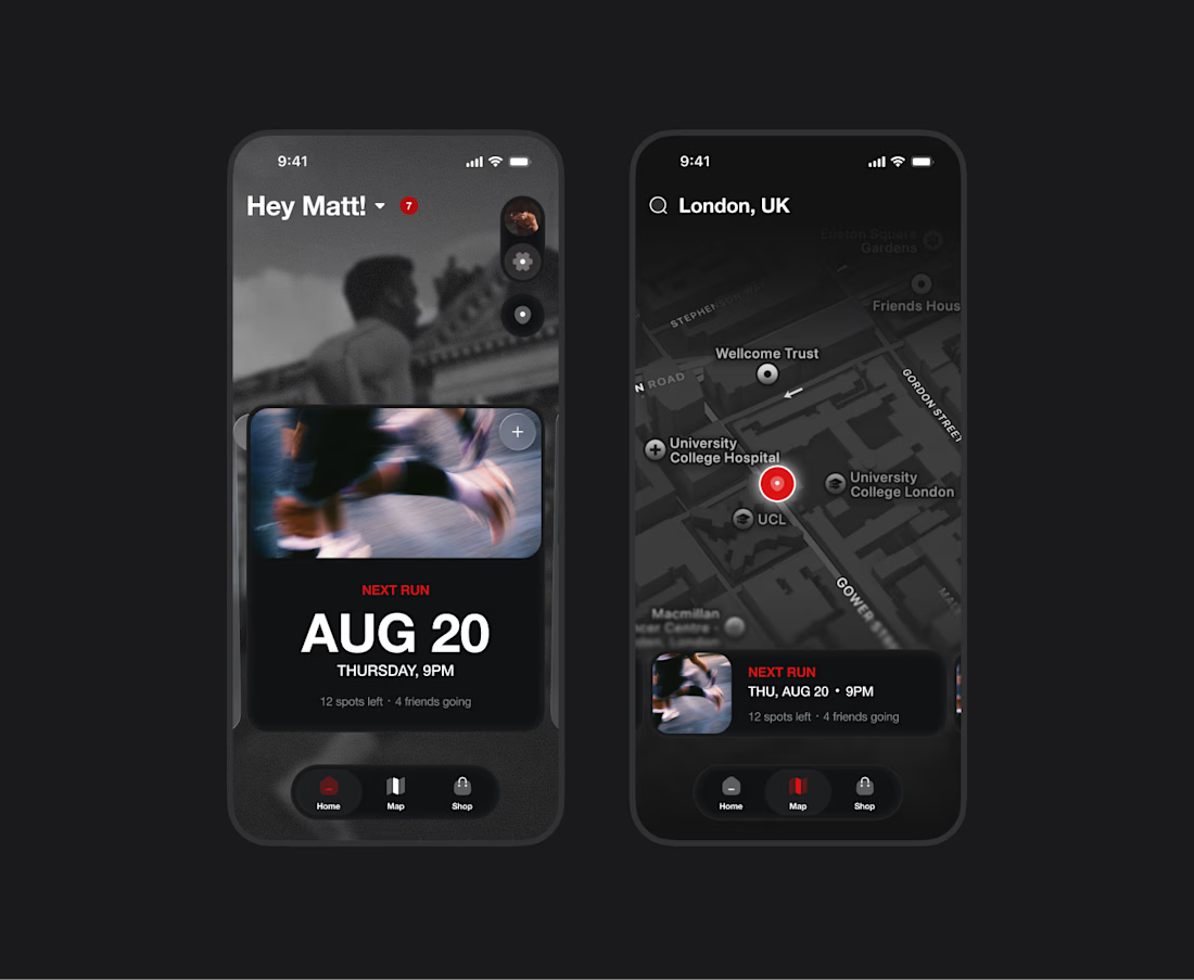

The dark mode here is so clean. The Next Run card with the spots left count feels like a proper community driver, not just a pretty widget. Putting the map next to home with the runner pins keeps the social layer front and center. Did you lean on user research for what keeps...

A productivity widget i designed on figma and currently building on Google antigravity! It is designed to track daily progress, organize your tasks, and stay in the zone with a tactile flip-clock timer.
What are your thoughts?
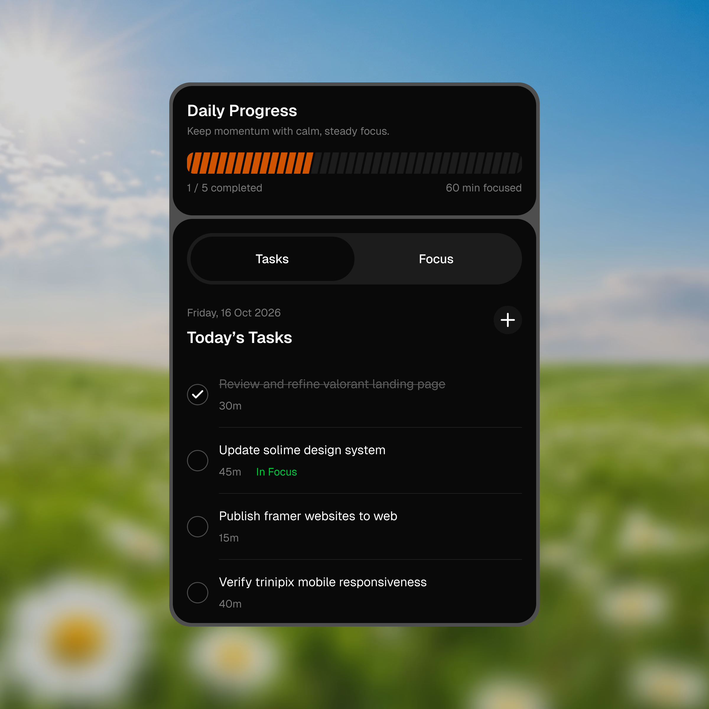
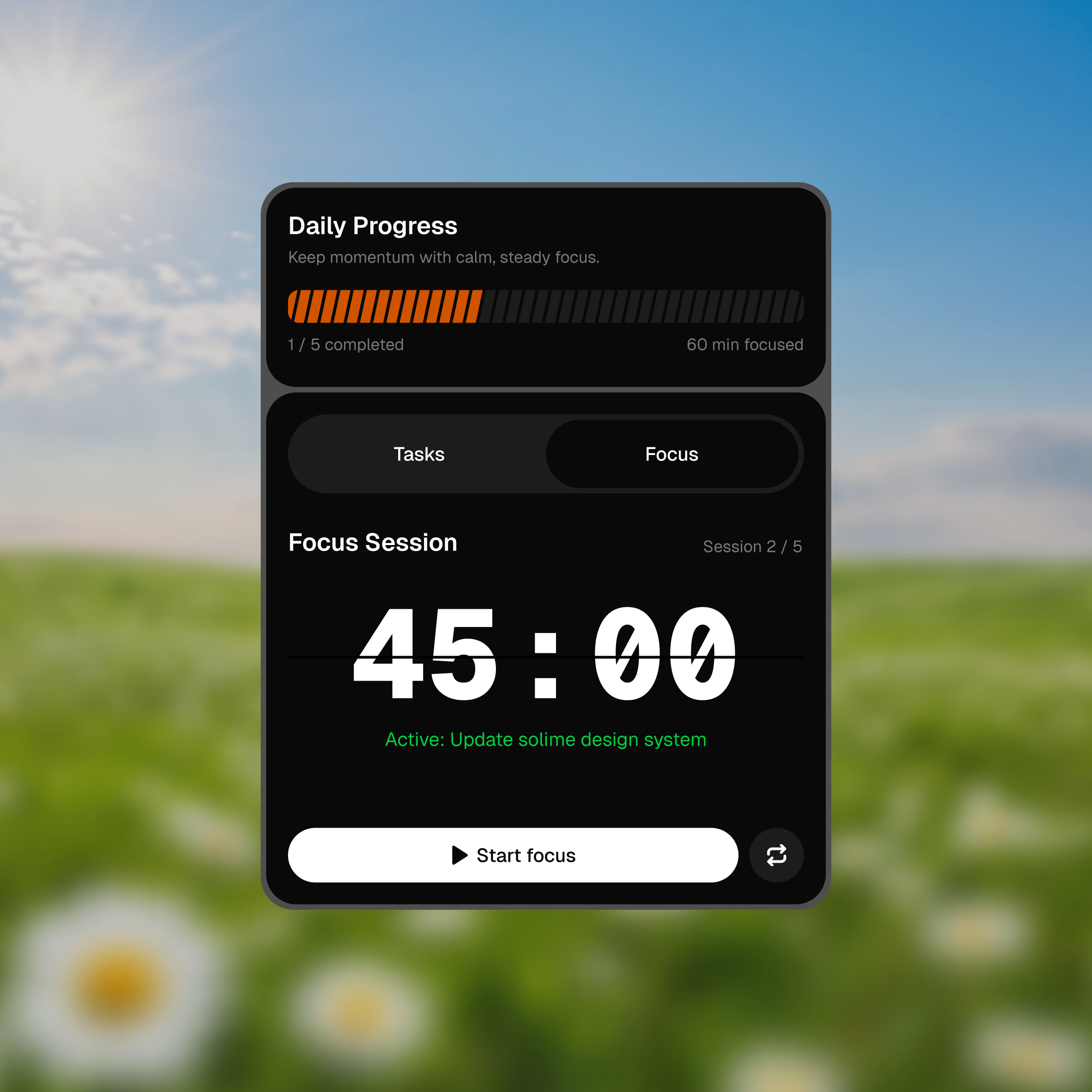
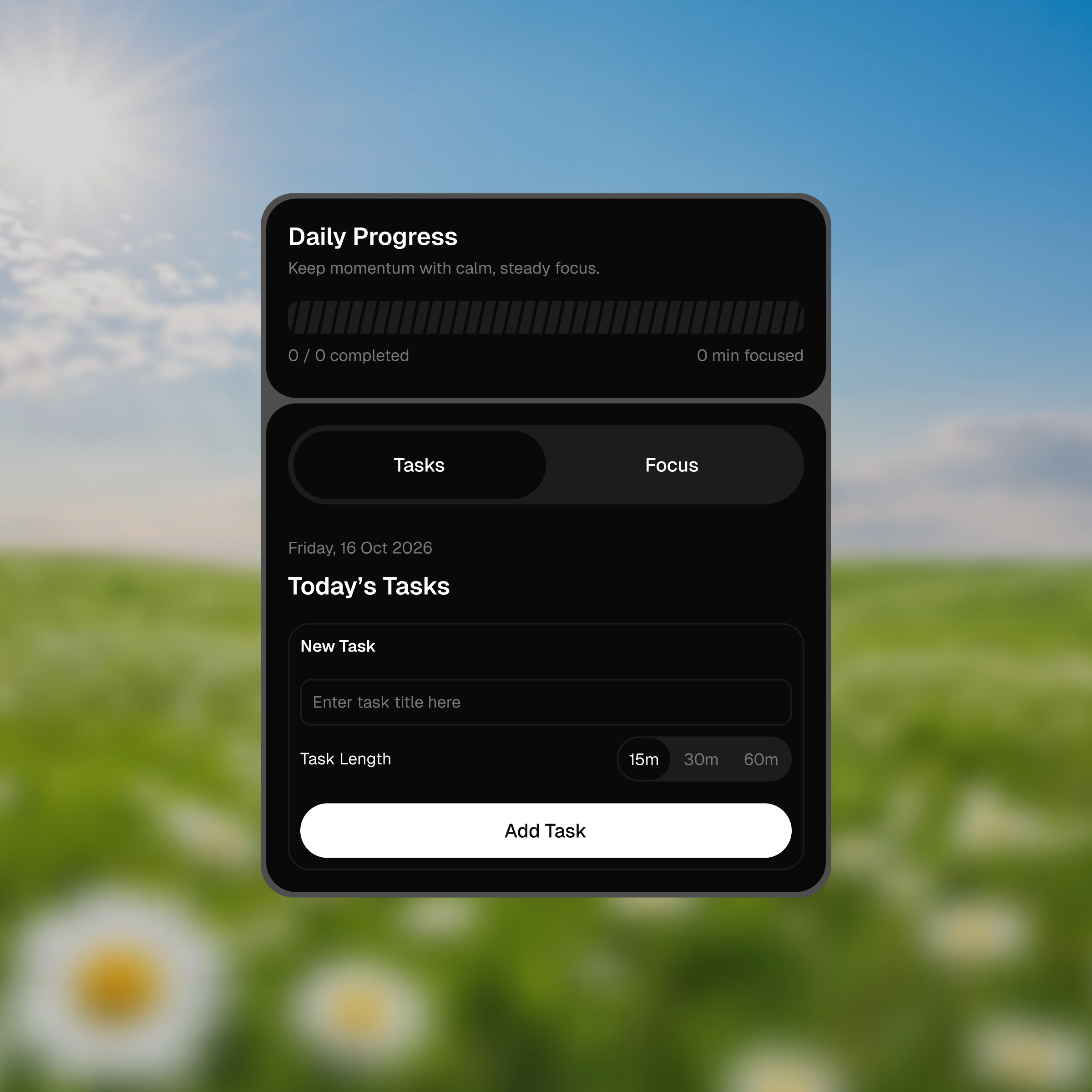
The tactile flip-clock timer on the dark widget is such a nice touch. Tracking daily progress inside the widget keeps it from becoming another list you ignore. Building it on Antigravity is bold, curious how it performs.