The network for creativity
Join 1.25M professional creatives like you
Connect with clients, get discovered, and run your business 100% commission-free
Creatives on Contra have earned over $150M and we are just getting started
Back to feedPost

Exploring dynamic transitions and visual depth in a responsive hero slider concept. 🌍✨
For this iteration, I wanted to see how a high-impact, tall display font could interact with iconic structural imagery to create a true sense of scale and architectural depth. By precision-masking the typography behind the landmarks, the layout achieves an immersive 3D parallax feel while maintaining a locked structural component grid across different global destinations.
🎯 Key Updates & Focus:
Cinematic Motion: Implemented an atmospheric fade-in intro to immediately capture user attention and establish mood.
Component Synchronization: Synced the micro-interaction of the card progress indicator and tracking bar to mirror live app logic.
Visual Hierarchy: Maintained strict text readability and contrast transitions against shifting sky backgrounds.
Built completely from scratch and animated within Figma.
I’d love to hear your thoughts on the motion pacing—would you prefer a faster snap transition or this smooth, atmospheric slide?👇
#UIUX #ProductDesign #FigmaAnimation #WebDesign #InteractionDesign #TravelUI #MotionDesign #UserInterface
The network for creativity
Join 1.25M professional creatives like you
Connect with clients, get discovered, and run your business 100% commission-free
Creatives on Contra have earned over $150M and we are just getting started







Related posts

Hero section of one my new templates. Preview it live to see the animations.
Relay is HTML or React you actually own.
Hand it to your AI assistant and it already knows how the thing is built.
Starting at $29
https://no-code.supply/templates/relay
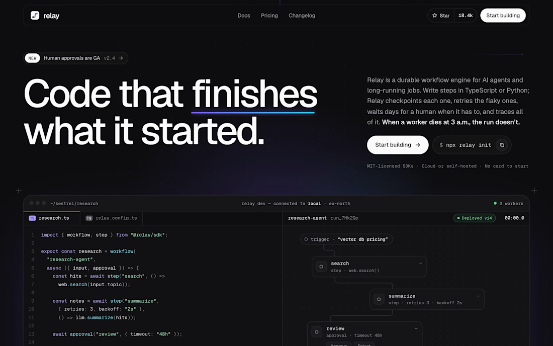

"Code that finishes what it started" is a great headline. Love that it's real HTML/React you own and not locked into a builder.

Investment Portfolio UI • Motion Exploration
Exploring how motion can make financial data feel easier to understand.
Designed this investment portfolio interaction around a simple idea: keep the numbers dominant, reduce visual noise, and use animation to communicate change over time rather than adding decoration.
Designed in Figma, with the motion focused on the graph, balance and period selection.
Would be interested to know which interaction feels most useful in a real investment product.


just wow

Day 3 of working on my project for the Lovable Challenge.
And somehow, almost one full day of those three went into the intro you see when the page first opens.
Not because it was necessary — mostly because I’ve wanted to try something like this for a long time.
Web design and development are far from my main field, so I kept putting this idea off. This challenge finally gave me a reason to test it properly — and seeing it actually work is ridiculously satisfying.
The video was converted into an image sequence and tied directly to scrolling on desktop and swiping on mobile, so the animation is controlled by the user as they move through the page.
Right now the project is already at Build 4.2.3.
The backend is working properly, the main mechanics are in place, but visually… there’s still a lot to redo. The current plan is to rebuild almost the entire visual layer before the final version.
I also found out today that Lovable reduced the number of prize spots quite significantly — apparently, there will only be 3 finalists.
That definitely makes the odds a little more painful 😅
But either way, I’m already getting a new portfolio case out of this project, and I’m finally experimenting with things I’ve wanted to build for a long time.
How’s everyone else doing?
Still working on your project, or have you already submitted it?
Or did you decide not to participate at all? If so, I’m curious — what made you skip it?
