The network for creativity
Join 1.25M professional creatives like you
Connect with clients, get discovered, and run your business 100% commission-free
Creatives on Contra have earned over $150M and we are just getting started
Back to feedPost

Absolutely. Here’s a ~1,200-character version written to make store owners stop, think, and keep reading.
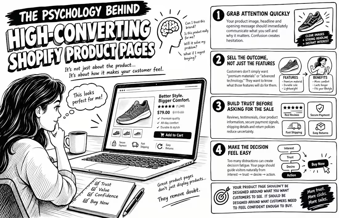
The Psychology Behind High-Converting Shopify Product Pages
Why do some Shopify product pages make you want to click “Buy Now”, while others make you leave, even when the product is good?
It’s not always about price. It’s psychology.
Before customers buy, their brains are quietly asking: Can I trust this brand? Is this product really for me? Will it solve my problem? What happens if I regret buying it?
A high-converting product page answers these questions before the customer has to ask.
1. Grab attention quickly.
Your product image, headline, and opening message should immediately communicate what you sell and why it matters. Confusion creates hesitation.
2. Sell the outcome, not just the features.
Customers don’t simply want “premium materials” or “advanced technology.” They want to know what those features will do for them.
3. Build trust before asking for the sale.
Reviews, testimonials, clear product information, secure payment signals, shipping details, and return policies reduce uncertainty.
4. Make the decision feel easy.
Too many distractions can create decision fatigue. Your page should guide visitors naturally from interest → trust → desire → action.
And here’s the biggest mistake:
Your product page shouldn’t be designed around what you want customers to see.
It should be designed around what customers need to feel confident enough to buy.
Because great product pages don’t just display products.
They remove doubt.
If you want, I can also turn this into a 1400 × 900 black-and-white comic/sketch illustration concept that visually explains the psychology behind the post.

The network for creativity
Join 1.25M professional creatives like you
Connect with clients, get discovered, and run your business 100% commission-free
Creatives on Contra have earned over $150M and we are just getting started







Related posts

Designed and built a professional Framer website for a dog training business, focusing on clear service presentation, easy navigation, strong calls-to-action, testimonials, FAQs, and a responsive experience across devices.
What I did
- Framer website design and development
- Custom responsive layout
- Homepage design
- Services page
- About page
- FAQ page
- Contact page
- Service presentation
- Consultation and contact CTAs
- Testimonials section
- Trust and credibility sections
- Mobile responsive design
- User-friendly navigation
- Content structure and visual hierarchy
- Lead-generation focused design
- Professional branding integration
- Newsletter section
- Social media integration
- Etsy shop integration
- Image and content layout
- Conversion-focused user experience
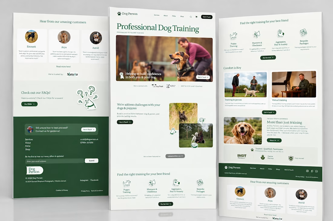
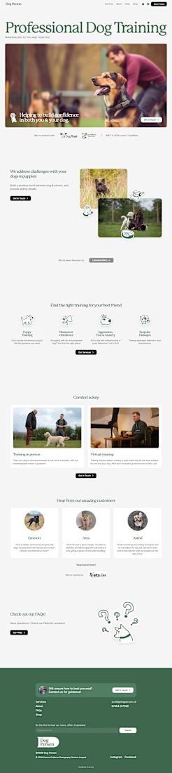
Designed and built a professional Framer website for a dog business website, focusing on clear service presentation, easy navigation, strong calls-to-action, testimonials, FAQs, and a responsive experience across devices

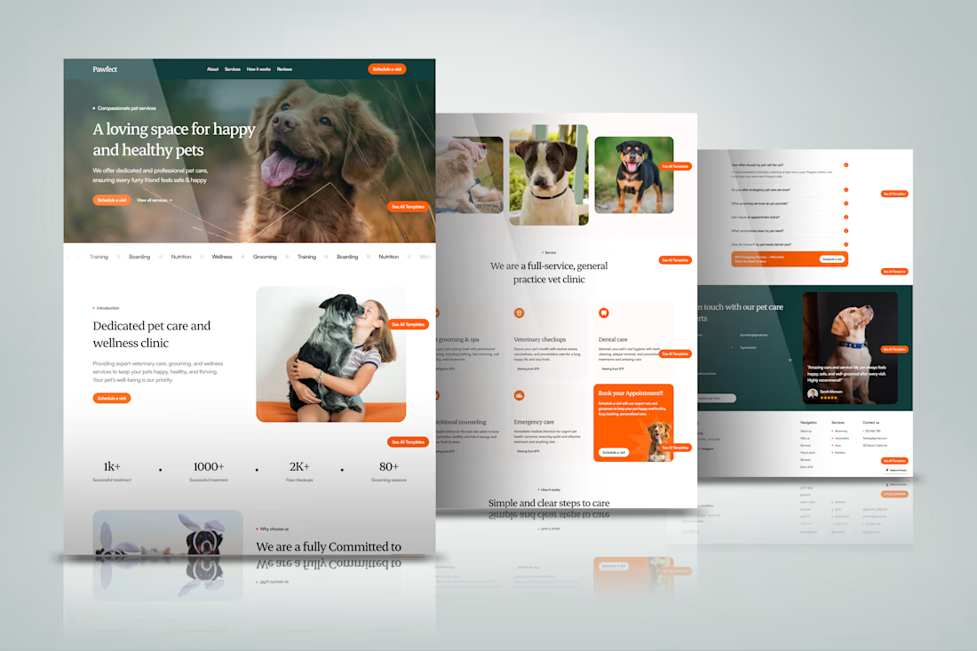



cool work
Designed and built a professional Framer website for a dog training website, focusing on clear service presentation, easy navigation, strong calls-to-action, testimonials, FAQs, and a responsive experience across devices