The network for creativity
Join 1.25M professional creatives like you
Connect with clients, get discovered, and run your business 100% commission-free
Creatives on Contra have earned over $150M and we are just getting started
Back to feedPost
Nobody has ever left a website thinking:
“You know what that needed?”
“Another paragraph.”
Yet that’s usually the first thing founders add when enquiries slow down.
Not because they’re bad at marketing.
Because they’re trying to help.
“If I explain it better…”
“If I tell them more…”
“Maybe I need to mention this certification as well.”
Seems logical.
Then another section appears.
A new framework gets squeezed in.
Somewhere a second call to action pops up.
Nothing disappears.
Everything survives.
Eventually the homepage turns into a storage unit.
The strange part?
Visitors aren’t leaving because they don’t have enough information.
Most of the time they’re leaving because they haven’t found a reason to care yet.
Those are completely different problems.
I’ve finished reading websites that explained absolutely everything.
Couldn’t tell you what the business actually wanted me to do.
Funny how that works.
More information feels like confidence to the founder.
Less confusion feels like confidence to the visitor.
That’s usually where I start when I’m auditing a website.
The network for creativity
Join 1.25M professional creatives like you
Connect with clients, get discovered, and run your business 100% commission-free
Creatives on Contra have earned over $150M and we are just getting started
Related posts
People leave websites for simple reasons.
The page is slow.
The message is confusing.
The buttons are hard to find.
A clean website keeps visitors longer.
Keep it simple.

A German e-commerce brand was spending 4+ hours every week writing blog content manually.
Every. Single. Week.
The owner would sit down, research a topic, write the article in German, format it, find images, then manually publish it to their WooCommerce store.
By the time it was done, half the day was gone.
And it had to happen again next week. And the week after. Forever.
The frustrating part? Their competitors were publishing content consistently while they were struggling to keep up.
More content = more SEO = more traffic = more sales.
They were losing ground every single week without realizing it.
I got on a call with them. Listened to the problem. And told them something they didn't expect:
"You'll never have to write another blog post manually again."
They didn't believe me.
So I built it.
In one afternoon.
Using Make.com and Claude AI, I built a pipeline that now runs every week automatically. No manual writing. No formatting. No publishing. Nothing.
How exactly did I build it?
What tools did I connect?
And what does the client's store look like now after 3 months of automated content?
I'll show you everything in Part 2 👇
Follow me so you don't miss it.

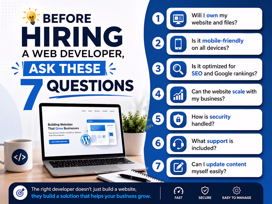
💡 Before Hiring a Web Developer, Ask These 7 Questions
Hiring the wrong developer can cost you time, money, and missed business opportunities.
Before you start your next website project, ask these important questions:
✅ Will I fully own my website and files?
✅ Is the website mobile-friendly on all devices?
✅ Will it be optimized for SEO and Google rankings?
✅ Can the website grow as my business scales?
✅ How will security and backups be handled?
✅ What support do I get after launch?
✅ Can I easily update content myself?
A website is an investment, not just an expense. Asking these questions upfront can save you from expensive mistakes later.
As a WordPress Developer, I build websites that are fast, secure, scalable, and easy to manage—so my clients stay in control of their business online.
What question would you add to this list? Let me know in the comments! 👇
#WebDevelopment #WordPress #WebsiteDesign #SmallBusiness #SEO #WebDeveloper #BusinessGrowth #DigitalMarketing #Freelancer #WebsiteTips
Trending
Claude
Claude has entered the design space. How are you using Claude Design?
Contra University
Learn from expert creatives how to earn more using next-gen AI tools.
MagicPath
The canvas is infinite, and exploration is becoming the workflow. How are you using MagicPath?
creativeaiflow
Creative AI workflows are evolving. What tools do you use, and what are their strengths and weaknesses?
freelancerlife
Freelancer life is wins, pivots, and everything in between. What’s yours right now?