The network for creativity
Join 1.25M professional creatives like you
Connect with clients, get discovered, and run your business 100% commission-free
Creatives on Contra have earned over $150M and we are just getting started
Back to feedPost
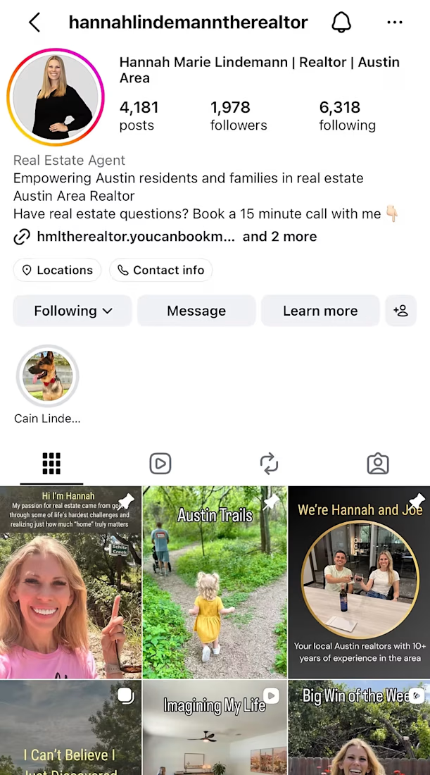
I worked as a Social Media Manager with a local realtor to increase brand awareness, maintain client retention, and generate leads.
I created a personalized marketing plan (revised monthly), updated her profile for SEO, established content pillars, and posted 4x per week on average.
Our time working together yielded steady growth in followers, views, and interactions. My client was no longer stressed about managing her social media, and dedicated more time to her business. Key results are as follows:
25 net followers gained int one month.
72.4K views and 316 interactions on one reel.


Such a good work!! Keep going!

Thank you so much!
The network for creativity
Join 1.25M professional creatives like you
Connect with clients, get discovered, and run your business 100% commission-free
Creatives on Contra have earned over $150M and we are just getting started








Related posts

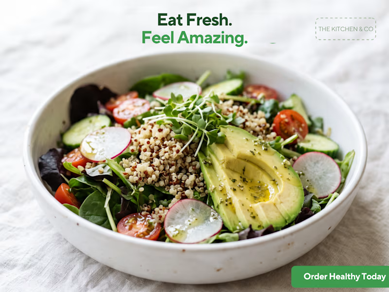
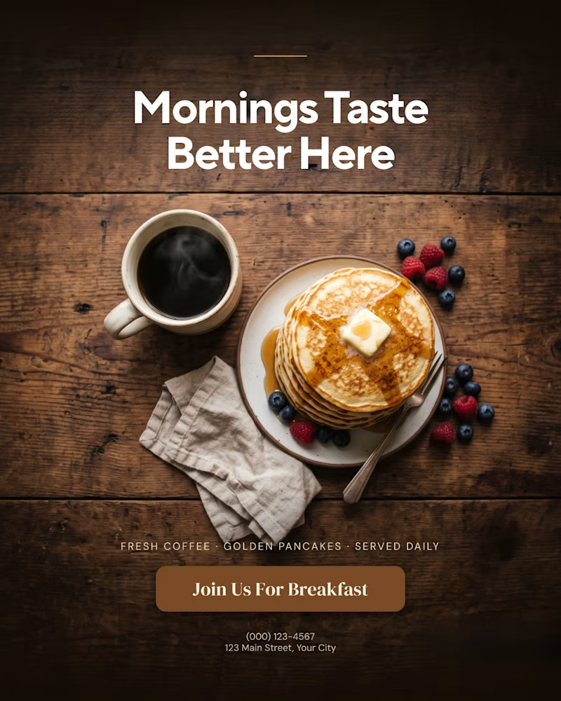
A creative food advertising design series focused on bold typography, visual hierarchy, and appetizing food photography.
The first design uses warm, rustic tones and expressive typography to create a cozy breakfast feel, while the second combines fresh green typography with a clean, modern layout for a healthy food concept.
Both designs explore how typography, color, and composition can communicate different food brand identities.
Which design do you prefer, the warm breakfast aesthetic or the fresh, minimal look?
1 voted
11%
8 voted
89%
9 votes
Closed

That is more attractive to me great job Malaika🎉🎉🎉


ADMINISTRATIVE & VIRTUAL SUPPORT
Business organization and daily operations.
Invoice management and payment tracking.
Error detection and document review.
Digital calendars and meeting coordination.
Business travel planning and cost optimization.
Supplier and client communication.
Accounting and financial assistance.
Task management and deadline reminders.
Digital filing and workflow optimization.
Reliable remote support to save you time.
SOCIAL MEDIA & DIGITAL GROWTH
Creative social media content planning.
Instagram, Facebook and TikTok organization.
Customized digital content calendars.
Eye-catching posts, stories and promotions.
Trend research and creative strategies.
AI-powered visuals and Canva designs.
Brand identity and online visibility.
Ready-to-publish content organization.
Engagement and performance tracking.
Creative solutions to help your brand grow.🎉




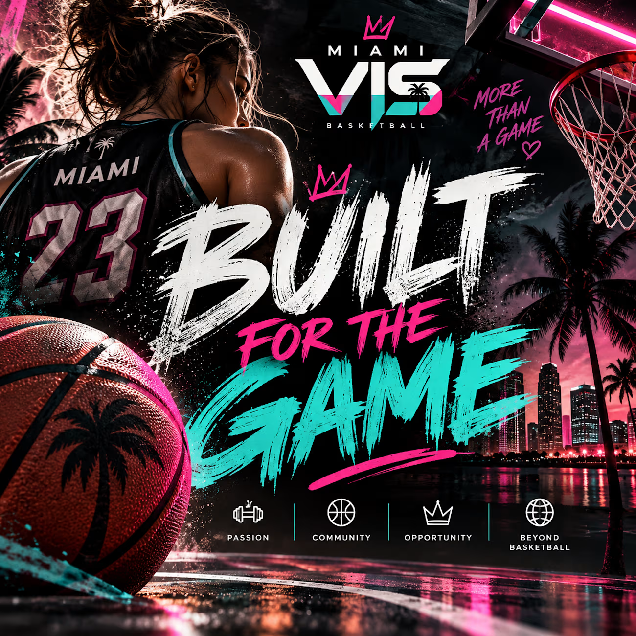
🏀 Miami VIS | Social Media Content Concepts
An independent portfolio project showcasing social media content ideas for a professional-style basketball brand.
This concept focuses on engaging captions, game-day excitement, audience interaction, and building a recognizable social media presence.
Project includes:
Basketball-themed social media graphics
Engaging Instagram captions
Community engagement ideas
Content strategy and brand storytelling
Created as an unofficial portfolio sample to demonstrate my content creation and social media skills.