The network for creativity
Join 1.25M professional creatives like you
Connect with clients, get discovered, and run your business 100% commission-free
Creatives on Contra have earned over $150M and we are just getting started
Back to feedPost
Taste Test
A creative food advertising design series focused on bold typography, visual hierarchy, and appetizing food photography.
The first design uses warm, rustic tones and expressive typography to create a cozy breakfast feel, while the second combines fresh green typography with a clean, modern layout for a healthy food concept.
Both designs explore how typography, color, and composition can communicate different food brand identities.
Which design do you prefer, the warm breakfast aesthetic or the fresh, minimal look?

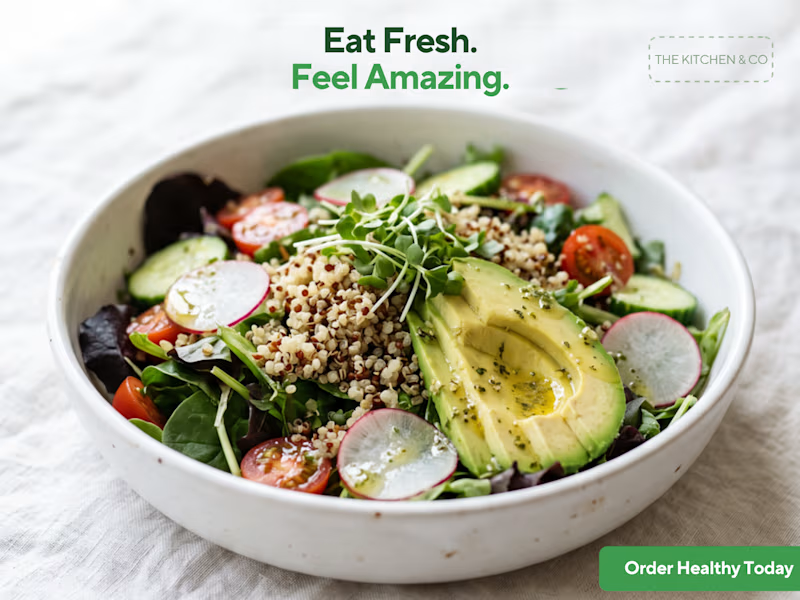
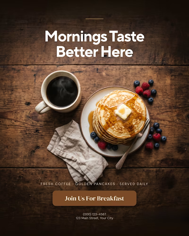
9 votes
Ends in 2h


Thank you so much! I'm really glad the rustic breakfast one stood out to you. 🙌

That is more attractive to me great job Malaika🎉🎉🎉
Thank you so much! I'm really happy you liked it. Your feedback means a lot. 🙌
Pardon Malaika❤️
The network for creativity
Join 1.25M professional creatives like you
Connect with clients, get discovered, and run your business 100% commission-free
Creatives on Contra have earned over $150M and we are just getting started

Challenges
View all


Related posts

some visuals from iki, a matcha shop i’m currently working on 🍵
one of the most interesting parts of this project has been figuring out how to turn an abstract concept into something people can actually see and feel.
from the typography to the illustrations and overall visual language, every element is an opportunity to give the brand more personality and make it feel like its own world.
still exploring, but i’m really enjoying where this is going.
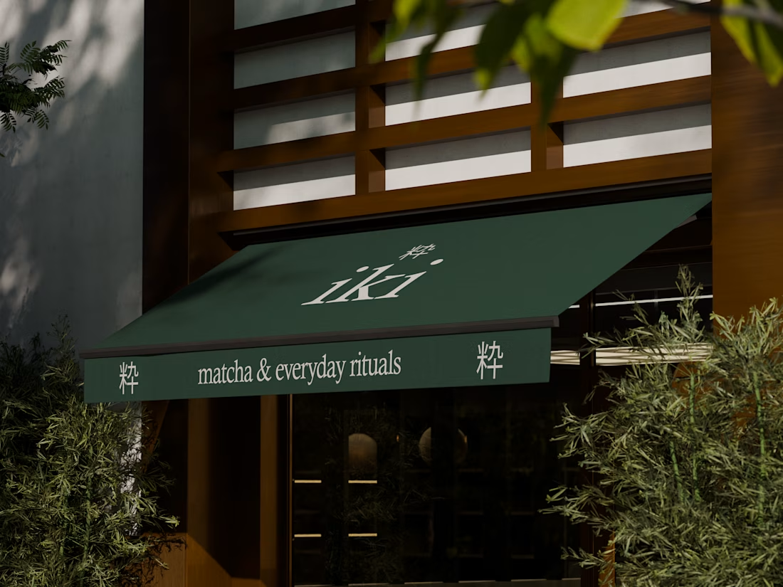
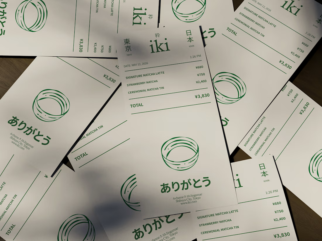
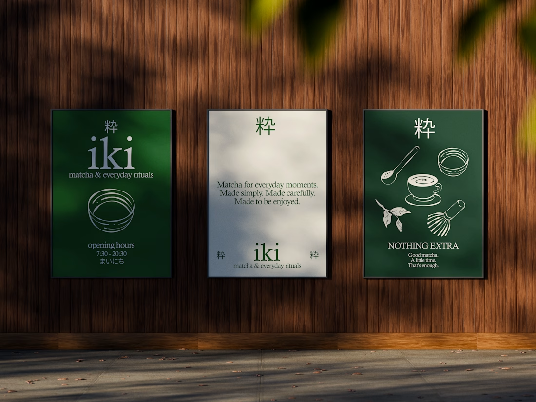
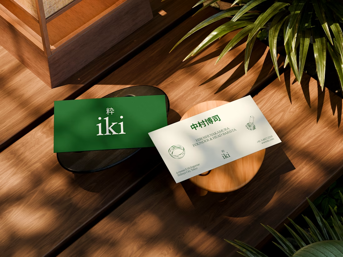


the illustration direction feels like it could take over the whole shop interior, not just the cups. thats usually where these projects fall apart

A founder ask me for a feedback on there product, so i started reviewing the healthcare app, and something felt off.
The website felt warm and welcoming. You could tell there were real people behind the brand.
But once you opened the app to sign up, that feeling was gone.
And honestly, for something as personal as healthcare, that matters. People need to feel comfortable before they trust you with their health.
So I worked on the onboarding screen to bring that feeling back.
Nothing complicated. I added a human touch through imagery and kept the screen simple, while making the app feel more connected to the website.
Sometimes, it's not about adding more to a screen. It's about making what's already there feel right.
Which would make you more comfortable signing up:
Before or After?

4 voted
14%
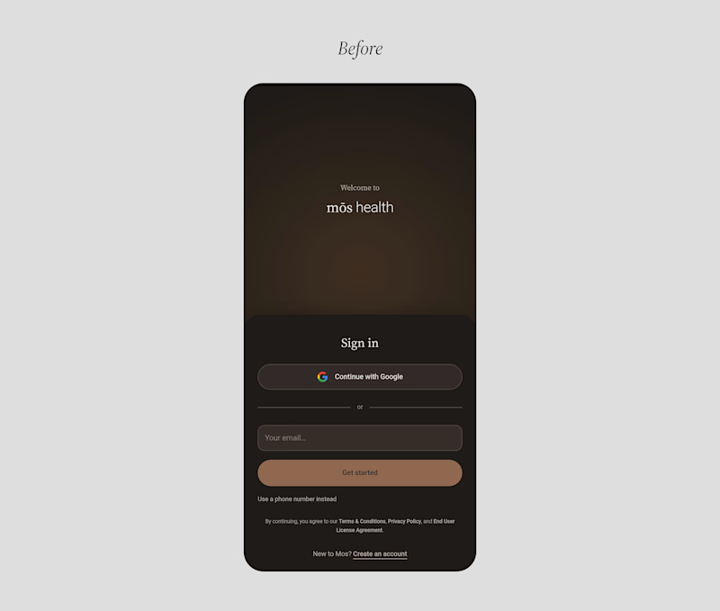
25 voted
86%
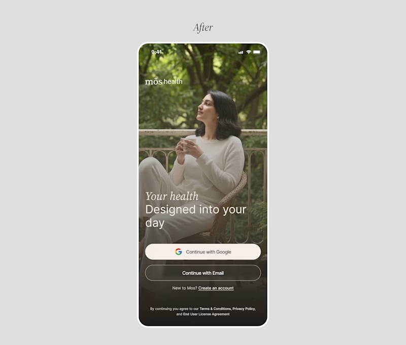
29 votes
Closed

Good catch on the disconnect between the website and signup flow. Carrying that human warmth into onboarding feels especially relevant for healthcare. Have you had a chance to test the redesign with new users?

We Finished one of our Cleanest Website recently, and created few ideas during our Initial Explorations.
Which one do you like the most?
Check the Entire Casestudy, Our Process here

4 voted
50%
4 voted
50%
8 votes
Closed

both are looking outstanding