The network for creativity
Join 1.25M professional creatives like you
Connect with clients, get discovered, and run your business 100% commission-free
Creatives on Contra have earned over $150M and we are just getting started
Back to feedPost

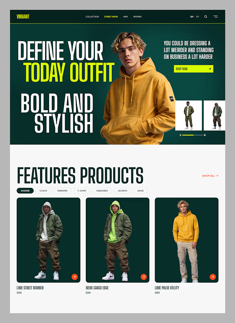
🔥 VIBRANT — Streetwear E-Commerce Landing Page
Just wrapped up this design exploration for a bold streetwear e-commerce store, and I'm excited to share it!
The concept: "Define your today outfit. Bold and stylish."
A few things I focused on:
🔸 High-impact editorial typography — oversized headlines paired with an energetic, cinematic hero image to instantly capture that rebellious street culture vibe
🔸 Frictionless product navigation — clean, accessible category filters (Hoodies, Coats, Sweaters, T-Shirts, Sneakers, Jackets, Shoes) laid out for effortless shopping
🔸 Striking color palette — deep forest greens contrasted with high-voltage yellow-green and punchy orange accents that feel modern and trendsetting
🔸 Conversion-focused layout — strategic "Shop Now" CTAs and clear product cards showcasing prices and styles to turn casual visitors into buyers
The goal was to design an online store that feels less like a generic template and more like a high-end streetwear statement — because that's exactly what modern e-commerce brands need to stand out.
Would love to hear your thoughts! What stands out to you — the hero section, the color story, or the product layout? 👇
#WebDesign #UIDesign #LandingPage #EcommerceDesign #UXDesign #Figma #StreetwearFashion


The network for creativity
Join 1.25M professional creatives like you
Connect with clients, get discovered, and run your business 100% commission-free
Creatives on Contra have earned over $150M and we are just getting started

Challenges
View all


Related posts

Luxury Fashion E-commerce Landing Page
A premium e-commerce website concept created for a modern luxury fashion brand. The experience focuses on elegant visuals, refined typography, and an intuitive shopping journey that reflects the brand's premium identity.
Project Goal💯
The objective was to design a sophisticated online shopping experience that combines visual storytelling with seamless product discovery. Every section was crafted to highlight the brand's quality, build trust, and encourage conversions while maintaining a clean, minimal aesthetic.


Stunning work


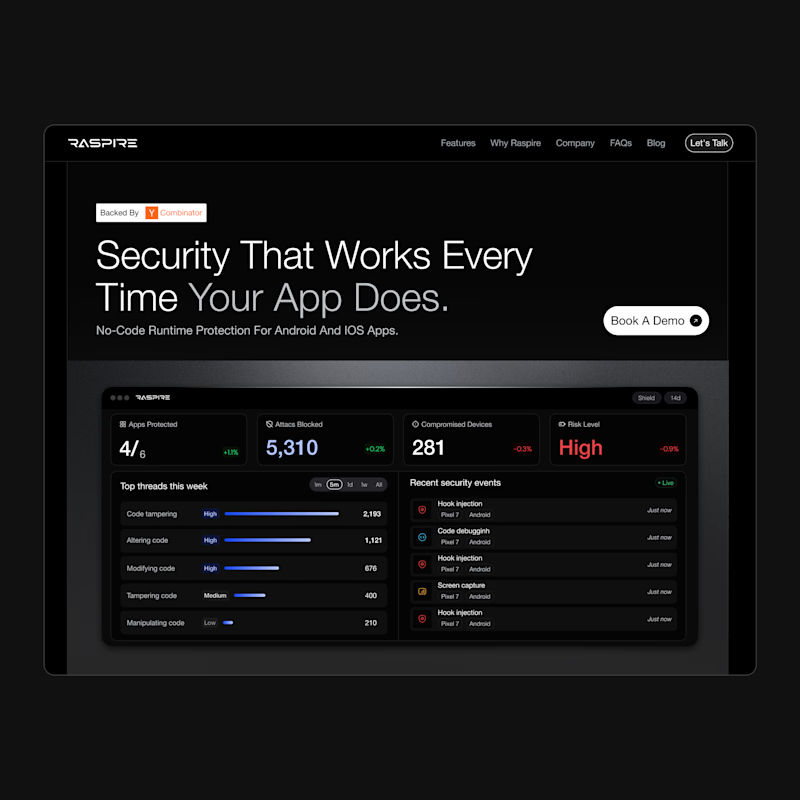
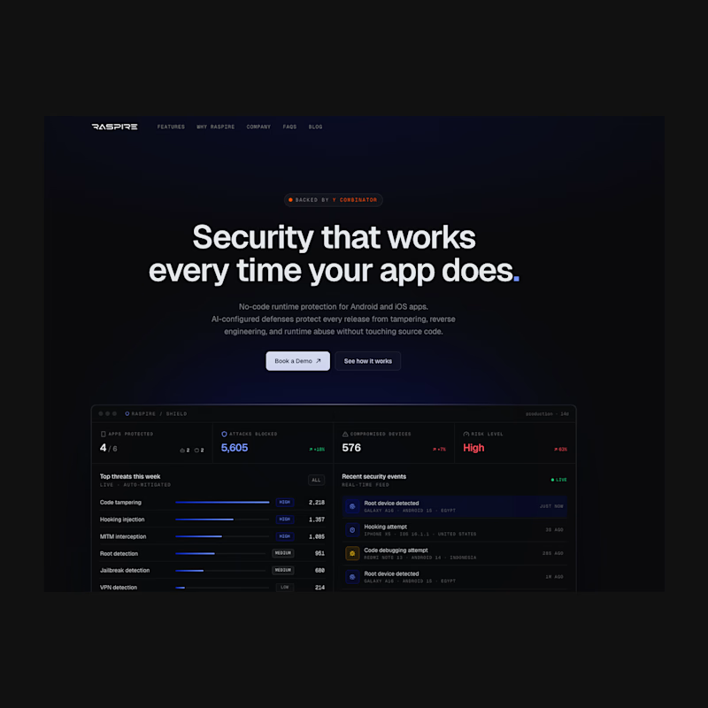
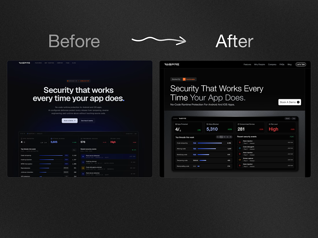

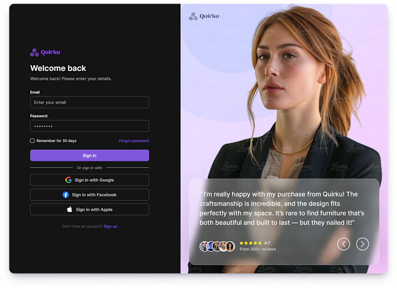
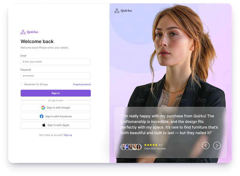
Which one works better for you — Light or Dark? 👀
11 voted
46%
13 voted
54%
24 votes
Closed

Both of them are great ❤️❤️