The network for creativity
Join 1.25M professional creatives like you
Connect with clients, get discovered, and run your business 100% commission-free
Creatives on Contra have earned over $150M and we are just getting started
Back to feedPost

The CMS Inquiry Funnel in Framer : Explore Advance CMS Capabilities
Framer CMS is an excellent tool for building inquiry-driven websites, such as agency portfolios, service-based businesses, or SaaS landing pages. Creating an "inquiry funnel" means structuring your CMS content to guide visitors from awareness to action.
Here is how to structure a CMS Inquiry Funnel in Framer:
1️⃣. Structure Your CMS Collection
Set up your CMS fields to support a journey. Don’t just add a title and description; add fields that facilitate a sale.
Fields to add: Title, Description, Image, CTA Link, CTA Text, Price Point, Feature List.
2️⃣. Design the "Awareness" Phase (List Page)
Create a CMS Listing Page that showcases your items (e.g., services, projects, or use cases).
Framer Component: Use a Collection List.
Goal: Provide enough information for users to be interested but not overwhelmed.
Design Tip: Use grid layouts for projects, or a clean vertical list for services.
3️⃣. Design the "Evaluation" Phase (Detail Page)
Create a CMS Detail Page for each item. This is where you explain the value proposition deeply.
Structure:
Hero Section: Clear title and summary.
Value Section: Use rich text or custom CMS fields to explain benefits.
Evidence Section: Add a reference to a "Testimonials" CMS or images of work.
Action Section: A prominent form or button linking to the next step.
4️⃣. Create the "Conversion" Phase (The Inquiry)
Create a dedicated inquiry page or a section at the bottom of every CMS page.
Framer Component: Use a Form Component.
Action: When a user clicks "Request Quote" on a CMS Detail page, they go to a page with a form that asks for:Name, Email, The specific Service/Project they are interested in (hidden field linked to the CMS title).
5️⃣. Finalize the Flow
Visitor arrives on Home Page.
Visitor clicks a CMS item on the List Page.
Visitor reads details on the Detail Page.
Visitor clicks CTA, which goes to the Inquiry Form.
By organizing content in the CMS, you can update services or projects without redesigning the pages, allowing your inquiry funnel to evolve with your business.

The network for creativity
Join 1.25M professional creatives like you
Connect with clients, get discovered, and run your business 100% commission-free
Creatives on Contra have earned over $150M and we are just getting started








Related posts

New template for craft studios, pottery studios and creative workshops. Meet Handsel.
Visitors find a class, see which dates are open, nearly full or sold out, and either book through your own booking tool or send a request that lands in your inbox. Tutors, crafts, open studio plans, private groups and gift cards each get their own page, all in the Framer CMS.
16 pages, 7 CMS collections, real content, no lorem.
Get it here → https://contra.com/products/lHTpjaNx-handsel-creative-workshop-and-pottery-studio-framer-template

Omg this is very clean and creative, interactive love the text spacing and overall design concept

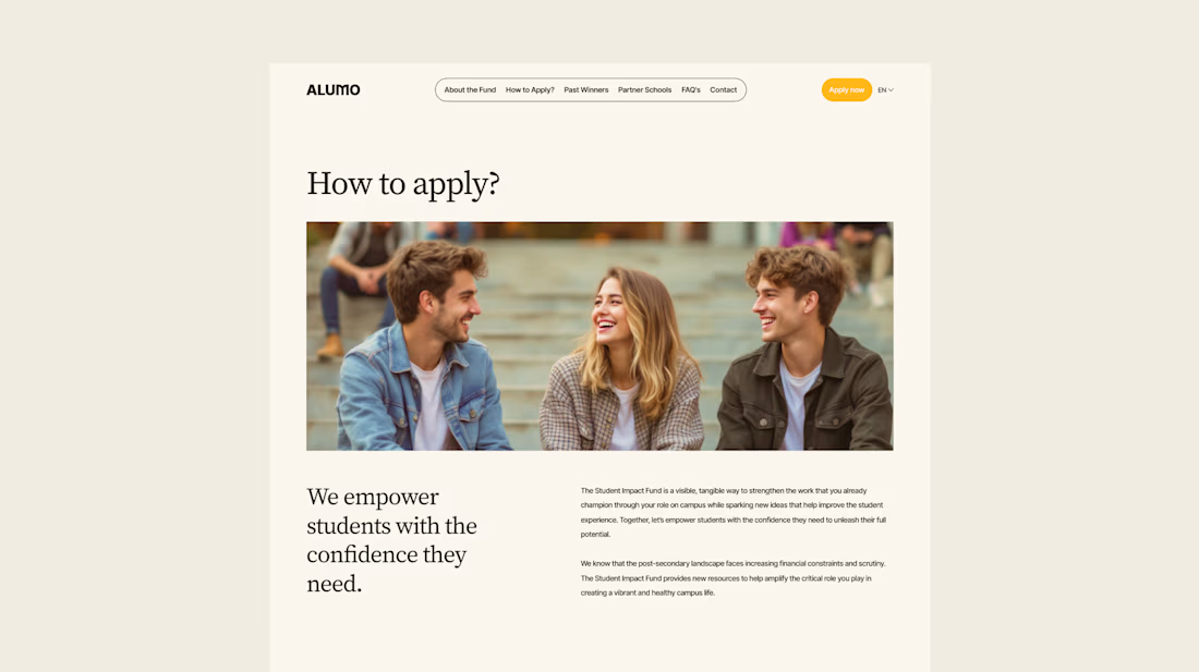
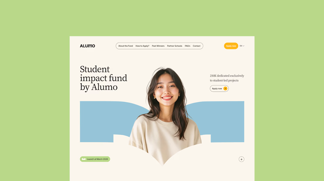
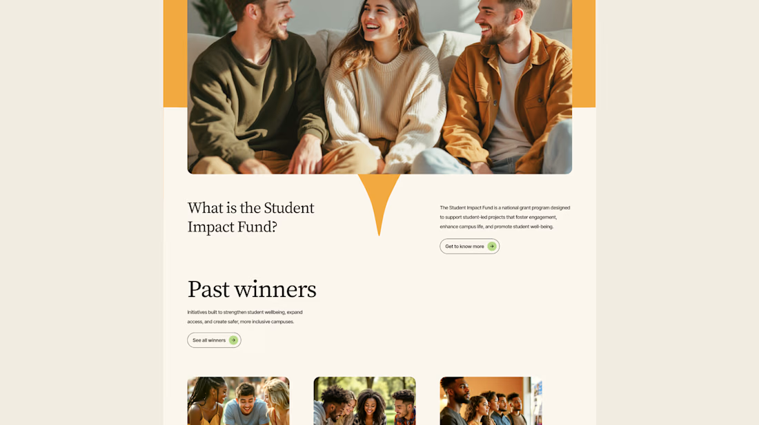
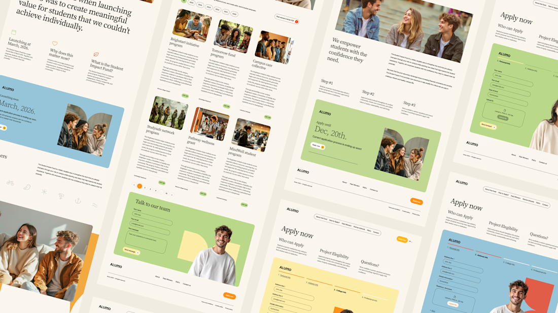
The Client: Alumo is a student impact fund that pools collective influence from influencers and partner schools to deliver a $250,000 annual grant program for student-led projects across Canada.
The Issue: The fund needed a website that could communicate trust and purpose to two very different audiences — students applying for grants and partner schools or influencers considering joining — while also showcasing past winners and guiding applicants through the process clearly.
The Solution: A multi-page website was designed with a warm, approachable visual identity using earthy tones, generous imagery, and clear information hierarchy. Each section — About, Past Winners, and How to Apply — was structured to reduce friction and build confidence, making it easy for students to understand eligibility and take action before the deadline.


Love how you're tackling trust + purpose for a $250K fund - that's a tough balance with two audiences. Communicating credibility for a student-led initiative across Canada is huge. Would love to see how you solved it!

Introducing AlignIQ — now live on Framer! 🚀
AlignIQ is an AI-powered planning workspace concept designed to help teams turn ideas into actionable plans, keep projects aligned, and make smarter decisions.
The product concept focuses on four core features:
• AI Planner — Turn goals into structured plans with clear milestones and next steps.
• Projects — Organize work, track progress, and keep everyone aligned.
• Roadmap — Visualize milestones, dependencies, and timelines with AI-powered suggestions.
• AI Insights — Identify risks, uncover blockers, and get recommendations before problems grow.
I turned this concept into a complete Framer website template, combining interactive mobile app showcases, editorial layouts, custom blue-duotone photography, and subtle animations.
Built for AI mobile apps, productivity platforms, planning tools, and startups looking to showcase their products through a modern, engaging website.
🎁 Free for a limited time, then $29.
Available on the Framer Marketplace!

The Framer execution looks butter smooth! Loving the deep blue palette and typography layout. AI planning tools often look cluttered, but this looks super clean and focused. Great launch, Ahmad!