The network for creativity
Join 1.25M professional creatives like you
Connect with clients, get discovered, and run your business 100% commission-free
Creatives on Contra have earned over $150M and we are just getting started
Back to feedPost
Taste Test

Quick input needed 👇
For the Pillarum Framer template (built for consulting firms).
Which blog section layout works better on the homepage?
Curious to hear your thoughts.
5 voted
45%
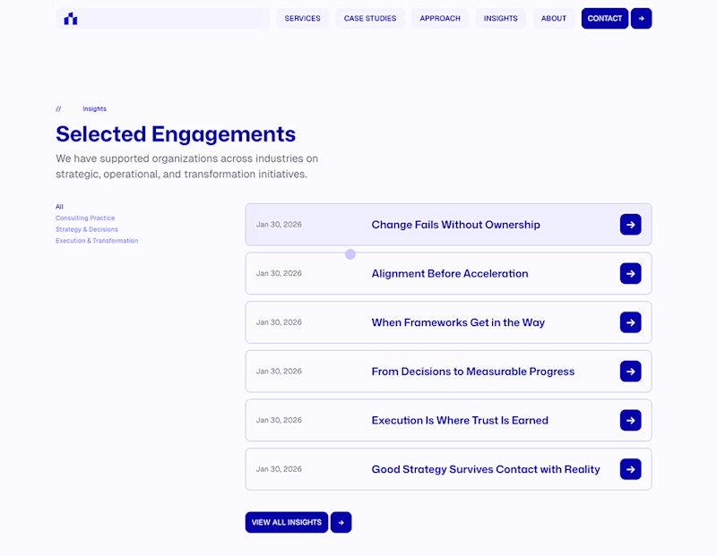
6 voted
55%
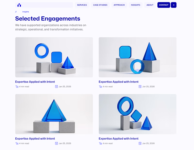
11 votes
Closed

The list layout is the winner here even tho the card layout is more common and more regarded as the beautiful design. But aesthetic won't convince people to trust the firm if it doesn't scream leadership. The list layout fits better for consultancies who sell intellectual capital😊
Well said.
Appreciate the thoughtful input.

Thanks Muhammad 😊

I think the Card layout works better for a homepage. Its more visual and does a better job of drawing the user into the individual stories.
That’s a fair point.
Cards are strong for visual entry and discovery.
The trade-off I’m weighing is attraction vs. authority — especially for consulting firms where credibility often needs to lead.
Appreciate the perspective.
The network for creativity
Join 1.25M professional creatives like you
Connect with clients, get discovered, and run your business 100% commission-free
Creatives on Contra have earned over $150M and we are just getting started
Related posts

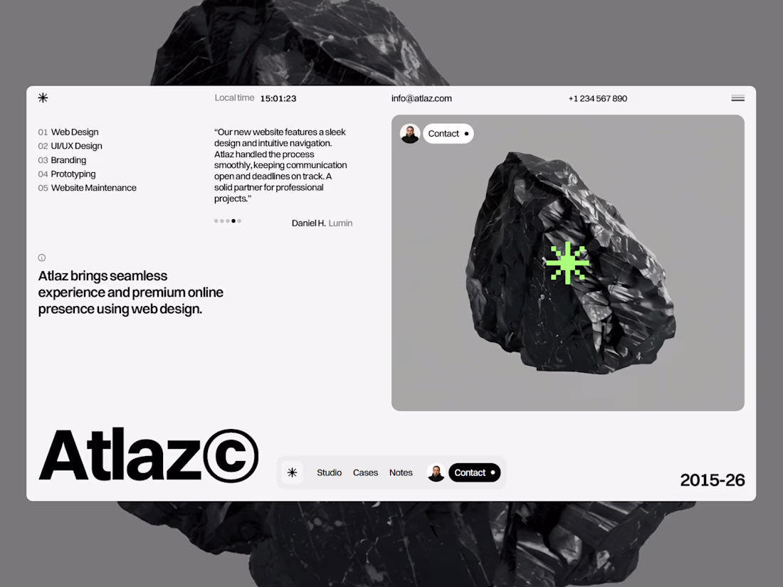
🚨My Website Template Atlaz is LIVE on the Framer Marketplace🚨
Atlaz is the go-to Framer template for creative agencies. Responsive design, built-in CMS, SEO optimization, smooth animations, and total customization, everything your digital agency website needs.
Live Preview: https://atlaz.framer.website/
Check out the template: https://www.framer.com/marketplace/templates/atlaz/


Nice work


my name kevin means crazy, so i made this really cool component hover effect on framer


Building the $12k landing page I'd charge a pre-seed/seed founder — live in public.
For Aria - AI meeting notes that joins your calls, records everything, and delivers clean transcripts + action items before you close the tab.
First sections done:
- Hero that builds trust fast
- Clean product mockup
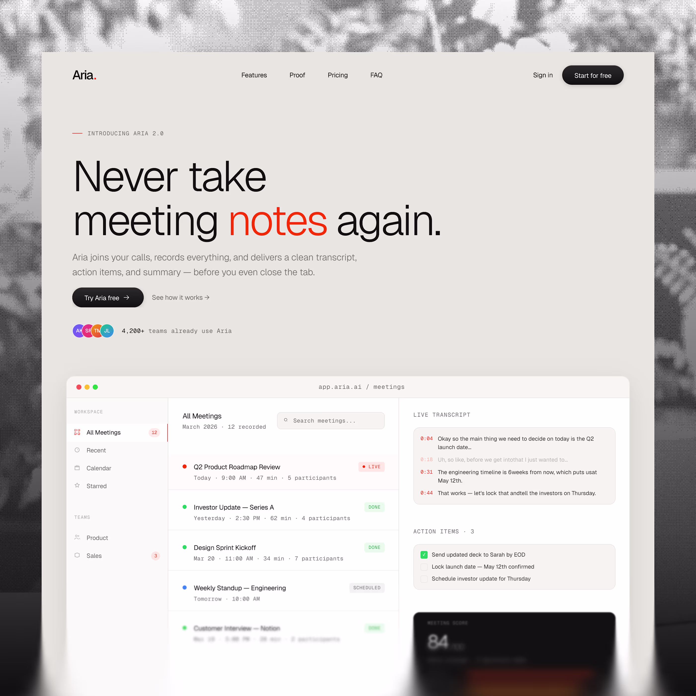

Can't wait to see the end!


Trending
portfolioreview
The best portfolios tell a story, not just show a grid. Share yours for feedback.
brandguidelines
Brand guidelines are becoming living systems, not static documents. What are you building for your clients?
aivideo
AI video tools are moving at warp speed. Which ones are you experimenting with?
freelancerlife
Freelancer life is wins, pivots, and everything in between. What’s yours right now?
aidesignflow
AI tools are redefining how design gets made. What does your workflow look like?