The network for creativity
Join 1.25M professional creatives like you
Connect with clients, get discovered, and run your business 100% commission-free
Creatives on Contra have earned over $150M and we are just getting started
Back to feedPost

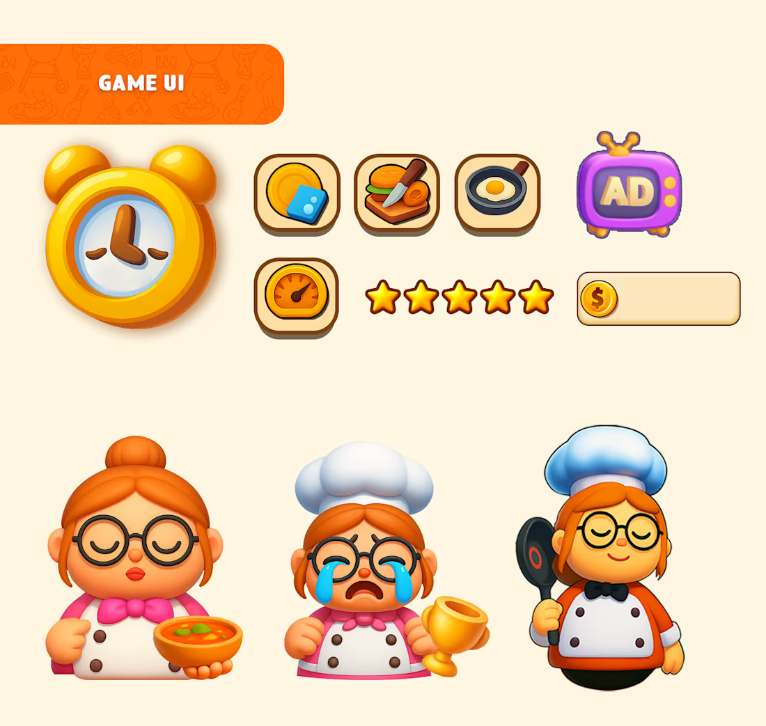
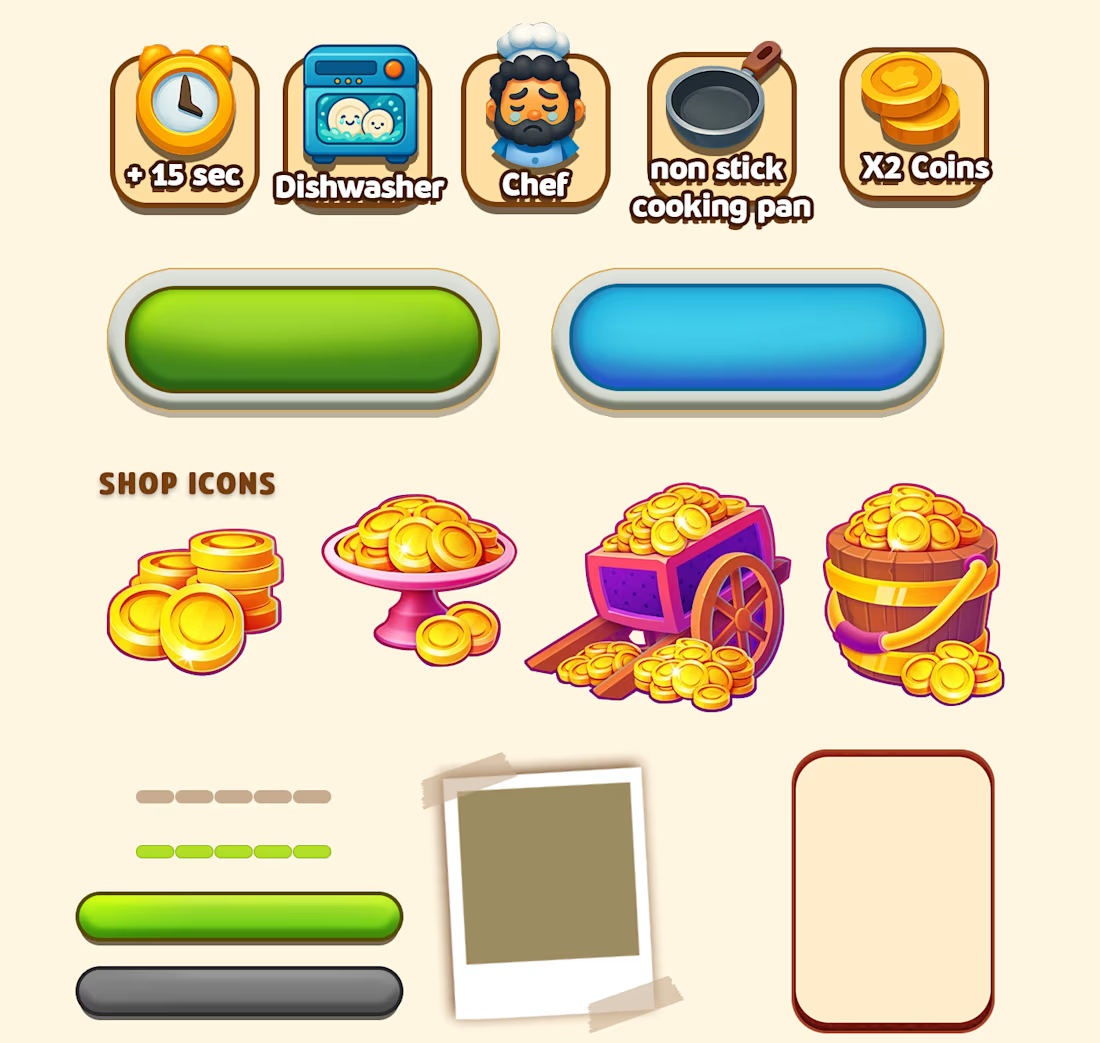
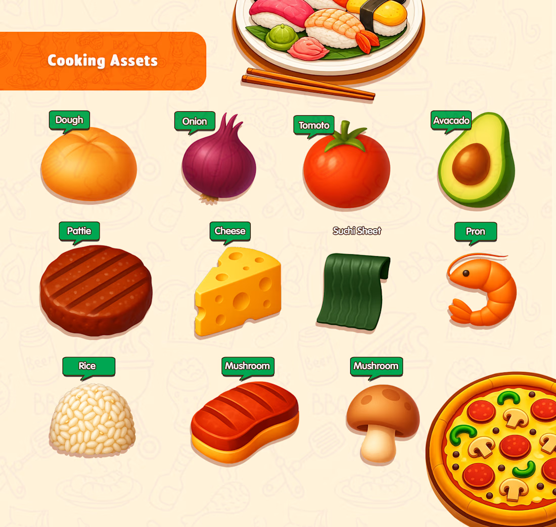
Cooked Over: Kitchen Madness — Game UI/UX
How do you make a chaotic cooking game feel simple and fun?
I designed the complete Game UI/UX, including:
🎮 Interactive UI elements
💬 Pop-ups & panels
🍽️ Custom dish icons
✨ UI icons & visual elements
🧭 Player-friendly navigation & flow
My focus was more than aesthetics I designed the experience around clarity, engagement, and smooth player flow, so every interaction feels intuitive while keeping the kitchen chaos fun.


The network for creativity
Join 1.25M professional creatives like you
Connect with clients, get discovered, and run your business 100% commission-free
Creatives on Contra have earned over $150M and we are just getting started





Related posts


Definitely the new one. Seems more fluid and easier to interact with

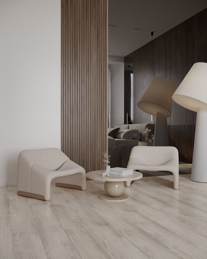
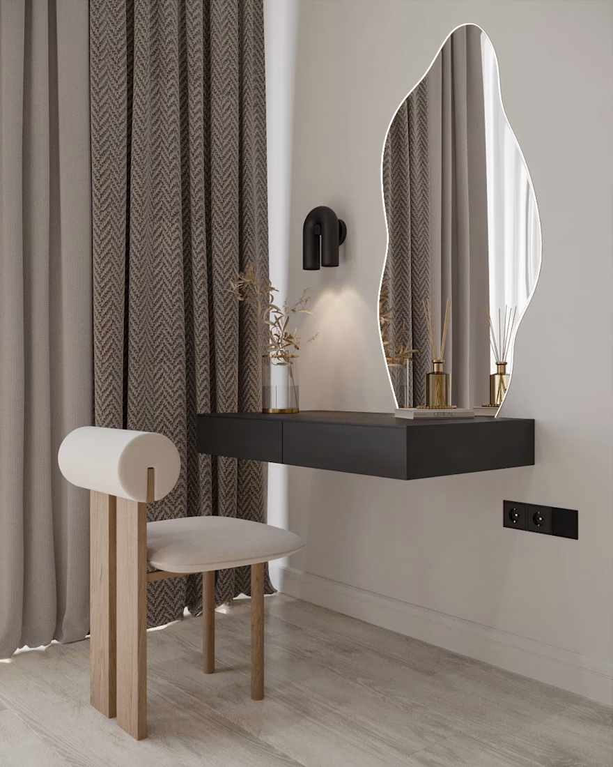
Sunny & Cozy Apartment
An apartment in Canada
Location: Toronto, Canada
Date: 2026
The main goal:
To create a minimalistic and comfortable home that feels warm, inviting, and cozy from the very first moment.
#InteriorDesign #LivingRoomDesign #ArchitecturalVisualization #3DRendering #ResidentialDesign
Adobe PhotoshopAutodesk 3ds MaxChaos Corona3D ModelingInterior Design Architecture & Interior Design






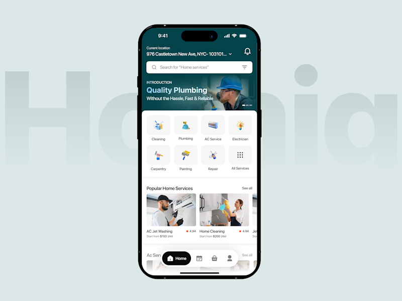
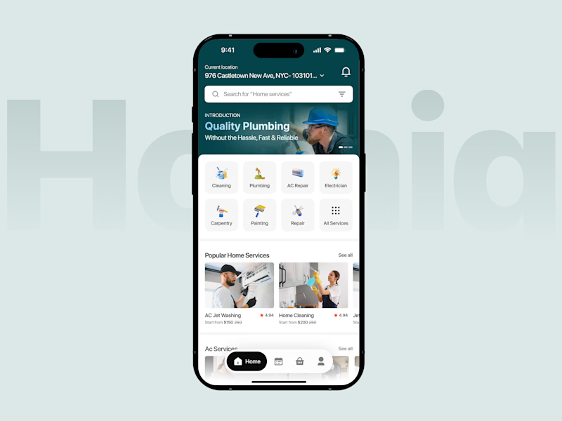
Which Homepage Feels Easier to Use?
A home services app should make finding the right professional simple and effortless.
Version A - Compact Layout. Keeps the service categories, popular services, and navigation close together, helping users explore more content with less scrolling.
Version B - Spacious Layout. Gives service categories and popular services more breathing room, creating a cleaner interface with a stronger visual hierarchy.
Both approaches aim to make booking home services easier, but they offer different browsing experiences.
Which version would you prefer when looking for a home service?


2 voted
100%
0 voted
0%
2 votes
Closed
