The network for creativity
Join 1.25M professional creatives like you
Connect with clients, get discovered, and run your business 100% commission-free
Creatives on Contra have earned over $150M and we are just getting started
Back to feedPost

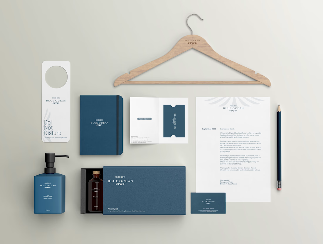
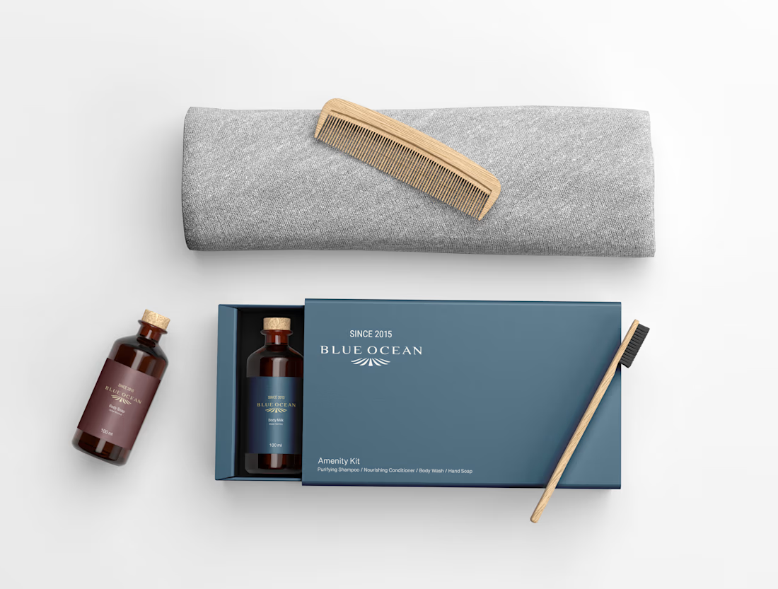
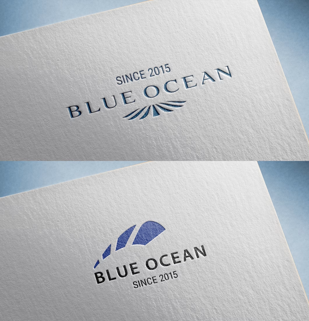
This minimalist logo design for a resort hotel is centered on the themes of tranquility and refined simplicity. Through typography, an understated color palette, and balanced composition, it expresses a calm and sophisticated atmosphere.
Originally created over 10 years ago, the logo is now presented as a mockup.


The network for creativity
Join 1.25M professional creatives like you
Connect with clients, get discovered, and run your business 100% commission-free
Creatives on Contra have earned over $150M and we are just getting started








Related posts

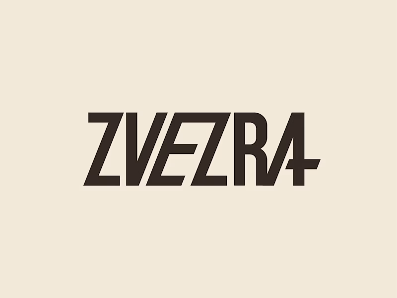
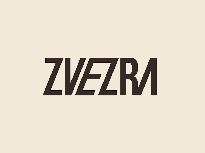
Which ZVEZRA logo direction do you prefer? 👀
I’ve been exploring two variations of the wordmark. Both follow the same visual direction, but each has its own character.
Vote below!
I’d love to hear your thoughts! 👇
39 voted
53%
34 voted
47%
73 votes
Closed

Option 1 for me, it has a bit more personality. Both are strong though, tough call

Designed this concept poster for the Koenigsegg CCGT1.
Art direction, layout, grade: all mine.




good one



Professional work. Keep it up.