The network for creativity
Join 1.25M professional creatives like you
Connect with clients, get discovered, and run your business 100% commission-free
Creatives on Contra have earned over $150M and we are just getting started
Back to feedPost


Thanks Alice

Congratulations 🎉 ::
Thanks Zarbaz


Congrats!!
Thanks Subash

congrats
Thank you Naveen


Thanks Nabeel.


👏👏👏

Congrats 👏
The network for creativity
Join 1.25M professional creatives like you
Connect with clients, get discovered, and run your business 100% commission-free
Creatives on Contra have earned over $150M and we are just getting started











Related posts


congratulation on your milestone


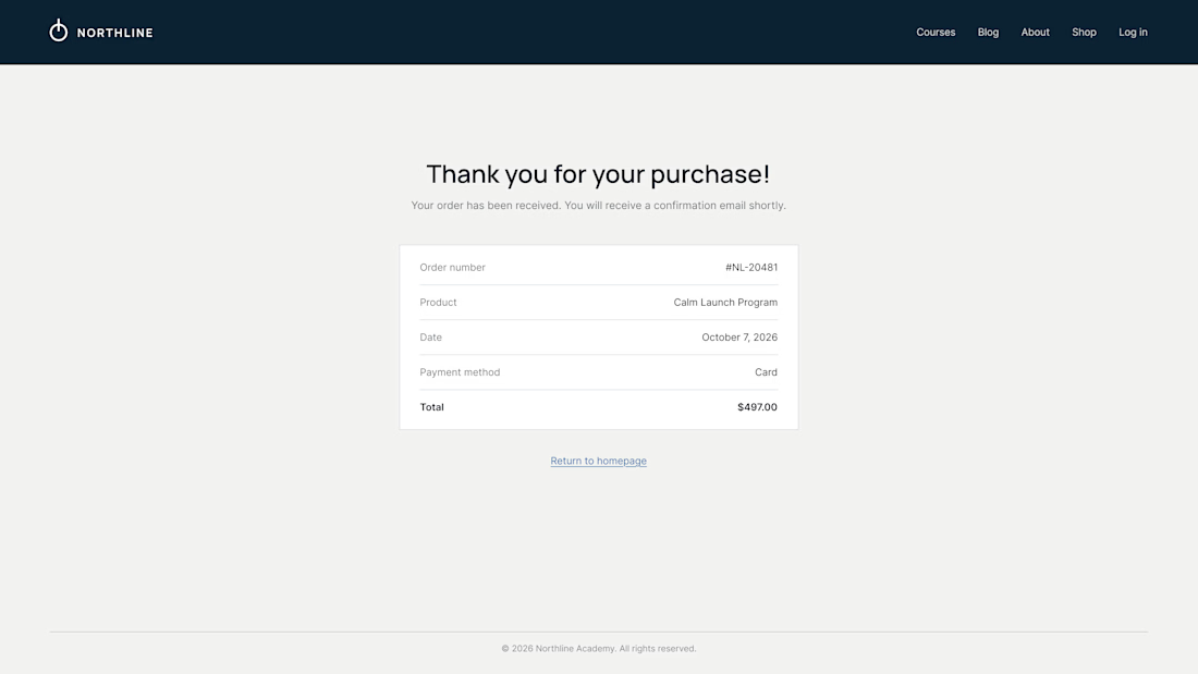
What does your customer see 3 seconds after paying?
On most Kajabi sites it's a plain "Thank you for your purchase" and a receipt. It's the moment of highest trust, and the page offers nowhere to go.
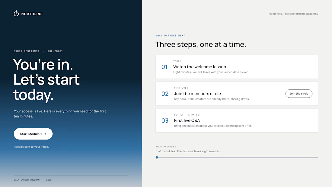
So we design the thank-you page as the first page of the course:
01 – One clear first step. "Start Module 1" sits above everything else. Momentum beats confirmation.
02 – A visible "what happens next". Today, this week, the first live call, with a calendar button. Clear dates calm the doubts that come right after paying.
03 – Proof they're in the right place. A link to the community, a human email they can reply to, progress at 0 of 8.
The receipt still lives in the inbox. It just isn't the headline.
Same brand, same colors. The only difference is where the page leads.
What did the last thank-you page you saw actually ask you to do?

Love the focus on making the experience feel simple for users.

Top 1% on Contra. 🎉
Grateful to everyone who has supported my work, shared feedback or trusted me with a project.Excited for what’s next
Back to building.
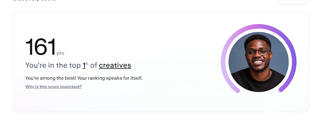

Congrats, Abel. Top 1% with 161 pts is no small thing, that ranking is earned one delivered project at a time. The quiet gratitude in this post says a lot too. Back to building is the right energy, what are you working on next?