The network for creativity
Join 1.25M professional creatives like you
Connect with clients, get discovered, and run your business 100% commission-free
Creatives on Contra have earned over $150M and we are just getting started
Back to feedPost
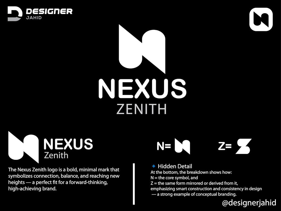
Letter N and Z combine Nexus Zenith Technology Company Logo.
The NEXUS ZENITH logo you shared is a clean, modern design with smart geometric symbolism and strong visual logic. Here’s a breakdown of its structure and meaning:
1. Primary Symbol
The main mark is an abstract, minimalist shape that cleverly combines:
The letter “N” for Nexus
The letter “Z” for Zenith
The designer achieved this by merging two mirrored shapes:
The left side forms a diagonal and a curve that represent half of the letter N.
The right side mirrors this but is flipped vertically, subtly creating the Z when viewed together.
This duality symbolizes connection and unity—fitting for the word Nexus (which means a link or bond).
Concept Summary
N = Nexus → Connection, unity
Z = Zenith → Peak, excellence
The fusion of N and Z visually represents the brand’s theme

The network for creativity
Join 1.25M professional creatives like you
Connect with clients, get discovered, and run your business 100% commission-free
Creatives on Contra have earned over $150M and we are just getting started
Trending
Claude
Claude has entered the design space. How are you using Claude Design?
Contra University
Learn from expert creatives how to earn more using next-gen AI tools.
creativeaiflow
Creative AI workflows are evolving. What tools do you use, and what are their strengths and weaknesses?
portfolioreview
The best portfolios tell a story, not just show a grid. Share yours for feedback.
freelancerlife
Freelancer life is wins, pivots, and everything in between. What’s yours right now?