The network for creativity
Join 1.25M professional creatives like you
Connect with clients, get discovered, and run your business 100% commission-free
Creatives on Contra have earned over $150M and we are just getting started
Back to feedPost

🚧 GREYFORGE is live on Framer
A premium construction and design-build template built for contractors, builders, renovation firms, and construction companies that need more than a basic brochure site.
Projects, services, process, estimate CTAs, case studies, service areas, and a strong mobile experience all designed around one goal: turning trust into enquiries.
GREYFORGE We build what lasts.
Available now on my Framer profile.
#Framer #FramerTemplate #ConstructionWebsite #ContractorWebsite #WebDesign

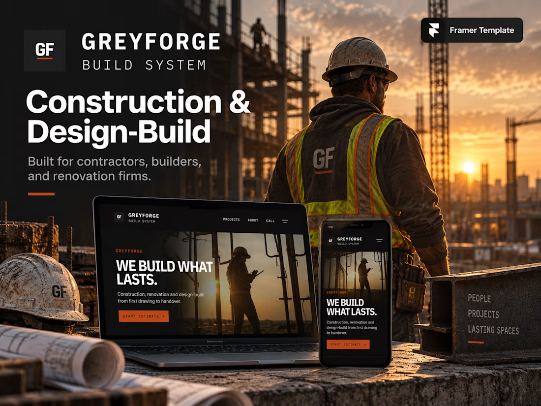

The hard-hat hero reads as a job site right away, not a generic SaaS skin. Putting estimate CTAs next to case studies is the right order for firms that have to prove the work first.
The network for creativity
Join 1.25M professional creatives like you
Connect with clients, get discovered, and run your business 100% commission-free
Creatives on Contra have earned over $150M and we are just getting started





Related posts


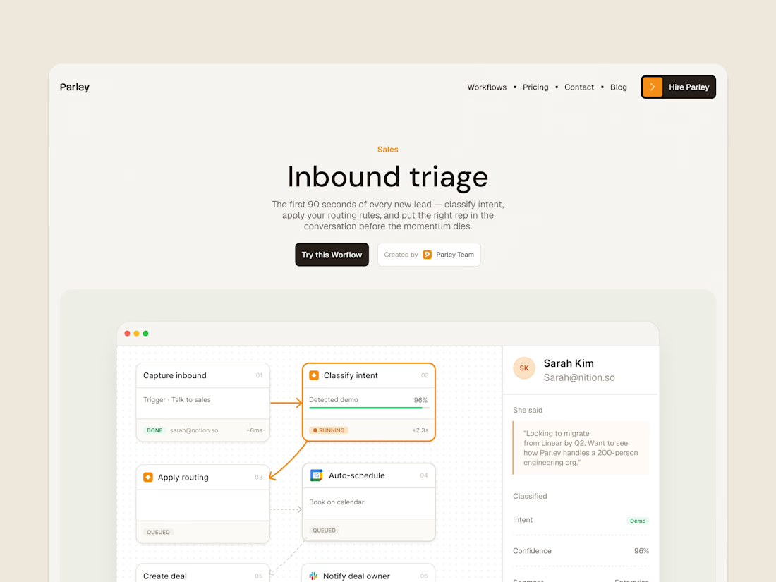
parley’s inbound triage page, with the workflow laid out below the introduction.
get it free now → https://framer.link/s1Llkdh

Nice work!

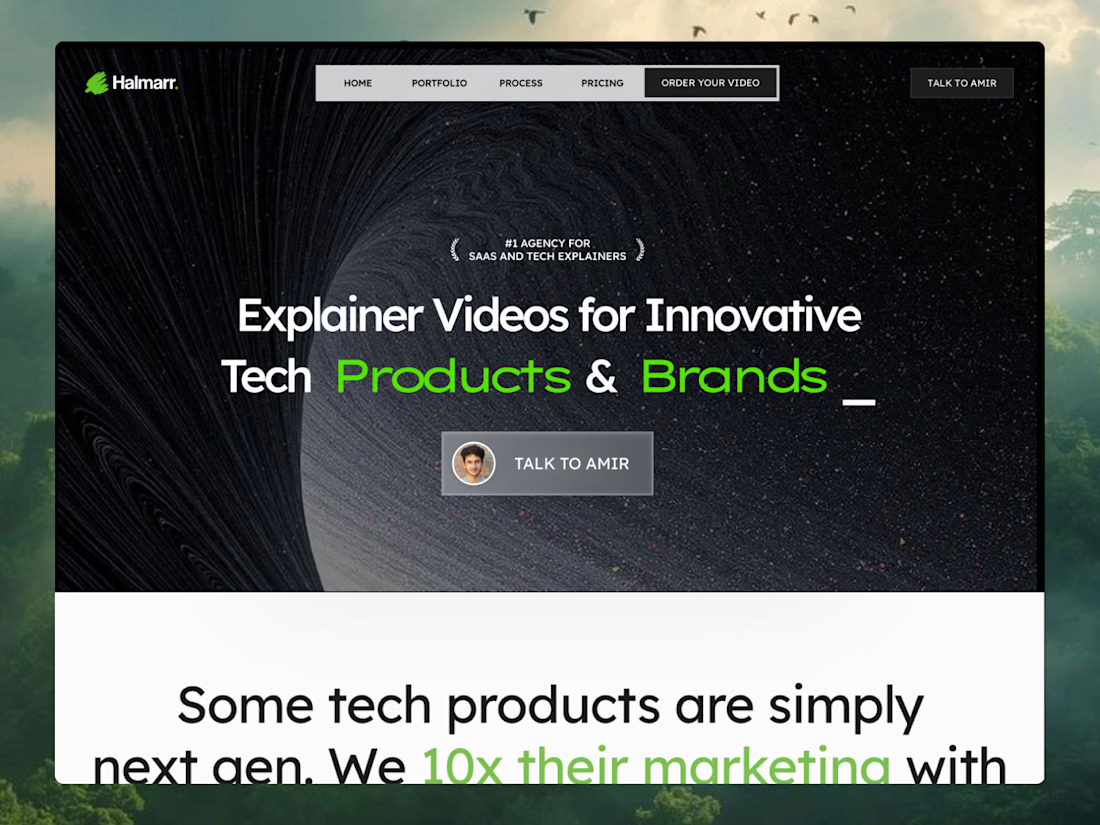
Just launched a new Framer template The MotionStudio Mograph, designed specifically for motion design studios and B2B SaaS marketing agencies.
Running Vixels and focusing heavily on Conversion Rate Optimization has shown me exactly where creative agency websites leak leads. I wanted to take those core CRO principles, clear visual hierarchy, strategic social proof, and frictionless user journeys & pack them into a ready-to-launch layout.
This template is structured to help creative founders sell high-ticket services, featuring:
A conversion-engineered project portfolio
Built-in trust badge and founder message sections
Flawless breakpoints across all viewports
If your studio builds next-gen tech products or SaaS explainer videos, your website should be your best salesperson.
Check out the live preview and grab the template here: https://proud-fade-319532.framer.app/



perfect visual balance

Just created a playful footer to add personality to your website! Check it here
If you want this for free, just lemme know and i will DM you with the link!
I like the playful design. This is a high-quality footer, the best one I have seen today.