The network for creativity
Join 1.25M professional creatives like you
Connect with clients, get discovered, and run your business 100% commission-free
Creatives on Contra have earned over $150M and we are just getting started
Back to feedPost



The network for creativity
Join 1.25M professional creatives like you
Connect with clients, get discovered, and run your business 100% commission-free
Creatives on Contra have earned over $150M and we are just getting started
Related posts


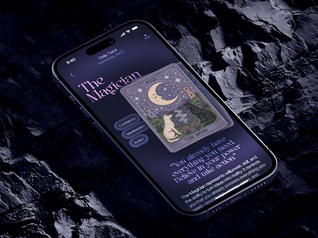
Just in time for Halloween! 🎃🔮 Excited to share this mystical tarot reading app concept, inspired by a little spooky season magic. Would love to hear your thoughts! ✨


Excellent work!

Brand Expressions -- Merdes




love this