The network for creativity
Join 1.25M professional creatives like you
Connect with clients, get discovered, and run your business 100% commission-free
Creatives on Contra have earned over $150M and we are just getting started
Back to feedPost
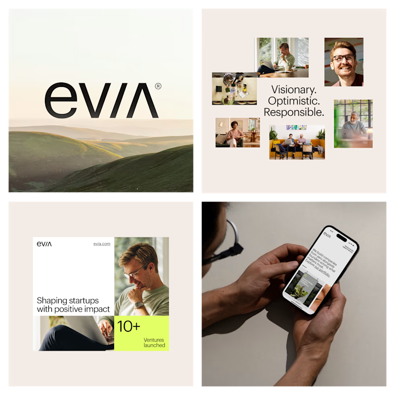
Taste Test
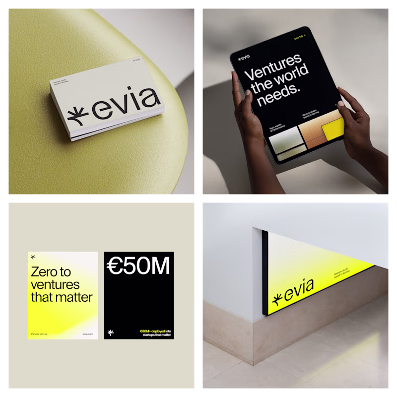
Evia A hits hard! The branding is so clean and bold, I love the energy
Voted B because it actually shows people working, emotion, collaboration. But the option A logo is better, more memorable.
If I may, I'd suggest to be more clear with what the company does and avoid abstract language such as "what matters most", "ventures the world needs"....
Agree — the brand direction on the right is stronger and more distinctive. But bringing in some of the human emotion and real-world energy from the first one could make it feel more alive and relatable. Best of both worlds. 👌
But what do you guys actually do?
B is more descriptive
They both look good IMO
A is cleaner.
version A is a definition of clarity
This is nice
The human interaction with the human face, most probability🧠
Option A logo for me
I opted for A. The cleaner, more legible wordmark really tipped it for me.
Positivity and clarity are better paired with white than with black. Aside from that, B shows real people and better implies connectivity than bold typography. Good design
Both are so clean🔥
Direction A feels punchier and more modern, but Direction B captures that human/visionary spirit a bit more effectively. Tough choice, but B feels very aligned with your mission
The network for creativity
Join 1.25M professional creatives like you
Connect with clients, get discovered, and run your business 100% commission-free
Creatives on Contra have earned over $150M and we are just getting started
Trending
Claude
Claude has entered the design space. How are you using Claude Design?
Contra University
Learn from expert creatives how to earn more using next-gen AI tools.
MagicPath
The canvas is infinite, and exploration is becoming the workflow. How are you using MagicPath?
creativeaiflow
Creative AI workflows are evolving. What tools do you use, and what are their strengths and weaknesses?
freelancerlife
Freelancer life is wins, pivots, and everything in between. What’s yours right now?