The network for creativity
Join 1.25M professional creatives like you
Connect with clients, get discovered, and run your business 100% commission-free
Creatives on Contra have earned over $150M and we are just getting started
Back to feedPost
Taste Test
Designed 2 Hero's
A or B?
36 voted
38%
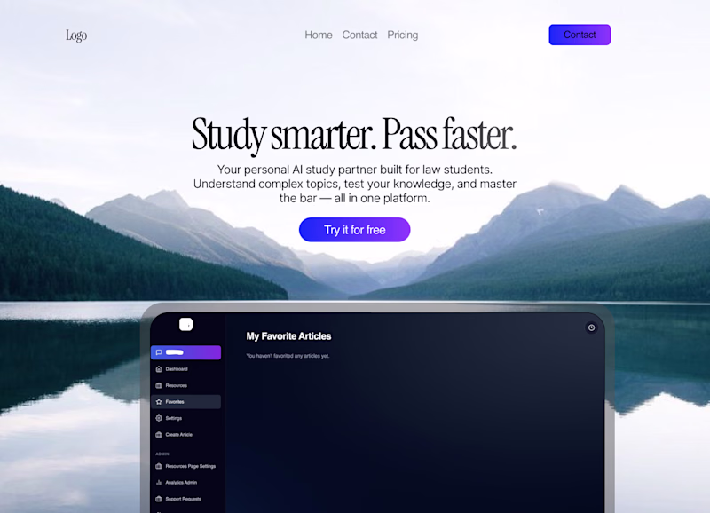
59 voted
62%
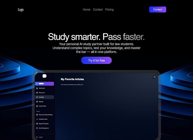
95 votes
Closed
Variant B is amazing
B is better
B
B matches the dashboard styling better
A is more attractive!
Option B is more aligned with the goals.
B clearly wins, stronger contrast on that CTA pulls the eye instantly, perfect for conversion driven heroes
great work 🔥
Dark looks more better!
Although B reminds me of the Amazon Prime intro logo, it reads a lot better in comparison to A. I do like the spacing between button and screen on A though. Great Job!
B is cooler.
B feels a bit crowded to me with the elements
A looks more shiny but way more distracting, I think B would convert better
Use Both
The type is better imo, but I think both designs lack focus and a specific feel for your product, and both images should probably vary less, but great work
B looks clean 🙌 @Danish Nazar
B is better
B
bold and confident vibes!
B works for me
i love the dark mode
I'll go for B
The network for creativity
Join 1.25M professional creatives like you
Connect with clients, get discovered, and run your business 100% commission-free
Creatives on Contra have earned over $150M and we are just getting started
Challenges
View allTrending
Claude
Claude has entered the design space. How are you using Claude Design?
Contra University
Learn from expert creatives how to earn more using next-gen AI tools.
fifaworldcup2026
The World Cup is here and the whole world's watching. How are you designing for the world stage?
creativeaiflow
Creative AI workflows are evolving. What tools do you use, and what are their strengths and weaknesses?
freelancerlife
Freelancer life is wins, pivots, and everything in between. What’s yours right now?