The network for creativity
Join 1.25M professional creatives like you
Connect with clients, get discovered, and run your business 100% commission-free
Creatives on Contra have earned over $150M and we are just getting started
Back to feedPost
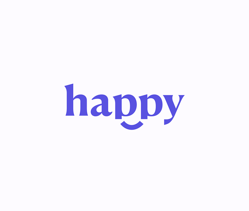
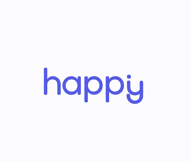
Taste Test
Guys, we're currently working on rebranding our studio.
Help me choose a logo!
179 voted
66%
94 voted
34%
273 votes
Closed
At first glance i connected more with the V1.
V1 is obvious!
Hi Tamara 👋
If your studio leans more towards marketing and expressive branding, I’d choose V1. If it’s more dev focused with a restrained and reliable tone, V2 makes more sense.
Without context, V1 feels more “Happy” to me😊
I like that your option selection was backed up with a reason for each choice.😊
v1 at first glance, but tbh I have for a task deep more about what your studio is about to have more context to get a better opinion on the selection, put just purely for a visual thing, I would go for v1.
Thanks everyone! You help a lot 🙏
Def "V1"
The first version seems visually more balanced, Tamara jan. I'd still play with the kerning and tracking though - give those letters some breathing room and it'll come together.
Heey, thank you and so nice to see a fellow Armenian here 🙌🏻
Likewise 😄
Hi Tamara, V1 resembles "happy" better than V2. Choose V1
V1 looks really nice with the smile
For me, it's easier to catch the smile on V1 than V2. In addition, does your studio have a target niche? I see that this can also be a factor.
Both look great but V1 gets my vote. The contrast in the letterforms feels more premium and unique for a design studio. Can not wait to see which one you go with!
clever idea, like both!
Though I’m not a designer, I’d suggest primarily using V2, keeping its font and details (including the “y”), and pairing it with the happy face from V1. This would make the logo feel more friendly and approachable.
Right now, V1 comes across as a bit formal and slightly...
oo I always find these so hard! V1 is more distinctive and reads as happier to me.
Yeah, it's hard indeed 😂 Thank you!
V2
v2 is best
First one has so much more personality than V2. Love it!
Thank you!
Me gusta más la versión 1
Gracias!
I really like how both look, but V1 just appeals to me more, it feels more comforting. Great work!
V1 for me.
- Has more personality to it.
- Looks and feels unique to stand out unlike the V2 which looks a bit generic.
- The round letters give off the vibe of premium + comfort. Fire combination.
version 2 does it for me
I like V1 more because the smiling face is clearly visible. Good work 🙌
V1 looks really good. This is another way to look at it.
Oh thank you hahah 😄 Indeed!
V.1 very strong and easy to make fav icon 😊
The network for creativity
Join 1.25M professional creatives like you
Connect with clients, get discovered, and run your business 100% commission-free
Creatives on Contra have earned over $150M and we are just getting started
Trending
Claude
Claude has entered the design space. How are you using Claude Design?
Contra University
Learn from expert creatives how to earn more using next-gen AI tools.
creativeaiflow
Creative AI workflows are evolving. What tools do you use, and what are their strengths and weaknesses?
freelancerlife
Freelancer life is wins, pivots, and everything in between. What’s yours right now?