The network for creativity
Join 1.25M professional creatives like you
Connect with clients, get discovered, and run your business 100% commission-free
Creatives on Contra have earned over $150M and we are just getting started
Back to feedPost
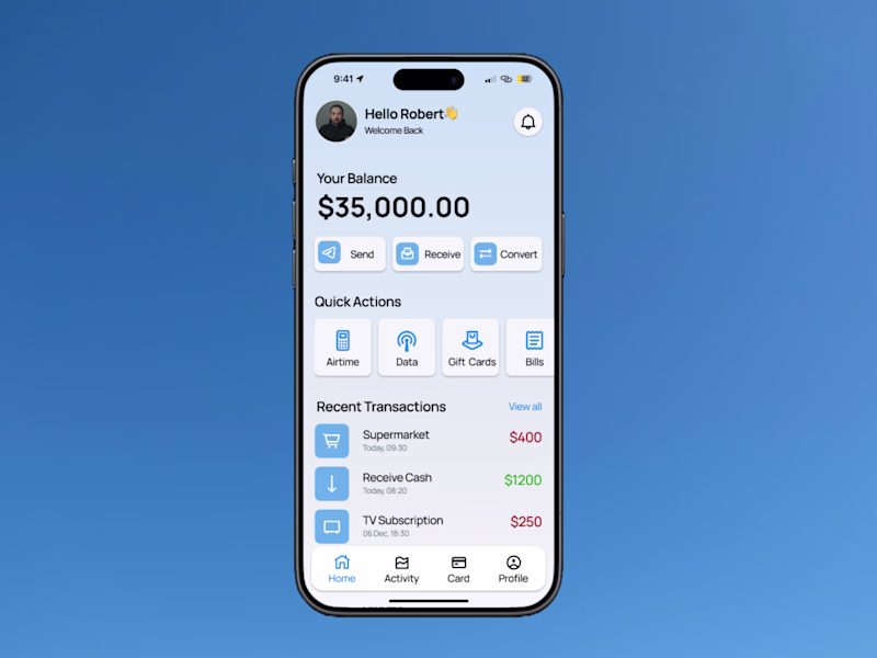
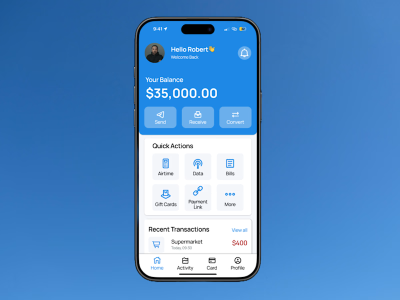
Taste Test
Hey designers!👋
I just wrapped up designing two versions of a banking app home page and I’d love your thoughts.
Both focus on clarity, ease of use, and smooth experience, but they take slightly different approaches.
Which one would you pick if it was your banking app? 🤔
0 voted
0%
3 voted
100%
3 votes
Closed
both needs a bit more work but version 2 seem better, looks cleaner!
Thank you very much for the feedback, would definitely work on that!
Thank you Nabeel
Version 2 feels friendlier! The blue works nicely. What made you go with two totally different color schemes?
Thanks for the feedback Timothy!
I was testing two different moods. The goal was to see which one connects better with users.
Locked in on the second one, I love the blue background on the upper layout, it bring out the beauty of the design
Likewise, it makes the layout feel more inviting. Thanks.
The network for creativity
Join 1.25M professional creatives like you
Connect with clients, get discovered, and run your business 100% commission-free
Creatives on Contra have earned over $150M and we are just getting started
Trending
Claude
Claude has entered the design space. How are you using Claude Design?
Contra University
Learn from expert creatives how to earn more using next-gen AI tools.
fifaworldcup2026
The World Cup is here and the whole world's watching. How are you designing for the world stage?
creativeaiflow
Creative AI workflows are evolving. What tools do you use, and what are their strengths and weaknesses?
freelancerlife
Freelancer life is wins, pivots, and everything in between. What’s yours right now?