The network for creativity
Join 1.25M professional creatives like you
Connect with clients, get discovered, and run your business 100% commission-free
Creatives on Contra have earned over $150M and we are just getting started
Back to feedPost
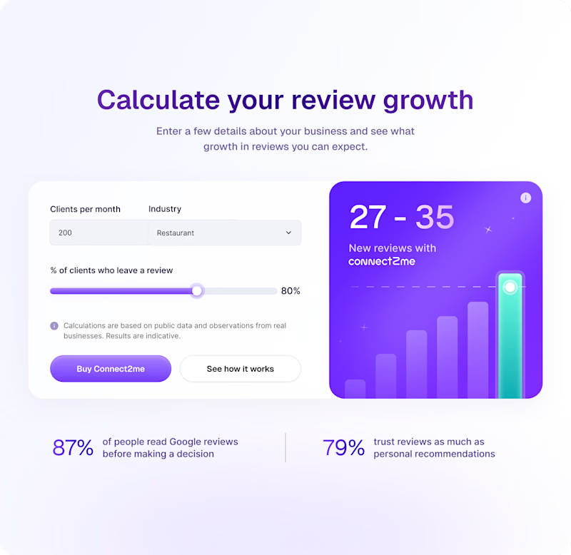
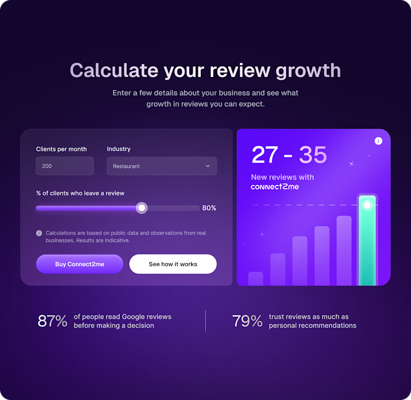
Taste Test

Interactive calculator for marketing website to engage users while they are exploring the product's value.
Which version do you prefer, ☀️ Light or 🌑 Dark?
61 voted
42%
85 voted
58%
146 votes
Closed

I love the light mode

I’d pick Light, the calculator feels clearer

Dark is always my choice!!
Pakistan


Gonna go with dark. I really love the background gradient for it

dark theme looks great 💯

Amazing UI

Dark looks neat, but light looks more usable. I wonder if there are ways to increase contrast on dark mode.

I’m biased toward Dark visually, but every time we’ve tested something like this, Light converts better. Especially for forms + sliders where people need clarity over aesthetics

I prefer the second, it looks more easy to interact with.

Light is much clearer. Good job tho!

@Denitsa Ivanova Both look great😊
Dark mode feels very SaaS and modern while the light mode feels a bit more trustworthy for a calculator. Nicely done🙌

light feels cleaner. Dark looks better

Light mode!

dark mode really makes the purple pop!

I actually like the light one this time around! I think the dark themed background is too colourful. I usually prefer dark themes but light one wins here!

Dark mode always... Love the purple effect here.


i would pick the light one here;

I’d choose the dark one

light work more for me

Dark looks better

Both designs are strong, but I’d lean toward the Light version for a marketing calculator. The readability, contrast, and form clarity make it easier to scan inputs and results quickly, which is critical for engagement and conversion. Nicely balanced UI overall.

Both look really nice but, I'm leaning more towards the light side because I feel like I can see it better.

I love both dark and light,
but if I think from perspective of MARKETERS,
they most of the time spend on screens.
So, I would love to keep their eyes less on light.

I think Light look more clean

Dark👍

Dark Version

going with the lighter version. Feels more easy on my eyes for weird reasons

i love the dark design

Impressive design!

Creative work


Light one
The network for creativity
Join 1.25M professional creatives like you
Connect with clients, get discovered, and run your business 100% commission-free
Creatives on Contra have earned over $150M and we are just getting started


Trending


Notion
Notion isn’t just where you work, it’s starting to work for you. What agents are you building?
portfolioreview
The best portfolios tell a story, not just show a grid. Share yours for feedback.
brandguidelines
Brand guidelines are becoming living systems, not static documents. What are you building for your clients?
aivideo
AI video tools are moving at warp speed. Which ones are you experimenting with?
freelancerlife
Freelancer life is wins, pivots, and everything in between. What’s yours right now?