The network for creativity
Join 1.25M professional creatives like you
Connect with clients, get discovered, and run your business 100% commission-free
Creatives on Contra have earned over $150M and we are just getting started
Back to feedPost
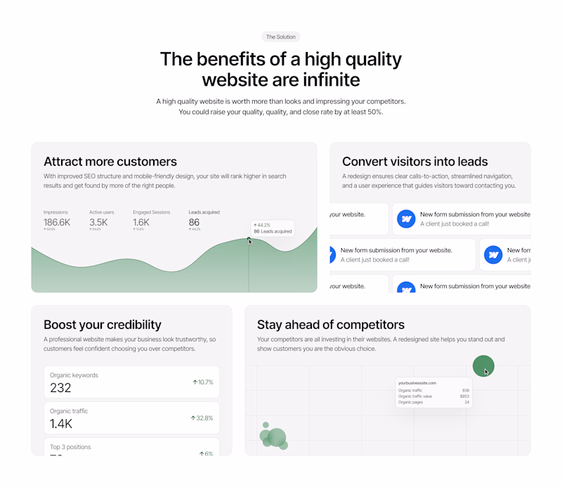
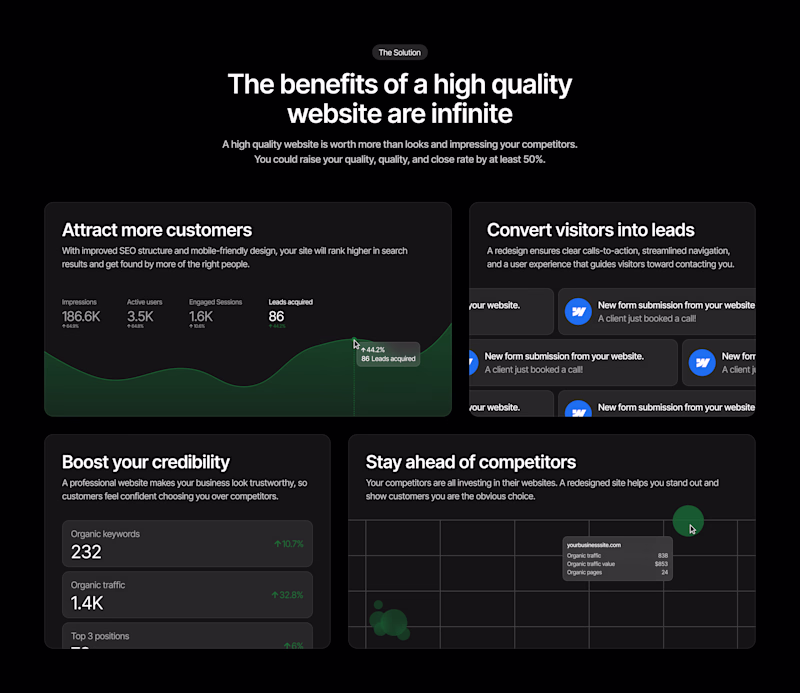
Taste Test
Having a hard time decided whether or not this Benefits section should be in light mode or dark mode. What do you think? Which do you prefer?
45 voted
42%
63 voted
58%
108 votes
Closed
Dark Mode
Thanks Victrex!
Dark 😍
Thanks Umar! I agree
Dark one looks better to me!
Me too!
Thanks Muhammad! Your opinion is appreciated here haha
depending on the target audience's age?
How so?
I was reading a case study that showed that darker themes are attractive to younger audiences
Oh interesting! I never thought about it like that. Something to look into
dark mode is definitely way better
Thanks Kendrick!
Both look good. The white looks crisper, even though I usually like dark mode haha
I'd say you are good with either, decision may depend on the sections above and below this one. Do you need a contrast section? or do you want to make a certain transition? How can you keep the...
You got it spot on! This would be the contrast section to break up the flow of the whole page.
My thinking was whether or not it should be this section or just the one after it haha
dark mode
Thanks!
Love the light thi
Thank you!
Works out well!
Thanks Adekola!
“I’d lean light here. The numbers and graphs feel more like ‘proof’ than ‘campaign’, which matches the benefits framing really well
Interesting insight! I do agree the light mode feels like more authority
This is well thought out. Love how you’ve explained the process instead of just the outcome.
Thanks Arun! Never overlook the copy haha
Dark mode one feels better
Thanks Mir!
I’d go with dark mode here — it really makes the benefits section stand out and draws attention to key points.
Both options are clean, but dark mode feels more impactful for this layout
Thanks Nader! I agree I feel the dark mode is just a little bit better
Light mode wins. Dark mode is designer bias, looks cool but murders readability on benefits/data sections. Keep it for emotional content, switch to light when you're selling with facts. Your conversion rate will thank you
(I prefer dark mode too btw, we just gotta fight our instincts lol)
Favorite comment so far! I think for that reason light mode might be the right answer haha. I do love the dark mode but with all of the information on the section the dark mode is instinctively harder to read
Light mode nice one
Thanks!
Love the dark mode
Thank you!
Thanks Chintan!
clean;
Thanks!
I think the greens are easier to see against the white vs. the black. But both look really nice, great job!
Thanks Cesar! I do agree
Dark mode
Thanks!
The network for creativity
Join 1.25M professional creatives like you
Connect with clients, get discovered, and run your business 100% commission-free
Creatives on Contra have earned over $150M and we are just getting started
Trending
Runway
AI video generation is exploding. What are you dreaming up in Runway?
Contra University
Learn from expert creatives how to earn more using next-gen AI tools.
creativeaiflow
Creative AI workflows are evolving. What tools do you use, and what are their strengths and weaknesses?
portfolioreview
The best portfolios tell a story, not just show a grid. Share yours for feedback.
freelancerlife
Freelancer life is wins, pivots, and everything in between. What’s yours right now?