The network for creativity
Join 1.25M professional creatives like you
Connect with clients, get discovered, and run your business 100% commission-free
Creatives on Contra have earned over $150M and we are just getting started
Back to feedPost
Taste Test
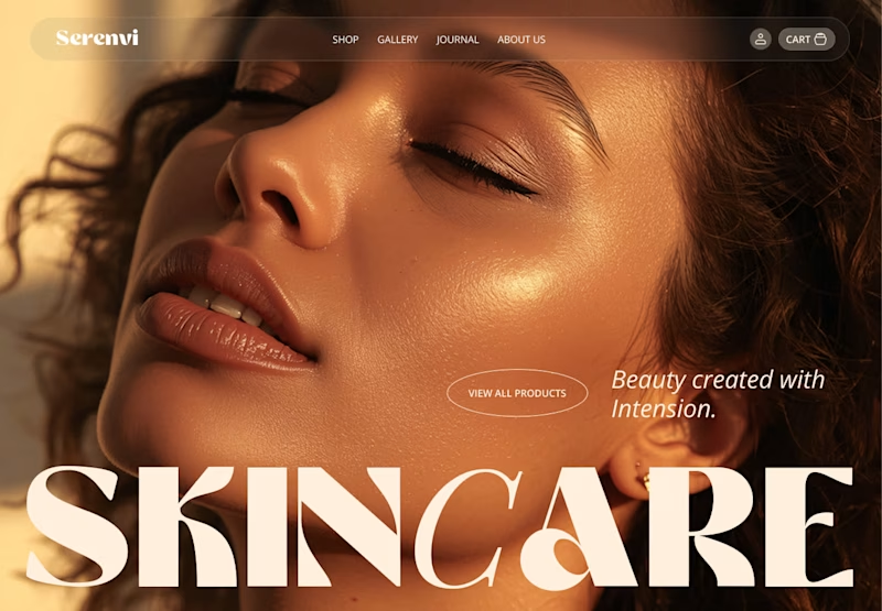
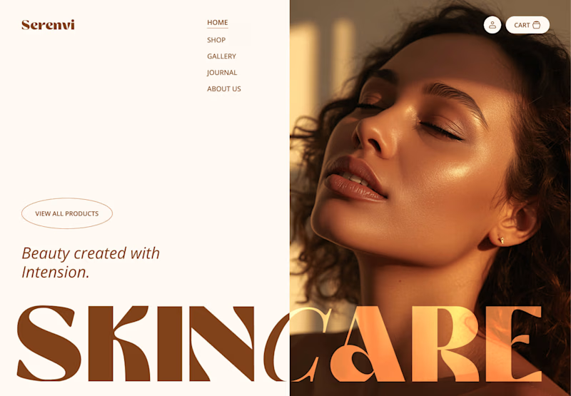
option A🙌
Thanks for your opinion @Catherine & Vlad Of July Studio
This is beautiful Akibul
Thank you @Vezubuhle Khumalo
Option A I really Like
😍
Thank you @Ritik Chhipa
A is so much cleaner. Looking good
Thanks @Alex Pro
Thanks @Neha Soni
option A is full of aesthetics!!!!
Option A is so nice. I A will be win.
Let's go with Option A!
A - for hero section
B - for any other section
Both are nice, but leaning A for better clarity on the messaging.
honestly both looks good but option A is more traditional (which i don't always like to follow) BUT A works best
I like the concept of B but the layout feels more like collateral than a web page. Voted for A!
I like them both. But A the full image works great and 'skincare' better in one color.
I feel the A is more direct to what it's about rather than just a noise as of B.
Super work
I preferred first one
Definitely A.
Clean execution!
Thank you @Hatypo Studio
The network for creativity
Join 1.25M professional creatives like you
Connect with clients, get discovered, and run your business 100% commission-free
Creatives on Contra have earned over $150M and we are just getting started
Trending
Claude
Claude has entered the design space. How are you using Claude Design?
Contra University
Learn from expert creatives how to earn more using next-gen AI tools.
creativeaiflow
Creative AI workflows are evolving. What tools do you use, and what are their strengths and weaknesses?
portfolioreview
The best portfolios tell a story, not just show a grid. Share yours for feedback.
freelancerlife
Freelancer life is wins, pivots, and everything in between. What’s yours right now?