The network for creativity
Join 1.25M professional creatives like you
Connect with clients, get discovered, and run your business 100% commission-free
Creatives on Contra have earned over $150M and we are just getting started
Back to feedPost
Taste Test
Which one is better?
60 voted
76%
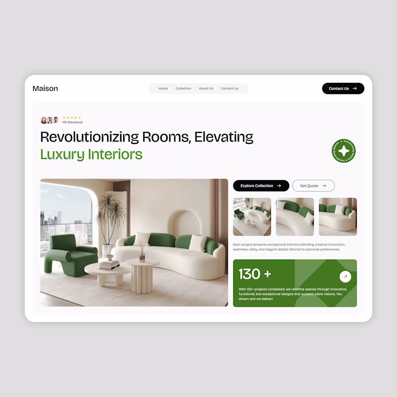
19 voted
24%
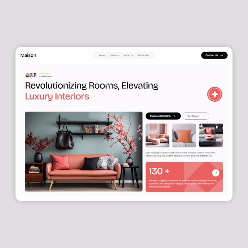
79 votes
Closed
both options are good
bro I see you say that on every post 😅
I support everyone without exception😊
both of them looks good! but i think green should be default and maybe pink if you want to customize it? great work !
Am going with the pink
can't decide both are great!!!
Personally the pink vibe feels better for me, maybe it's a bit more warm and inviting this way. good design!
Green is pleasing to the eye and conveys calmness, which is ideal for a home presentation ui, and it has good contrast, which the red of the second interface lacks.
Pink seems better and more catchy
They both look nice, but the green meets accessibility requirements for contrast (6.07). The salmon color combined with white doesn't have enough contrast (2.89). If you use a Mac, Pika is a great tool for quickly checking contrast.

superhighfives.com
Pika • Super High Fives
An open-source colour picker app for macOS
Honestly both look great, but I love green!
Leaning green. The softer contrast makes the layout feel calmer and more architectural, which fits the elevating interiors line. I’d steal the accent structure from pink (CTA + stat block) and keep it in the green world
Orange all day! All day!
both are good.
Green
honestly depends on clients color choice lol
Pink is better for me because the black color in the photos matches the color of the buttons and the whole thing creates a coherent harmony
Both is looks good to me, but I like green color
I feel that the green one brings more trust, the image used there looks better in my opinion, as well as the 3 images on the right side.
The network for creativity
Join 1.25M professional creatives like you
Connect with clients, get discovered, and run your business 100% commission-free
Creatives on Contra have earned over $150M and we are just getting started
Trending
Claude
Claude has entered the design space. How are you using Claude Design?
Contra University
Learn from expert creatives how to earn more using next-gen AI tools.
creativeaiflow
Creative AI workflows are evolving. What tools do you use, and what are their strengths and weaknesses?
freelancerlife
Freelancer life is wins, pivots, and everything in between. What’s yours right now?