The network for creativity
Join 1.25M professional creatives like you
Connect with clients, get discovered, and run your business 100% commission-free
Creatives on Contra have earned over $150M and we are just getting started
Back to feedPost
Taste Test

I'd love to hear your thoughts, which hero style do you prefer?
25 voted
27%
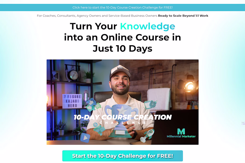
67 voted
73%
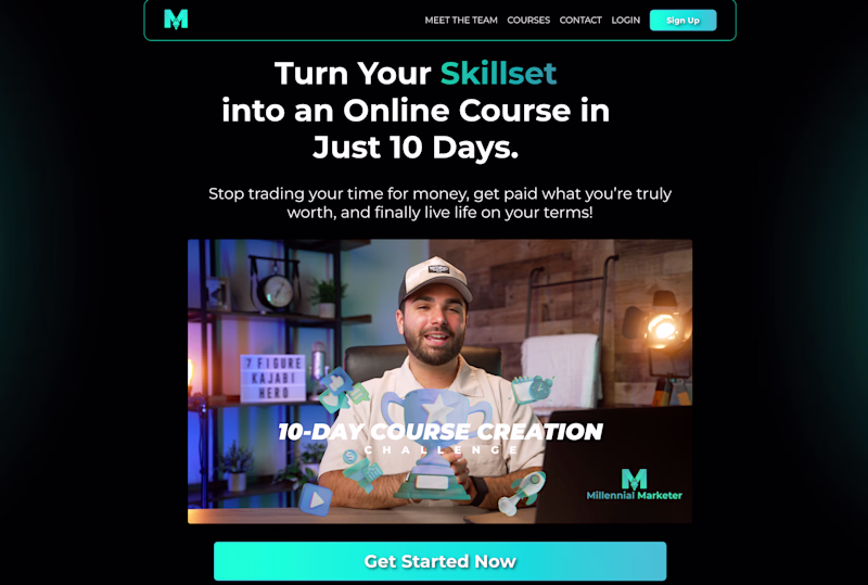
92 votes
Closed

It's dark for me!

Love the dark
Thank you!

for me dark mode always wins
I'm usually a fan of dark mode, but right now "light" is getting more conversions!

Although I usually like dark mode ones, between these I think light one looks better. Both great btw 👍
Plus, the light is getting more conversions.
Oh makes sense 👍

Definitely dark! Designed well 🔥
Here's the strange thing... light is getting more conversions!

I will go for the Dark version!
Welldone Joanna
Thank you so much for your feedback and kind words!

I like the light version its more cleaner
Thanks!

the colour theory is more popping in the dark mode!!!

I like Darker one but Light one is also great.
Thanks!
Always was a fan of dark profiles..😊

Dark mode!
Although I’d take a second look at that button text shadow
Will do! We're actually using the light version right now because it's getting more conversions.

I love them both. You are doing a great work 💪🏼
Thank you!

I like the Dark one more, there's better contrast and the color feels more natural

Same, but what's interesting is when we test "light" we got more conversions.

I’d keep the dark hero and steal one thing from the light, a tiny bit more breathing room around the headline so the message hits as hard as the color contrast

Thanks for the tips!


Although I usually prefer light, I think the dark them is one of those few exceptions for me :)
The ultimate solution would be just to have light and dark that adapts to the user's system preferences and it's really not hard to achieve this :)

nice

The light one looks beautiful

dark

You still need to learn the basics Joanna.
Dark is better..
Thanks for the feedback.
The network for creativity
Join 1.25M professional creatives like you
Connect with clients, get discovered, and run your business 100% commission-free
Creatives on Contra have earned over $150M and we are just getting started
Trending
maxearnings
The next frontier of payments is live on Contra. How are you maximizing revenue?
freelancerlife
Freelancer life is wins, pivots, and everything in between. What’s yours right now?
aidesignflow
AI tools are redefining how designer work. What does your workflow look like?
micrographics
Micrographics started as utility - barcodes, packaging, instruction labels. How would you use them?
aivideo
AI video tools are moving at warp speed. What tools are you using?